


Tableau Next introduces a new way to work with data. Instead of checking dashboards and reports manually, the Tableau Next features deliver insights automatically with AI, automation, and clear explanations. This helps you understand what is happening in your business faster and with less effort.
Tableau Next builds on the familiar Tableau platform but adds smarter tools. These features use generative AI, automated insight delivery, and deep connections to Salesforce. Together, they help you get answers without searching for them. This shift makes analytics easier for everyone, even if you are not a data expert.
In this blog, you will learn what Tableau Next is, what the main Tableau Next features are, how they compare to traditional Tableau, and how you can get started quickly. Each section will break down the features in simple terms so you can see how they support everyday decisions.
What is Tableau Next?
Tableau Next is the new version of Tableau that focuses on AI, automation, and faster insights. It moves analytics from dashboards you check yourself to insights that come to you. This makes it easier to understand your data and react quickly.
Tableau Next combines flexible analytics, generative AI, and strong Salesforce integration. It delivers insights directly into tools you already use, like Slack, email, and Salesforce. You do not need to open a dashboard to see what changed. The platform works in the background and sends you updates when something important happens.
Tableau Next is built on top of the classic Tableau experience. You still explore data, create visuals, and build dashboards. But now you also get automatic explanations, alerts, and insights without asking. This shift helps people make faster choices with less manual work.
Tableau Next features
Tableau Next features give you faster insights, clearer explanations, and less manual work. These tools use AI, automation, and improved data structures to make analytics easier for everyone. Each feature helps you understand data without needing deep technical skills. Below are the main features explained in simple, direct terms.
Tableau Pulse Metrics
Tableau Pulse is an AI tool that explains your data in short, simple sentences. It looks at your metrics every day and tells you what changed. It does this using generative AI, so you get clear summaries even if you do not know how to read dashboards.
What Tableau Pulse does:
- Sends automatic insights about your metrics.
- Writes easy-to-understand explanations for trends and changes.
- Helps non-technical users see what is happening right away.
- Delivers insights inside tools like Slack and email.
Why Tableau Pulse matters:
- You do not need to search for answers.
- You get updates without opening Tableau.
- It supports teams that rely on quick decisions.
Agentic Analytics
Tableau Agents with Agentforce offers a smart helper that watches your data for you. It checks for problems, patterns, or changes and sends alerts when something important happens. This is called agentic analytics because the system acts on its own instead of waiting for you to ask.
What agentic analytics does:
- Finds anomalies automatically.
- Sends warnings when something looks unusual.
- Suggests actions based on context.
- Reduces the need for manual data checking.
Why agentic analytics matters:
- Teams can react before problems grow.
- You spend less time digging through dashboards.
- You get insights based on real-time data movement.
Salesforce Data 360 integration
The Salesforce Data 360 (previously known as Data Cloud) connection is one of the biggest upgrades in Tableau Next. It lets Tableau read live customer data from Salesforce without copying it. This is called a zero-copy architecture.
What the Data Cloud integration does:
- Connects Tableau directly to real-time customer data.
- Removes the need to move or duplicate data.
- Provides a single view of every customer interaction.
- Powers features like Pulse and agents with fresh, accurate data.
Why this integration matters:
- Insights are based on up-to-date information.
- You can analyse customer journeys end-to-end.
- You get cleaner, faster analytics across marketing, sales, and service.
New Semantic Layer and Metrics Layer
The semantic layer is where you define all your important metrics in one place. This creates one shared version of the truth for everyone in your company.
What the semantic layer does:
- Stores metric definitions in a central location.
- Ensures Pulse and dashboards use the same formulas.
- Reduces errors caused by different teams calculating data differently.
- Makes AI explanations more accurate.
Why it matters:
- It improves consistency across all analytics.
- It removes confusion about how numbers are calculated.
- It supports governance and trust in data.
New Authoring Experience and Automation Tools
Tableau Next also improves the way you build dashboards and automate workflows. These updates make creating content easier and faster, especially for beginners.
What the authoring updates include:
- Guided modelling tools.
- AI support to help build charts and insights.
- Cleaner data preparation experiences.
- Automated workflows that send insights when events happen.
Why these updates matter:
- You spend less time designing dashboards.
- You get smarter suggestions from AI.
- Insights trigger automatically without extra setup.
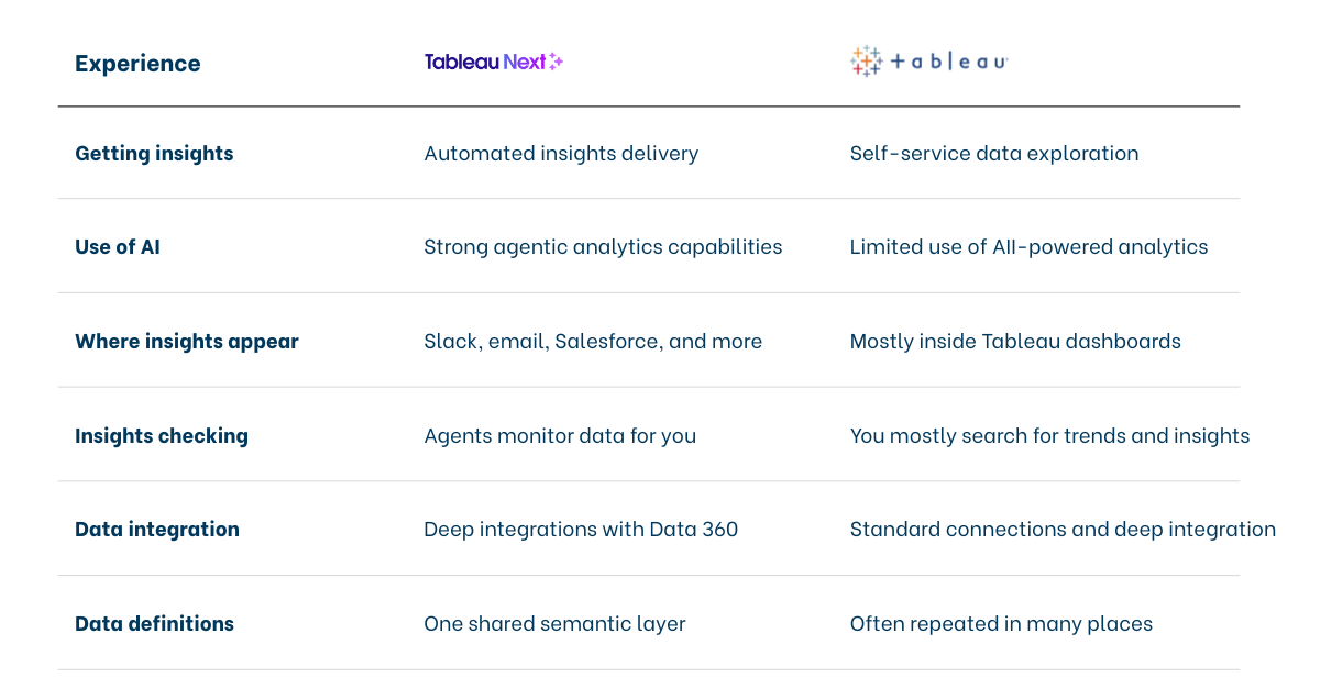
Tableau Next vs Tableau Classic
Tableau Next changes how people use Tableau by adding automation, AI, and real-time insights. Traditional Tableau focuses on dashboards you build and check yourself. Tableau Next focuses on insights that come to you automatically.
Here’s a concise overview of the main differences between Tableau Next and the classic Tableau experience.
Conclusion
Tableau Next changes how people work with data. Instead of relying only on dashboards, you get insights sent to you automatically. AI explains changes in simple language. Agents watch your data in real time. Salesforce Data Cloud gives you a complete, live view of your customers. Together, these tools help you make faster and clearer decisions.
Tableau Next builds on the strengths of classic Tableau but adds automation, intelligence, and stronger data connections. This means you spend less time searching for answers and more time taking action. Whether you are new to analytics or experienced with data, Tableau Next makes the entire process easier.
By starting with features like Pulse, the semantic layer, and the Data Cloud connection, you can begin using Tableau Next right away. These tools help teams understand what matters most without extra work.
Tableau Next is the future of analytics—simple, smart, and always ready with the insight you need.


