

.avif)

One size most definitely does not fit all in data analysis. People want to see different things because people interpret data in different ways, and they want to feel like the report they are looking at is specific to them.
Customise Tableau dashboards with custom titles
One way to customise what they see is to use custom titles. This is an effortless thing to do in Tableau, and it has a huge impact:
- It gives your user an idea of what information is displayed,
- It gives your user an idea of which filters have been applied,
- And you can even use a custom title to say "Anoop Odedra's Dashboard" dynamically. So each user's name is displayed as if they own the dashboard.
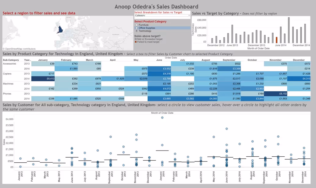
In the example above, you can see that the Dashboard title has my full name in it.
The Sales by Product Category highlight table title has been customised to show which product category and region is being displayed and the Sales by Customer circle chart title shows which sub-category, product category and region is being displayed. As long as one of the fields is being used within the view or is on the marks shelf you can add it to your custom title.
Additional fields
There are a few additional fields that can be added to titles that differ from Dashboard titles and Worksheet titles.
Dashboard Titles:
- Sheet Name (Dashboard name)
- Workbook Name
- Default Title
- Full name (of user signed into Tableau Server or Tableau Online)
- User Name (of user signed into Tableau Server or Tableau Online)
- Any parameters in the workbook
Worksheet Titles:
- Data Connection Name
- Data Update Time (Date and Time of data refresh)
- Page Count
- Page Name
- Page Number
- Default Caption
- Any field or Action being used to build that worksheet
Building a Dashboard Title
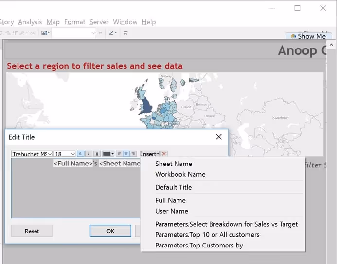
To build the dashboard title above, here are the steps:
- Right-click on the dashboard title
- Select "Edit title"
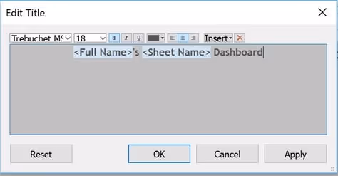
- In the dialog box that appears create the title that you require, inserting any of the fields to customise the title from the "Insert" drop down menu. In the above case my title reads:
<Full Name>'s <Sheet Name> Dashboard
Any text placed within <> is a field being used in the title. You can add any other text around it as you require.
- Hit "OK" and you are done.
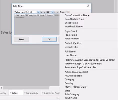
Building a Worksheet Title
Creating a worksheet title is identical to a dashboard title, but you have more options of fields to add. To generate the worksheet title for the Sales by Customer circle chart above here are the steps:
- Right click on the worksheet title
- Select "Edit title"
- In the dialog box that appears create the title that you require, inserting any of the fields to customise the title from the "Insert" drop-down menu. In the above case, my title reads:
<Sheet Name> for <ATTR(Sub-Category)> sub-category, <ATTR(Category)> category in <State>, <Country>- select a circle to view customer sales, hover over a circle to highlight all other orders by the same customer
- Hit "OK", and you are done


