


Note: This blog presumes you have already read the preceding blog in this trilogy: Get the most from Tableau Map Layers – Basics – Getting started.
If you haven't read that blog already, please visit that one first before continuing.
From our previous blog we have discovered that Map Layers opens a creative opportunity to how we can design our charts and customise them beyond what is available through Tableau original UI.
Also, we can see that whilst the introduction of Viz Extensions provides us with access to more complex charts quicker and easier than before, the customisation of those Viz Extensions are even more limited than standard Tableau chart builds – because you are unable to add any dimensions / measures to rows and columns.
This is where Map Layers really do shine. If you are looking for something specific about your chart visualisation that standard Tableau or Viz Extensions do not provide, then Map Layers will likely come to your rescue.
We should also not forget; data visualisation is about presenting the data in best way possible for your audience and so we do not want to let any limitations of the tool we use impact how we think it is best to design our visuals.
With that said, this blog is going to run through how we can look to create more chart types using map layer logic to provide us with a base to layer our creativity on top of. In the previous blog we looked at creating the simple bar chart.
Yes, it was trickier to create a bar chart using Map Layers than standard Tableau, but it opened up the facility to do more with the visual.
Here we will look to create these charts:
- Pie Charts
- Doughnut Charts
- Line Charts
- Area Charts
Tableau Map Layers: Pie Charts
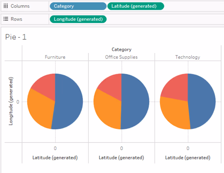
Pie charts are the easiest of all the charts to create using this Map Layer method, all we need is to define the location of the pie chart and that is easily done using the MAKEPOINT function and setting Longitude and Latitude both to zero.
//mp.Pie_Zero
MAKEPOINT(0,0)
From this point we would set up our pie chart as we would normally, putting a continuous field onto Angle and a discrete field onto Detail or Colour.

Example using Segment & SUM(Sales).
We could leave it at that and move on to the next chart, but there is something else we need to consider here. What if we want to divide this chart up by some kind of Discrete field, for example, Category? Well, we actually have two options here.
Option 1: Place Category onto Rows or Columns. This will divide up the worksheet view as per normal providing a column or row for each category.
Option 2: We prescribe the position for each category using our Makepoint calculation and utilise it by putting the Category pill onto the Detail. This provides us with the opportunity to be more creating with our layout.
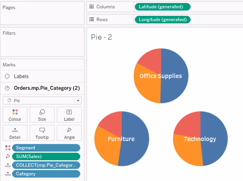
Tableau Map Layers: Doughnut Charts
These are exactly the same set up as a Pie Chart with an additional Layer in the build to mask the centre of the Pie Chart.
Using Map Layers to build a Doughnut Chart has a big advantage over the normal build we would usually do when utilising a dual axis.
The advantage is that in the normal build when you hover on a slice of the doughnut, the whole slice of the underlying pie chart is highlighted – kind of annoying from a design perspective, whereas in the Map Layer build we can utilise the ability to disable selection from the layers – stopping the highlight of the marks.
This is great if you display the labelling of each slice elsewhere on the chart or dashboard. Not so good if you were relying on the tooltips to help your users.
So, to build the doughnut chart, add another map layer using the same Makepoint calculation used for the Pie Chart, but this time there is no need to add Segment or SUM(Sales) to the marks card, as we only require a circle to cover the centre of the Pie Chart and not actually display anything data related – this is purely a design choice.
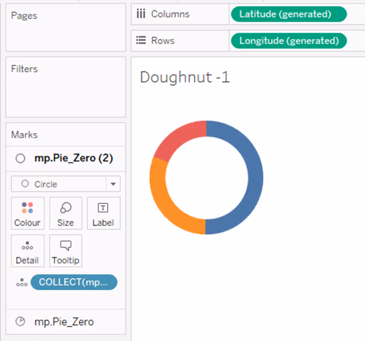
From this stage you can then use the Circle layer to place the label into the centre of the Doughnut.

From this point you can play to your heart’s content with the design to suit your needs. To provide some examples of what is possible take a look at this visualisation I created a while ago on Tableau Public.
Here is a sneak peak!

Tableau Map Layers: Line Charts
Building Line Charts using the map layer method is a little trickier than a Pie or Doughnut chart. The issue being the magnitude of the marks on both the date axis and also the metric value.
What exactly is the problem, well because map layers use Longitude and Latitude our marks need to be placed within the normal boundaries for both Longitude (0 to 180 degrees – note, ‘degrees’ doesn’t matter here, we are transferring our value to the scale of 0 to 180) and Latitude (0 to 90 degrees), otherwise they will fail to show on our worksheet.
To navigate this we need to normalise our values and adjust our date axis to fit.
Normalising our values:
We do this by taking the value and dividing it by the largest value – returning a result value between 0 and 1.
Adjusting our date axis:
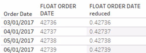
When we try and plot our date axis, for it to work we need to convert our dates into a number, otherwise the Makepoint function will not accept it.
We can easily convert a date by wrapping the date field in a FLOAT function, such as:
FLOAT([Order Date]).
This will return a value in the tens of thousands like this:

To convert our dates into a value that will fit in our Long and Lat ranges, we need to reduce the values by a factor. I would suggest dividing the dates by 100,000.
This will future proof your dates (way beyond what you will need) and return your date values into decimals – easily fitting in the ranges we require.
To plot a line chart using Map Layers we need to write two calculations:
//ORDER DATE REDUCED
FLOAT(Order Date) / 100000
//mp.Line
MAKEPOINT (
MIN(ORDER DATE REDUCED)
,
SUM(Sales) / MAX({SUM(Sales)})
)
Note: with this calculation, the second part that deals with Sales, this is the normalisation of Sales. You will need to adjust this depending on the level of detail you choose to set your date range to (i.e. Weeks, Months etc).
Placing both of these calculations onto Detail on a new worksheet and selecting a Line mark type, will give you your line chart!

For comparison, here is the same data built using the standard Tableau build. As you should be able to see, they are identical – as they should be!
Again, this now provides us with more option for formatting these lines, such as:
Here we have different formatting for each line – line style, line size, colour, labelling options. I am not sat here saying this is a good formatting option to have so many different things going on, but it illustrates the point that you can customise so many variables.
It must be said that creating a line chart through the normal methods is easier and nearly as flexible in what you can create.
However, the real power of creating line charts via the Map Layer method will be revealed in part three of this blog series, so watch this space!
Tableau Map Layers: Area Charts
The good news is that setting up area Area Charts is the same as line charts, we just need to change the mark type to Area Chart.
In the next blog I will highlight an issue around using Area Charts in Map Layers, but the issue is related to specific use case.
One other thing to note about both Line Charts and Area Charts in Map Layers is the Y-Axis will not show the true value of the marks, it instead will show the normalised value of the mark.
There are more complex workarounds for creating axis labelling, but we will not address this as part of this three-blog series.
Understanding the basics of building these three chart types along with the bar chart from the first blog gives us a great foundation to understand how to use Map Layers and how we can move on to the more complex builds that really start to harness the power of using this feature as a whole – creating bespoke views that combine more than one map layer element.
Such as these, believe it or not, both of these are created in a single worksheet!

This is STEP 2 in your learning for how to use Map Layers. Look out for the next blog post in this trilogy of blogs for taking this learning to the next level where we will look at combining elements into a single view.
Tableau Map Layers: Getting Started (part 1/3)
Tableau Map Layers: Pulling Everything into one view (part 3/3)
See you next time!


