BI & Analytics
Blog
Tableau
3
min read

Tableau's order of operations

Learn more about Tableau's order of operations: or what happens when and how. Read the full blog here.
Author
Fabian Zimmer
Fabian Zimmer
Data & AI Engineer
Tableau's order of operations
Share article

Tableau’s Order Of Operations: Or what happens when and how

One of my first blog posts as an Analytics Consultant in the Business Intelligence and Tableau space was about Tableau’s data lifecycle. The blog post was meant to be a trilogy, but as life and work have it, other tasks soon filled up my schedule and I never wrapped it up. Bummer.

Fast forward a few years and this topic still fascinates me: what operations happen in which order, how does that help me and others understand Tableau’s data lifecycle, and how can I use that to my benefit?

I deliver quite a few Tableau Workshops, and next to all the material and exercises I always wished I had a precise and concise one pager that clearly shows why you cannot mix aggregates and non-aggregates in calculated fields (and how to circumnavigate that issue), why level of detail expressions essentially are non-aggregates after they have been computed, and why cosmetic table calculation filters are a thing.

How great would it be to have a poster for fresh Tableau graduates, next to a flurry of amazing online resources, for their data journey. Some honorable folks, namely David Weaver and Joe Mako have been working on a great overview, some of which I have adopted. But I felt it was lacking a key ingredient: data visualisation.

What better way to quickly get when a certain filter is applied, what happens to the length of your data set, and due to what operations your data set grows in width? All that was left to do was to add a bunch of sample calculations that mix various operations, and using colour coding to tie them back to the order of operations.

So here it is, produced for the big screen (or printed on DIN A3 paper): The Tableau Order Of Operations Cheat Sheet!

You read the upper half from left to right, and you can see how your data set shrinks vertically with each new filter that is being applied, colour coded in red. You can also observe how your data set grows in width with each new calculation you add, colour coded in grey, yellow, beige, blue and white.

At one point the data set shrinks further, as we enter the realm of summary data, using aggregations. Soon after that blending kicks in, and an additional orange data set appears. Easy.

Tableau Data Lifecycle Cheat Sheet

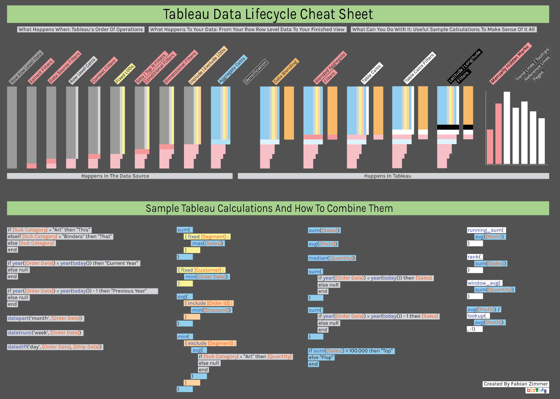
The lower half are sample calculations, colour coded to tie them back to the individual stages of the order of operations. See how row level calculations and simple aggregates are mixed? Hopefully this will be a big help for people having just started with Tableau and more often than not are running into the “cannot mix aggregates and non-aggregates” error.

Enjoy and let me know what you think via the section below!

Facts & figures

About client

Testimonial

Blogs you might also like

5 Ways to Level Up Your Bar Chart Using Tableau Parameter Actions

5 Ways to Level Up Your Bar Chart Using Tableau Parameter Actions

Tableau Parameter Actions are a great feature in Tableau. Read all about it in our latest blog.

BI & Analytics
Blog
Tableau
Everything you need to know about Tableau Certifications

Everything you need to know about Tableau Certifications

Thinking of taking one of the Tableau Certifications? We explore how to get ready in our latest blog. Read all about it here.

BI & Analytics
Blog
Tableau
Personalise your Tableau Dashboard with Custom Titles

Personalise your Tableau Dashboard with Custom Titles

Learn about how to add the personal touch to your Tableau Dashboard with custom titles.

BI & Analytics
Blog
Tableau
Bar Charts: The Good, the Bad, and the Ugly

Bar Charts: The Good, the Bad, and the Ugly

Why can bar charts be effective and how to use them to get answers easier, and faster!

BI & Analytics
Blog
Tableau
How to create a waterfall chart in Tableau

How to create a waterfall chart in Tableau

Learn how to create your own waterfall charts in Tableau Desktop by following these steps.

BI & Analytics
Blog
Tableau
The Ultimate Guide to Embedded Analytics

The Ultimate Guide to Embedded Analytics

Discover what embedded analytics is all about and how it can drive additional revenue streams for your business.

BI & Analytics
Blog
ThoughtSpot
How to label pie charts in Tableau

How to label pie charts in Tableau

Learn more on how to label pie charts in Tableau like a pro.

BI & Analytics
Blog
Tableau
How to label bar charts in Tableau

How to label bar charts in Tableau

Learn how to label bar charts in Tableau like a pro and level up your dashboard design. Read the full article here.

BI & Analytics
Blog
Tableau
How to create a donut chart in Tableau

How to create a donut chart in Tableau

Looking to create a donut chart in Tableau? Read our in-depth guide on how to level up your donut charts in Tableau here.

BI & Analytics
Blog
Tableau
How to ace your ThoughtSpot certifications?

How to ace your ThoughtSpot certifications?

Learn more about ThoughtSpot certifications and how to ace your exams.

BI & Analytics
Blog
ThoughtSpot
How to stop marks being highlighted when ‘clicked’ in Tableau

How to stop marks being highlighted when ‘clicked’ in Tableau

Learn how to stop marks from being highlighted when clicked in Tableau.

BI & Analytics
Blog
Tableau
How to Create Multiple Select Parameters in Tableau

How to Create Multiple Select Parameters in Tableau

Learn how to create multiple select parameters in Tableau to add more control and interactivity to your analysis.

BI & Analytics
Blog
Tableau
How to apply conditional formatting to tooltips in Tableau

How to apply conditional formatting to tooltips in Tableau

Learn how to apply conditional formatting to tooltips in Tableau with our step-by-step guide. Improve your data visualization skills today with Biztory.

BI & Analytics
Blog
Tableau
Rediscovering Business Intelligence with Sigma Computing

Rediscovering Business Intelligence with Sigma Computing

Discover how Sigma Computing is reshaping the BI landscape with its user-friendly interface and powerful capabilities.

BI & Analytics
Blog
Sigma
Sigma Computing: Our Favourite Features

Sigma Computing: Our Favourite Features

Discover our favourite features of Sigma for powerful and fun data analysis.

BI & Analytics
Blog
Sigma
Tableau vs. Power BI: Everything to know

Tableau vs. Power BI: Everything to know

Compare Tableau and Power BI to determine the best business intelligence tool for your needs.

BI & Analytics
Blog
Tableau
Tableau Map Layers: Getting Started (1/3)

Tableau Map Layers: Getting Started (1/3)

Learn how to leverage Tableau's Map Layers feature to create complex visualizations.

BI & Analytics
Blog
Tableau
Tableau Map Layers: Pull everything into one view (3/3)

Tableau Map Layers: Pull everything into one view (3/3)

Use Tableau Map Layers to combine multiple visuals in a single worksheet and create custom dashboard views for enhanced data visualization.

BI & Analytics
Blog
Tableau
Tableau Map Layers: Building Different Charts (2/3)

Tableau Map Layers: Building Different Charts (2/3)

Learn how to create Pie, Doughnut, Line, and Area charts using Tableau Map Layers.

BI & Analytics
Blog
Tableau