


Hey there, data enthusiasts! 🌟
If you're anything like me, you love discovering tools that make data analysis not only powerful but also fun and intuitive. Enter Sigma Computing, the data analytics platform that's quickly becoming a favourite for all things data.
Whether you're a seasoned analyst or just dipping your toes into the data pool, Sigma has something for you! Let me take you on a whirlwind tour of a handful of my favourite Sigma features that have transformed my data experience: templates, the drill-down feature, KPIs, GIFs, and the writeback feature.
Trust me, by the end of this post, you'll be itching to try them out yourself!
Sigma Templates: Your data, your way
Let's start with templates. Sigma's templates are like the Swiss Army knife of data analysis. They come pre-loaded with a variety of formats and styles, making it super easy to get started on your reports and dashboards. Click here to take a look!
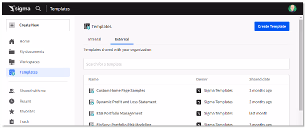
Whether you're looking to visualise sales data, track marketing metrics, or just need a quick start for your next big project, Sigma has a template for you. And the best part? They're fully customizable.
You can tweak them to fit your exact needs, ensuring your reports look professional and tailored to your audience.
Imagine starting your day, coffee in hand, and instead of staring at a blank canvas, you open Sigma and select a template that fits your project perfectly. In minutes, you've got a beautiful, data-rich report ready to share. It’s a productivity game-changer!
Sigma Drill-Down Feature: Customise your dive
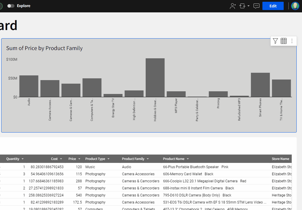
Next up, the drill-down feature. This is where Sigma really shines. With just a few clicks, you can dive deeper into your data, uncovering insights that might have been hidden at first glance. Say goodbye to the days of static, one-dimensional reports.
Sigma’s drill-downs are dynamic and interactive, allowing you to explore your data in real-time.
What I absolutely love is the ability to edit your own drill-downs and create bespoke control elements.
You’re not stuck with predefined paths; you can tailor the drill-downs to follow the logical flow of your analysis. This flexibility means you can adapt your reports to answer specific questions on the fly, making your data exploration as dynamic as your thought process.
Also…and this really is a fabulous addition in my opinion…why not create buttons for your own bespoke drill? Using Sigma’s ‘Drill down’ Control Element - you can do just that!
KPIs: Keeping Your Finger on the Pulse
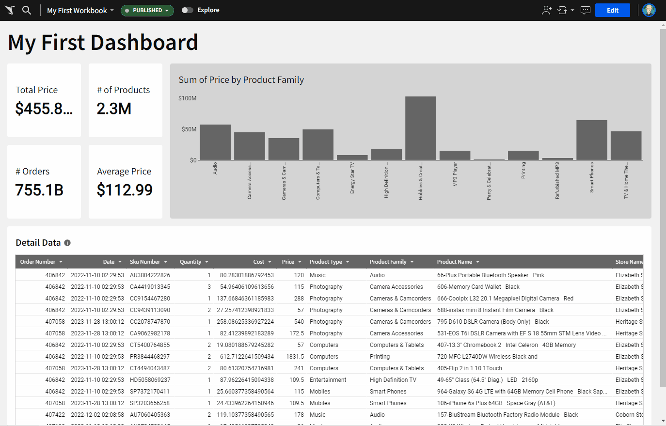
No data story is complete without Key Performance Indicators (KPIs).
Sigma makes tracking KPIs a breeze. You can set up dashboards that monitor your most important metrics in real-time. Whether it's sales targets, website traffic, or customer satisfaction scores, Sigma’s KPI dashboards keep you updated with the latest figures, beautifully visualised.
The real fun comes in customising these elements. You can really go to town with how your KPIs look and behave. You can add conditional formatting and tweak pretty much all of the component parts.
This ensures that your KPIs are not just numbers on a screen but a visual story that guides your decision-making. They’re super easy to create and you’ll have something swish up in no time!
Addings GIFs in Sigma: Spice Up Your Data
Now, let’s talk about a feature that adds a bit of flair to your data presentations – GIFs! Sigma allows you to embed GIFs in your reports and dashboards.
This might sound trivial, and let’s face it, it kind of is, but it’s a fantastic way to make your data more engaging and relatable. Imagine presenting your sales data with a celebratory GIF when targets are hit, or a funny reaction GIF to lighten up a particularly dense section of your report.
Adding GIFs not only makes your reports more fun but also helps to keep your audience engaged. It’s a small touch that can make a big difference in how your data is received.
Writeback Feature: Actionable Insights
Last but certainly not least, the writeback feature. This is where Sigma really goes above and beyond. The writeback feature allows you to update your database directly from Sigma. This means you can take action on your insights immediately, without switching between different tools.
Whether you’re updating sales records, correcting data entries, or adjusting forecasts, the writeback feature streamlines your workflow, saving you time and reducing the risk of errors. It’s a powerful tool that turns your data analysis into actionable insights, closing the loop between data discovery and decision-making.
Why We Think You Should Try Sigma
Sigma Computing is more than just a data analytics tool; it’s a platform that empowers you to explore, understand, and act on your data like never before. From the ease of templates to the depth of drill-downs, the precision of KPIs, the fun of adding GIFs, and the efficiency of the writeback feature, Sigma has something for everyone.
So why not give Sigma a try? Dive into its features, explore your data, and see how it can transform your analysis process.
Whether you're looking to streamline your workflows, uncover hidden insights, or just add a bit of fun to your reports, Sigma Computing has got you covered.
Happy analysing, and may your data always lead to great discoveries! 🚀


