


Note: This blog presumes you have already read the preceding blogs in this trilogy:
Part 1/3: Get the most from Tableau Map Layers – Basics – Getting started
Part 2/3: Get the most from Tableau Map Layers – Intermediate – Building Different charts.
In the previous two blogs we have discovered the flexibility and power of utilising Map Layers to create more custom and directed Data Visualisations.
Here we will look at the next level in the Map Layer potential when we dive into building multiple visuals into a single worksheet.
What we will talk through during this blog is two main concepts around this topic of combining visuals using map layers.
- Creating bespoke combination charts
- Creating dashboard style views
Creating bespoke combination charts
Tableau, as we have previously discussed, has limitations when trying to create combinations of visuals.
Dual axis is the solution that Tableau has provided but it only goes so far. For those information designers that want to portray their data in the best directed and succinct way can find the build limitations frustrating.
Dual axis tend to be mainly used when trying to compare bars & lines together, or bars versus bars. There are of course other use cases for a dual axis, but the real limitation is given in the name – they have to use the same axis, i.e. the same range for both elements of the dual axis.
With map layers you can break that limitation, allowing you to combine more than two elements on a single worksheet and also combine elements that require different axis ranges.
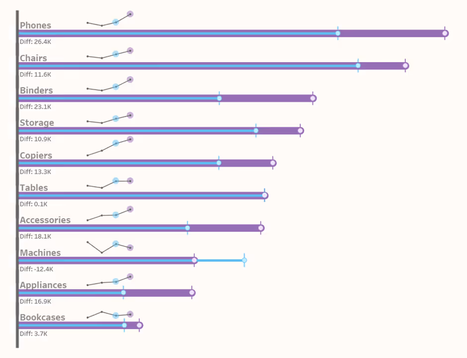
For example: Imagine you wanted to compare the current year sales versus the previous year sales for a certain set of Categories. Typically, you would want to either use Measure Names / Values or a Dual Axis to achieve that. But what if you want to do this YoY comparison, but also provide more context of the history of the numbers for each bar.
Again, you could do this through adding a separate chart that shows the historical data, and place both onto a Dashboard.
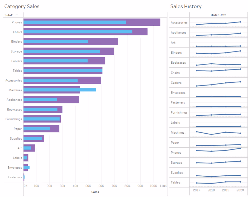
That is perfectly acceptable, but in this scenario, you want to give more emphasis to the YoY bars themselves and you want a more visual connection between the history of the numbers and the bars.
Well, Map Layers can help you here!
Remembering that Map Layers use a Longitude and Latitude coordinate system (because it was designed for Maps), we are able to utilise those coordinates to layer our dual bar chart visualisation and our line chart over one another on the same worksheet.
And create something like this, a visual that provides all the information we want to see, but with a more succinct use of space.
“But how?”
Without going through the full build of the above combination chart, here are the key points in building it.
Step 1: Normalise your metrics (Sales – CY and PY) so they can be plotted on the Long/Lat ranges.
Step 2: Build your bar chart as per part 1/3 of this blog trilogy
Step 3: Spread the bars our across the vertical per Sub-Category (remembering the long/lat limitations)
Step 4: Layer over the 2nd bar chart on top of the 1st and format both
Step 5: Normalise your dates for use on the Line Chart
Step 6: Build your line charts as per part 2/3 in this blog trilogy
Step 7: Scale your line chart, to the size you want them to be displayed
Step 8: Spread the line chart position as per Sub-Category, allowing for them to be positioned above the bars (trial & error is required here with how you spread them).
Step 9: To position your Line Charts, you will need to adjust the Makepoint calculation to transition your chart across both Long & Lat (as required), by simply adding a value to each part of the calculation.
Eg. MAKEPOINT([lat calc]+3, [long calc] + 0.25) – this would move the horizontal positioning 3 steps to the right, and the vertical positioning 0.25 of a step upwards (this is just an arbitrary example).
Once you are used to the Map Layer builds, creating visuals such as this are rather easy and straightforward. You are then able to add more information using map layers as you require (simply add more layers to the worksheet); such as:
- Category labels
- Metric value labels
- YoY differences
- More markers to help the understanding of the chart (here I used Gantt lines at the ends to help understand the true end point of the bars)
- Axis lines (the bar axis on the left)
- Marker Highlights on the line charts (to show what years have been selected)
Ultimately this is one example of how you can use Map Layers in a single worksheet to build a more bespoke visualisation than would have been possible through standard Tableau or even relying on someone else to build a Viz Extension to cover your specific needs.
More examples of Map Layer use:
Example 1: Creating multiple visuals in a single tile: See example
Example #2: Creating a custom visualisation - See example
Example #3: Creating a fully formed Tabular visualisation with multiple elements and interactivity - See example

Creating dashboard style views
Woah! Wait a minute, that sounds proper complicated! (Excuse my West Country accent coming through there!) Why would we want to build a dashboard using Map Layers?!
Well, hear me out! ... The Film Franchises visualisation above is essentially a dashboard in a single worksheet, it utilises everything we have learn through this blog series to date and just builds on it adding more layers.
In Tableau we have the great ability to combine charts into a Dashboard and include Actions to really help support a customer’s experience exploring the data.
This is a rather straightforward process that allows you as a Dashboard Designer quickly build and understand the layout of the dashboard. You have a lot of options to your disposal to create your dashboard, and you can control a vast majority of it through Actions, Dynamic Zone Visibility and even sheet-swapping (yes, that’s still a thing!).
So how can Map Layers help?
We have seen from the Combination Charts the flexibility we can possess with a visual in a single sheet.
Utilising this further and adding more charts to a sheet – effectively creating a dashboard, is turning that dial up to 11! (nod to all you This is Spinal Tap fans out there!).
Instead of having multiple objects / containers / charts placed on a dashboard that all need computing and rendering, you can look to build this using Map Layers.
Some benefits would include:
- Lifting the restriction of Tableau’s container system, without resorting to Floating objects. Allowing more creative freedom of placement of objects.
- Allowing for a more controlled system to show/hide different visualisations on the worksheet (presumably using parameter controls) – as you could define how and wear visuals move to and scale in size, more so than the current Dynamic Zone Visibility provides.
- A greater ability to lockdown various elements on the dashboard – using the ‘Disable Selection’ option on a Map Layer.
- Performance benefits – this is debatable as to whether building in a single sheet would be more performant or not – it hasn’t been tested. But in theory, there is only a single object which to render – be that a particularly more complex object!
We would probably not advocate building a dashboard using Map Layers as your first point of call, certainly not within a business context.
However, there may be occasions that arise that you find the method of layering multiple charts on a single worksheet more beneficial than the traditional Tableau method.
~ End ~
Thank you for reading this series of blogs on a topic I love. Clearly Tableau has a huge creative potential to support data visualisations, both Business and otherwise. This is sometimes lost with Tableau’s own recent push for AI advancement and Extension developments.
The core Tableau product is still as strong as ever! I hope you enjoyed this series of blogs and I also hope to see more Map Layers vizzes on Tableau Public.
See you next time!


