

.avif)
Labelling a bar chart in Tableau feels like it should be a straightforward task. There is a label shelf which allows you to show mark labels, edit the text of the label, adjust the font, set the alignment of the label and dictate which bars you want to label. You can also add additional fields to reference in the label by adding them onto the label shelf.
But sometimes the alignment property just doesn’t position the label where you want it. This post describes the multiple ways you can use to get the labels on a bar chart exactly where you want them.
Let's get started!
Using the label alignment property
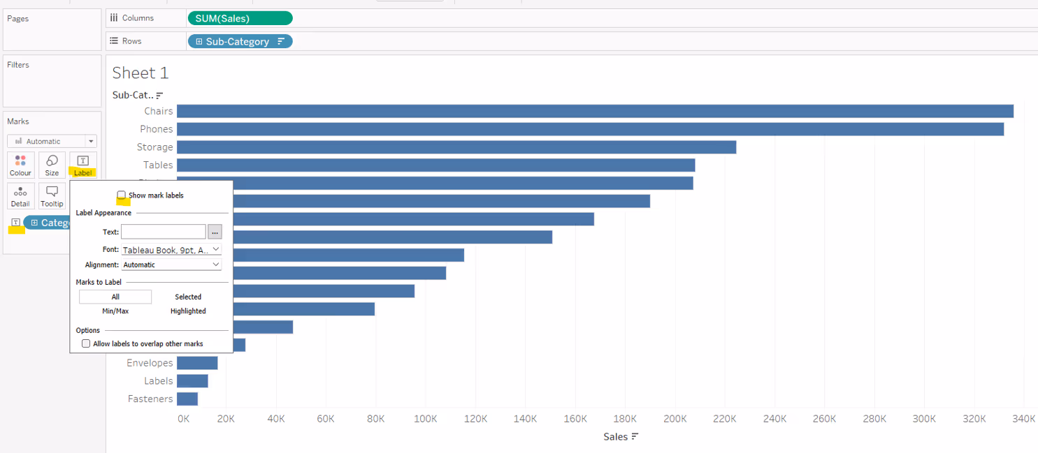
Let’s start by looking at the provided functionality available via the Label shelf.
By default labels on a horizontal bar chart will be automatically positioned outside of the bar on the right hand side, with the text aligned vertically with the centre of the bar.
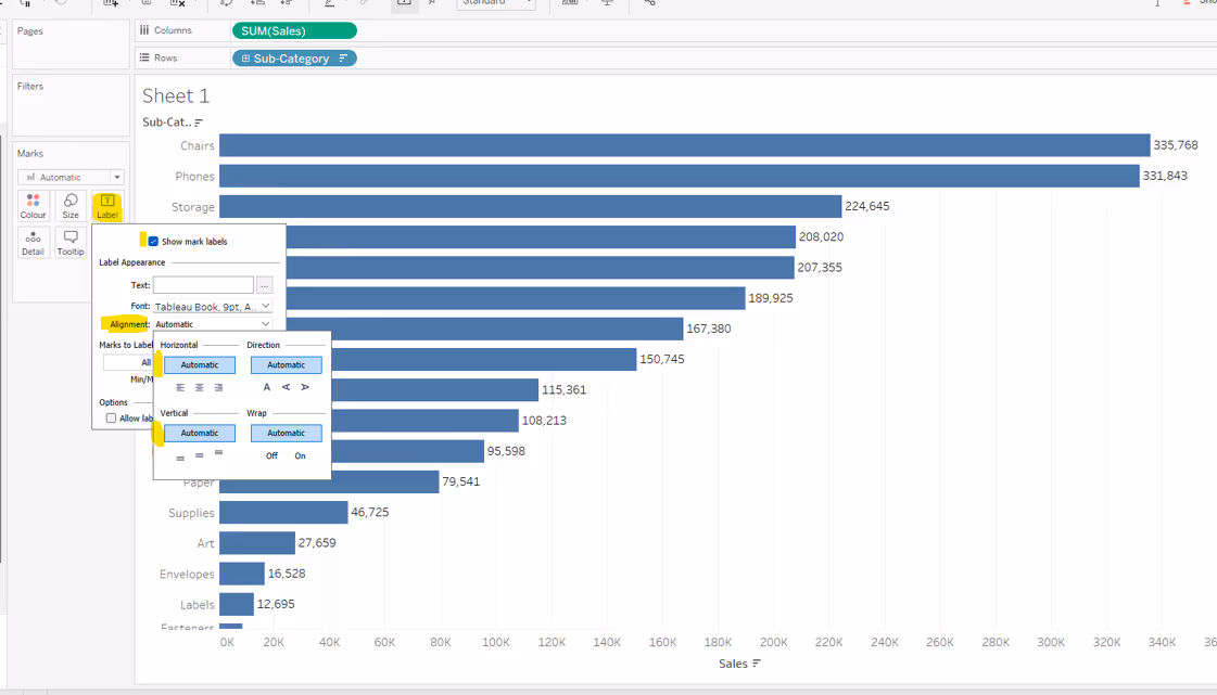
In this instance the automatic horizontal alignment option is the same as if you explicitly select right align, and the automatic vertical alignment option is the same as if you explicitly select middle.
If you adjust the vertical alignment to top or bottom, the label will align based on the top or bottom of the bar accordingly. This is more noticeable if your bars are quite wide.

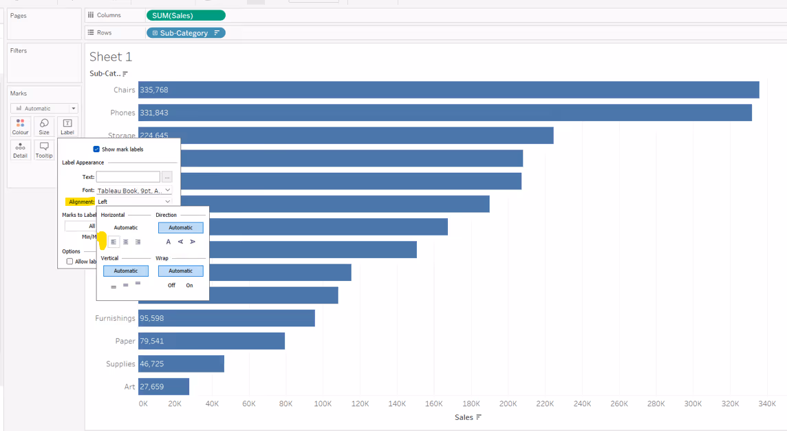
Changing the horizontal alignment option to left align, will position the label inside the bar on the left hand side.
And changing the horizontal alignment to centre will position the label centrally inside the bar.

If you’re working with a vertical bar chart, then by default the labels will be automatically positioned on top of the bar, with the text aligned horizontally with the centre of the bar.

In this instance the automatic horizontal alignment option is the same as if you explicitly select centre align, and the automatic vertical alignment option is the same as if you explicitly select top.
If you adjust the horizontal alignment to left or right, the label will align towards the left or right of the bar accordingly. This is more noticeable if your bars are quite wide.

Changing the vertical alignment option to bottom, will position the label inside the bar at the bottom

And changing the vertical alignment to middle will position the label centrally inside the bar.

But what if you want your bar chart label somewhere else?
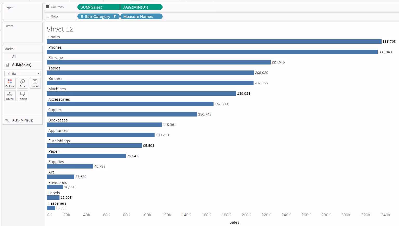
How Tableau handles the position of labels is based on the type of mark being labelled. When Tableau draws a bar, it is filling up the space from the 0 on the axis to the value of the measure being plotted (in the examples above, this is from 0 to the Sales value of each Sub-Category).
For the horizontal bar charts, the horizontal left and right alignment options available in the label shelf, are actually referring to which end of the bar to position the label; in both cases the actual text is right aligned to the line end. This is similar for the vertical bar charts.
We can make use of other functionality, and different mark types in Tableau to display the labels in different positions.
Labelling inside the end of the horizontal bar

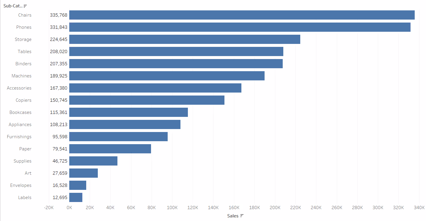
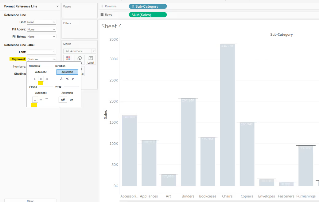
The simplest way to achieve this is to use a reference line, which is then formatted to be horizontally aligned left, and vertically aligned to the middle.
The reference line should be set per cell based on the measure value being plotted, in this instance Sales.
The label of the reference line should be set to Value, and the Tooltip and Line options should be set to None.
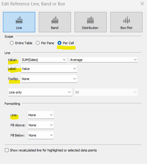
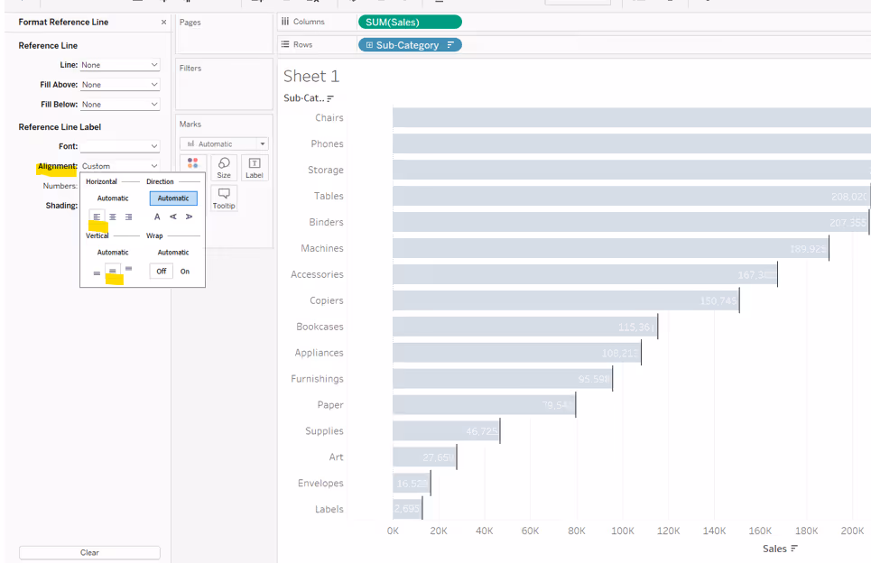
Once added, the reference line should then be formatted so the reference line label is aligned left middle. Depending on the colour of your bar, you may need to also adjust the colour of the font and reduce the shading opacity to 0%.
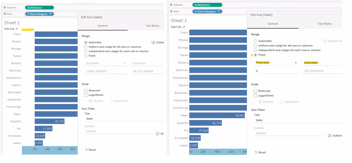
Note, the addition of the reference line, adds some ‘padding’ to the x-axis, so the axis no longer starts at 0, and the bars start further away from your row labels. To resolve this, and providing you are only ever plotting positive numbers, you can edit the x-axis to start from 0 or a small enough number that reduces the space without truncating the text (just remember to only fix the start and keep the end to be automatic).
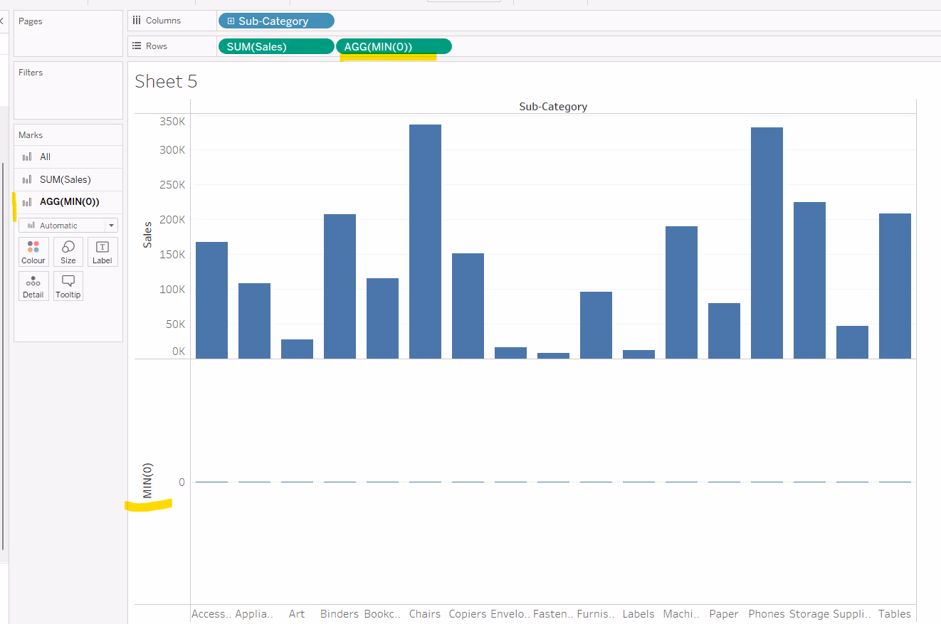
Labelling outside the start of the horizontal bar
Ideally it would be good to use a constant reference line at position 0 for this, but at the point of writing with Tableau Desktop version 2022.4, it is not possible to add other fields to the label property of a reference line. Using the technique described above would simply label the rows with 0 rather than the desired measure.
So we have to use another alternative. In this instance dual axis.
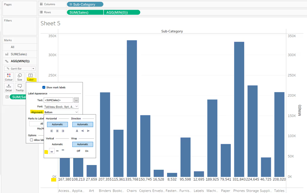
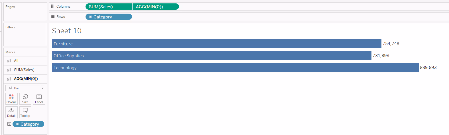
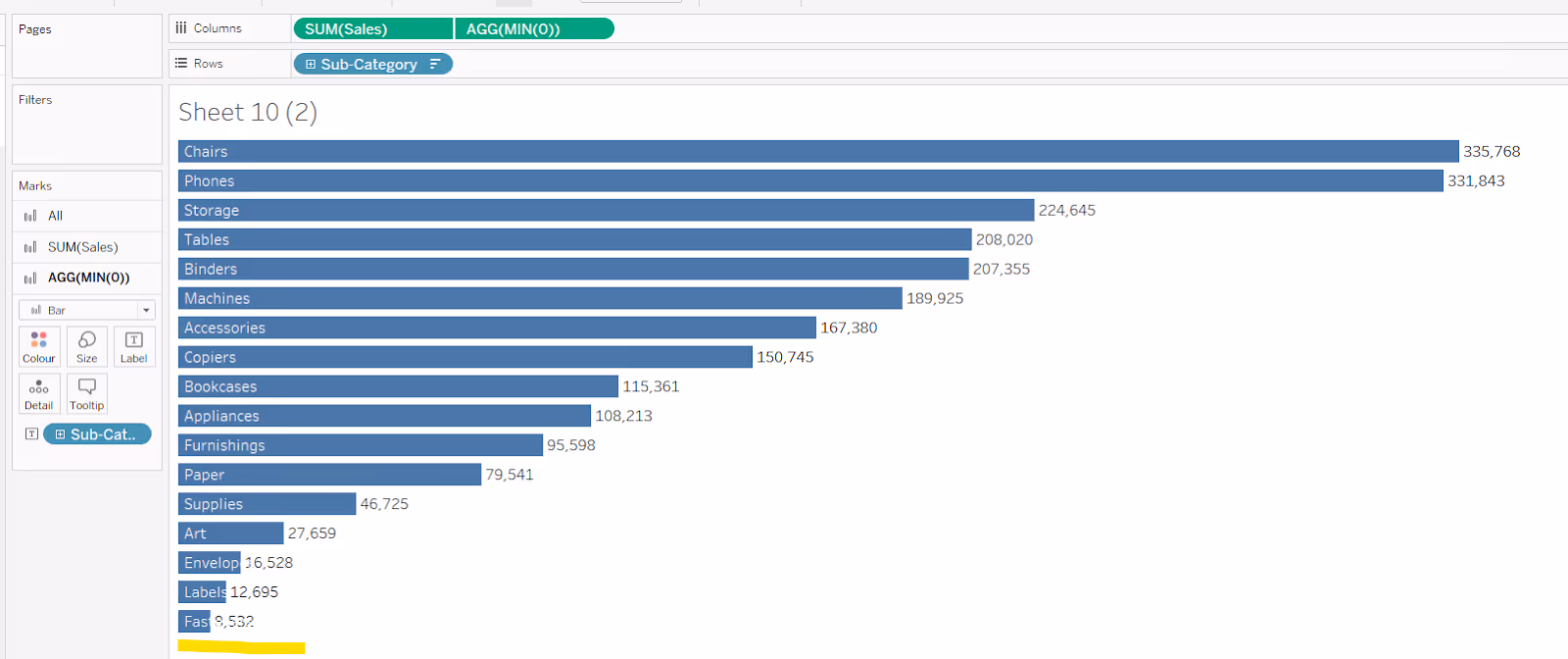
Double click into the Columns shelf next to the measure and type MIN(0). This will create a secondary axis, and with it, a second marks card.
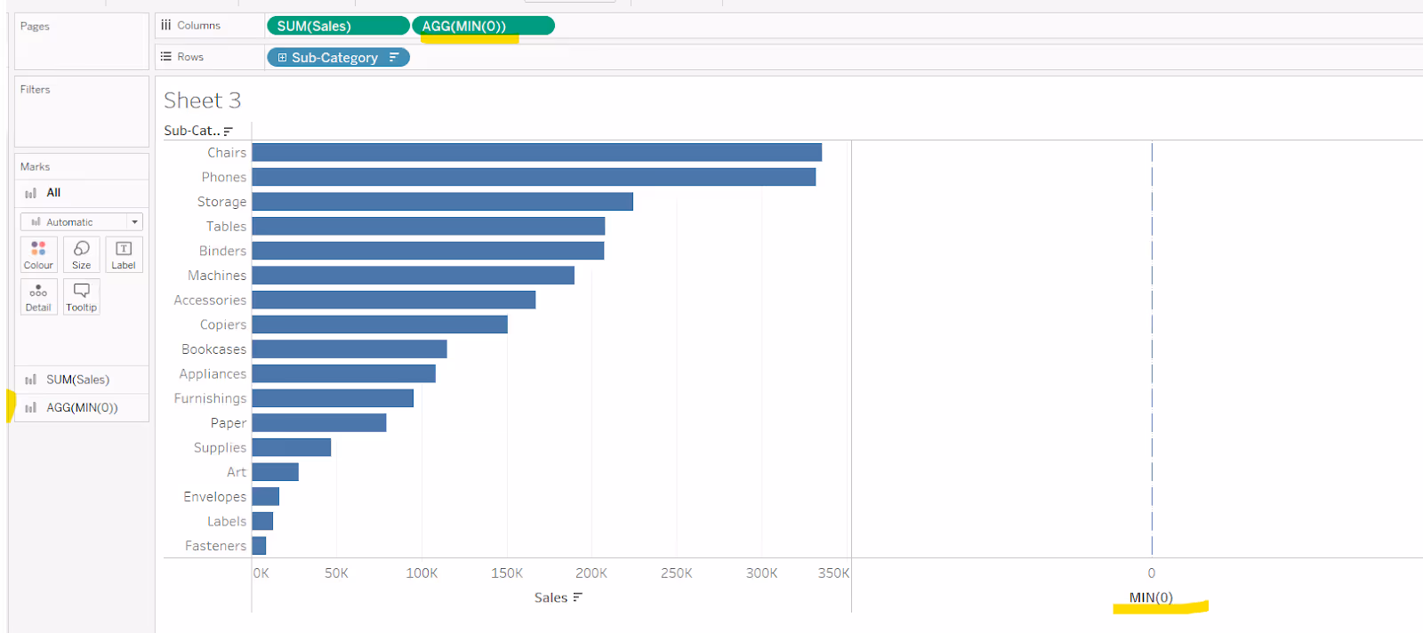
Set the chart to be dual axis and synchronise the axis. It is possible the mark types may have changed. Reset the mark type of your core measure to be a bar and set the mark type of the MIN(0) mark to be a gantt bar. Remove Measure Names from the colour shelf on the All marks card.

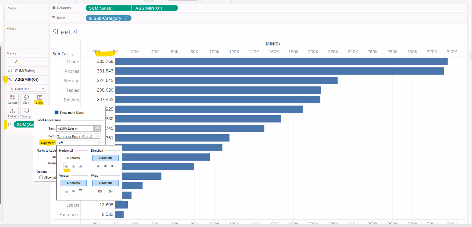
Now add your measure (in this instance Sales) to the Label shelf of the MIN(0) marks card. If the labels don’t automatically appear, then ensure show mark labels is checked. Modify the alignment via the Label shelf to be horizontally aligned left.
To tidy up, you can then remove the MIN(0) axis (right click on the axis and uncheck show header), and remove row and column dividers as required.
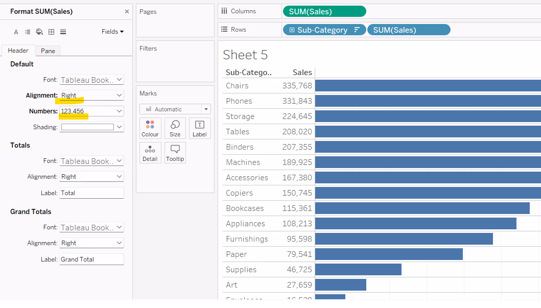
Note - Using the MIN(0) dual axis method of labelling the start of the bar, does allow for some flexibility, for example having more fields within the label, or colour coding the label based on some logic. However, if the need is just to display the measure value as described above, another alternative is to simply add the required measure as a discrete field (blue pill) on the Rows shelf, formatted and aligned as required.

Labelling inside the top of a vertical bar

This uses the reference line technique, where the label of the reference line is formatted to be aligned centrally at the bottom.
The reference line should be set to per cell based on the measure value being plotted, in this instance Sales.
The label of the reference line should be set to Value, and the Tooltip and Line options should be set to None.

Once added, the reference line should then be formatted so the reference line label is aligned bottom centre. Depending on the colour of your bar, you may need to also adjust the colour of the font and reduce the shading opacity to 0%.
Labelling underneath the bottom of a vertical bar
This requires the use of MIN(0). Double click into the Rows shelf next to the measure and type MIN(0). This will create a secondary axis, and with it, a second marks card.
Set the chart to be dual axis and synchronise the axis. It is possible the mark types may have changed. Reset the mark type of your core measure to be a bar and set the mark type of the MIN(0) mark to be a gantt bar. Remove Measure Names from the colour shelf on the All marks card.
Now add your measure (in this instance Sales) to the Label shelf of the MIN(0) marks card. If the labels don’t automatically appear, then ensure show mark labels is checked. Modify the alignment via the Label shelf to be vertically aligned at the bottom.
To tidy up, you can then remove the MIN(0) axis (right click on the axis and uncheck show header), and remove row and column dividers as required.
As before, you can also use a discrete (blue) instance of the required measure (ie Sales) and display that on the Columns. In a vertical bar chart, adding a secondary dimension to columns, will shift one column heading to the top of the chart, while the other remains at the bottom.

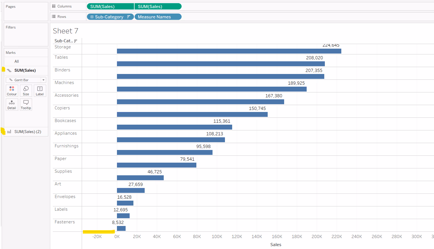
Labelling above a horizontal bar

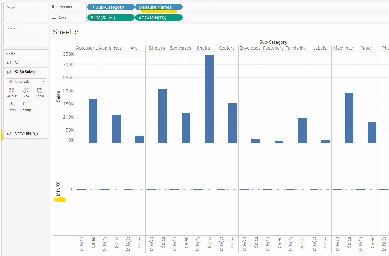
To label above/on top of the bar, you can again use a dual axis technique with MIN(0).
Double click into the Columns shelf next to the measure and type MIN(0). This will create a secondary axis, and with it, a second marks card.
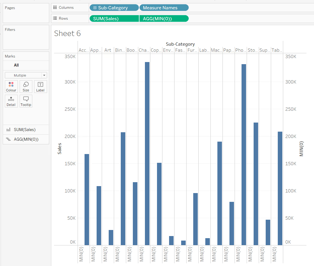
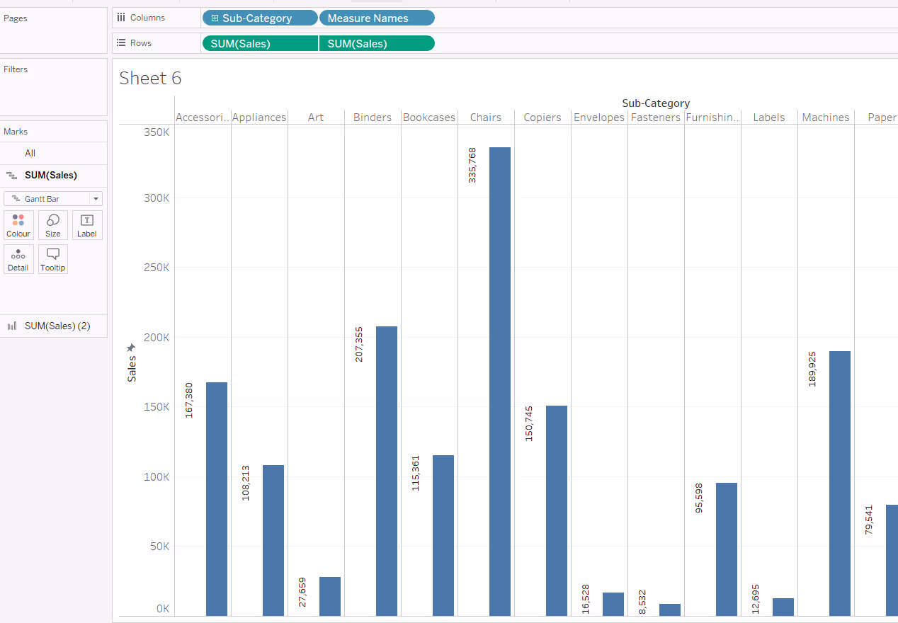
Add Measure Names to the Rows shelf, next to the existing dimension, in this case Sub-Category. This has the effect of generating 2 rows for each Sub-Category.
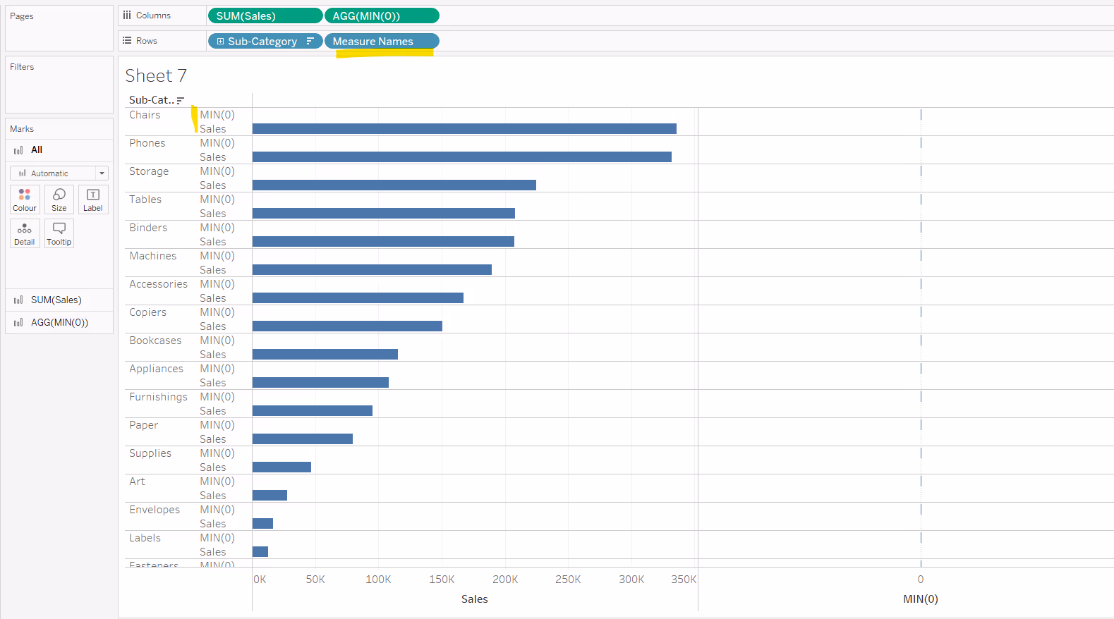
Make the chart dual axis and synchronise the axis. Change the mark type of the core measure back to bar and for the MIN(0) mark, set to gantt bar. Remove Measure Names from the colour shelf on the All marks card.

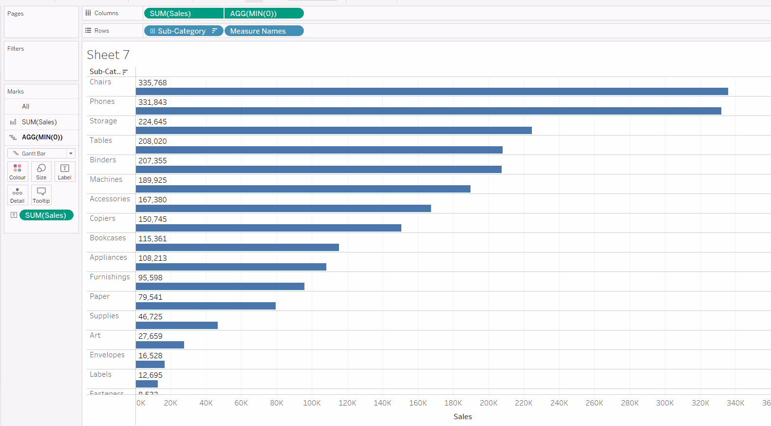
Add your measure (in this case Sales) to the Label shelf of the MIN(0) marks card. Reduce the opacity of the colour on the MIN(0) marks cards to 0, reduce the Size of the mark to the smallest possible. Hide the Measure Names column from displaying (right click on the Measure Names pill in the Rows, and uncheck show header). Hide the MIN(0) axis from displaying too.
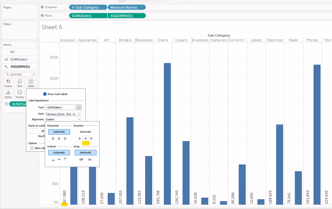
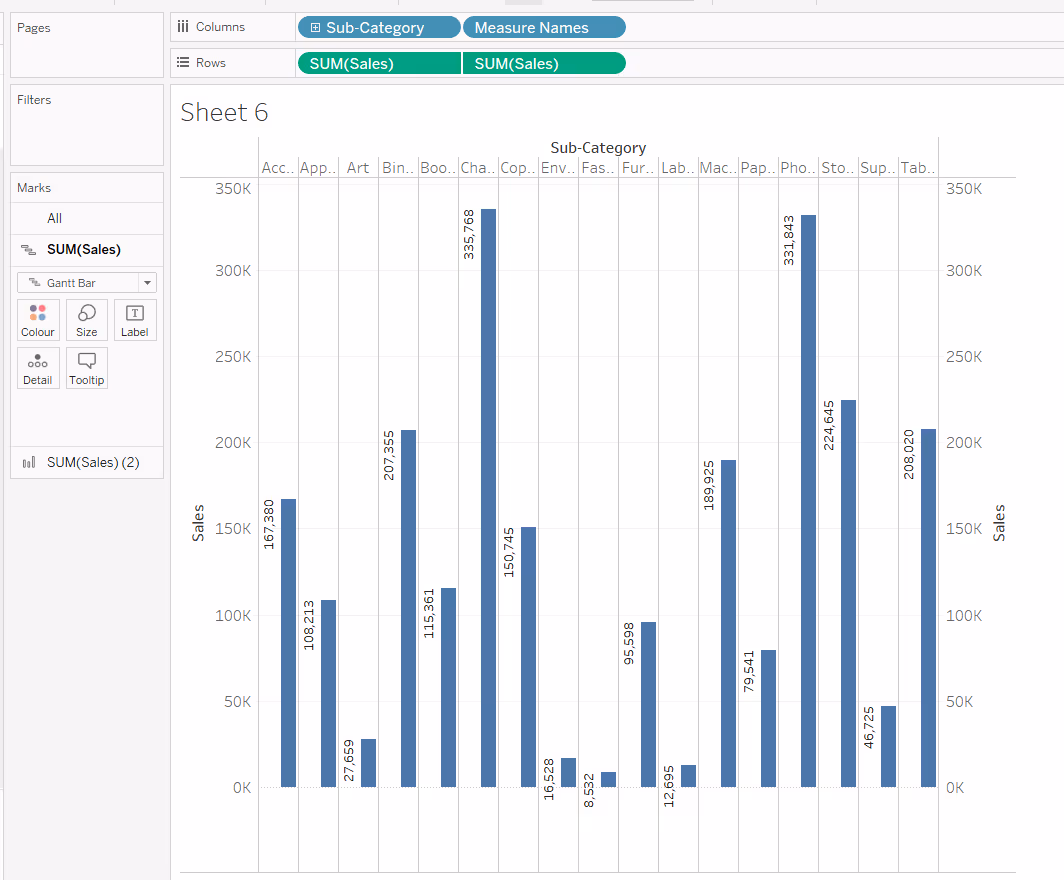
If you want to position the label on top of the bar, but at the other end, then use another instance of your measure (ie Sales) instead of MIN(0), but this time, set the first instance of the Sales marks card to be gantt bat and the second instance to be bar.
Show mark labels on the first marks card, and align the text to be left middle.
Once again if the x-axis has exposed more space to the left of the 0 point, you may need to fix it to start at 0 (or a suitable smaller number) to retain all the text.

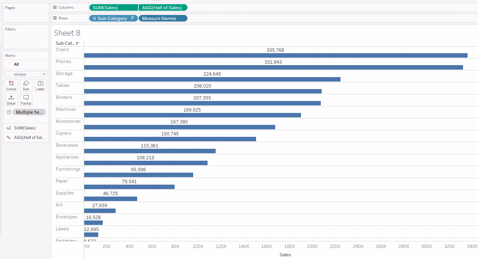
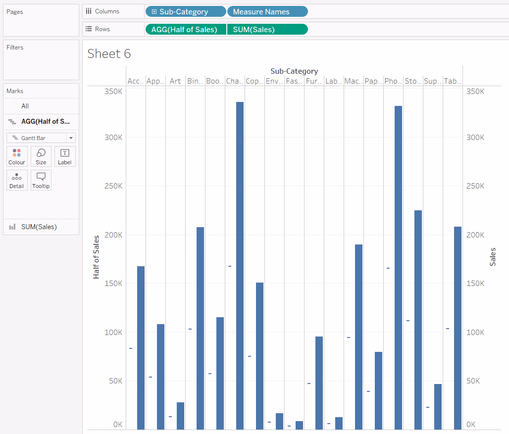
If you need to position the label centrally above the bar, then create a new calculated field that is half of the measure being plotted eg:
Half of Sales
SUM([Sales]) / 2
Add this to the Columns next to the existing measure, set to dual axis and synchronise the axis. Change the mark type of the core measure to bar and of the half measure to gantt bar. Remove Measure Names from the Colour shelf of the All Marks card. Add Measure Names to Rows.

Reduce the opacity of the colour of the half measure marks card to 0, and size to the smallest possible. Add Sales to the Label and align middle centre. Hide the top axis and the Measure Names column (uncheck show header).
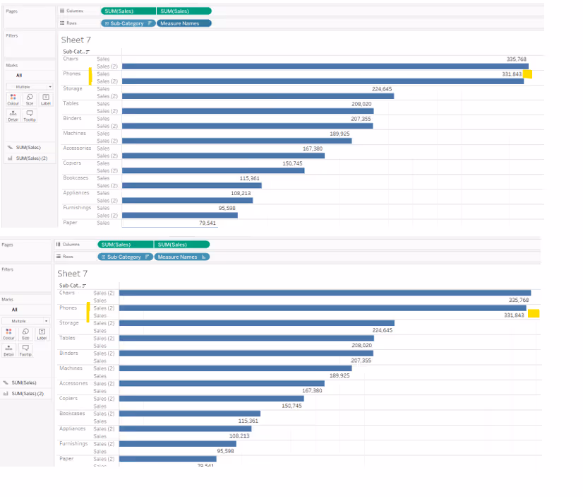
Labelling beneath a horizontal bar
To position the labels below/underneath the bars, you apply the same techniques described above but re-sort the order of the Measure Names. In the images below, just by swapping the order of the Measure Names (by simply clicking and dragging), the label moves from above the bar to beneath it.
Labelling to the left of a vertical bar
To label to the left of a vertical bar, you can again use a dual axis technique with MIN(0).
Double click into the Columns shelf next to the measure and type MIN(0). This will create a secondary axis, and with it, a second marks card.
Add Measure Names to the Columns shelf, next to the existing dimension, in this case Sub-Category. This has the effect of generating 2 columns for each Sub-Category.
Make the chart dual axis and synchronise the axis. Change the mark type of the core measure back to bar and for the MIN(0) mark, set to gantt bar. Remove Measure Names from the colour shelf on the All marks card.
Add your measure (in this case Sales) to the Label shelf of the MIN(0) marks card. Reduce the opacity of the colour on the MIN(0) marks cards to 0, reduce the Size of the mark to the smallest possible. Hide the Measure Names column from displaying (right click on the Measure Names pill in the Rows, and uncheck show header). Hide the MIN(0) axis from displaying too.
Depending on the width of your columns, you may also want to change the direction of the text. Sometimes Tableau will do this automatically based on the space available.
If you want to position the label to the left of the bar, but at the other end, then use another instance of your measure (ie Sales) instead of MIN(0), but this time, set the first instance of the Sales marks card to be gantt bat and the second instance to be bar.
Show mark labels on the first marks card, and align the text to be bottom centred.
If the y-axis has exposed more space below the 0 point, you may need to fix it to start at 0 (or a suitable smaller number) to retain all the text.
If you need to position the label midway along the bar, then use then create a new calculated field that is half of the measure being plotted eg
Half of Sales
SUM([Sales]) / 2
Add this to the Rows next to the existing measure, set to dual axis and synchronise the axis. Change the mark type of the core measure to Bar and of the half measure to Gantt Bar. Remove Measure Names from the Colour shelf of the All Marks card. Add Measure Names to Columns.
Reduce the opacity of the colour of the half measure marks card to 0, and size to the smallest possible. Add Sales to the Label and align middle centre. HIde the top axis and the Measure Names column (uncheck show header).

To label to the right of the vertical bar, apply the same techniques, but swap the order of the measure names.
Extending the concepts
Once you’ve grasped these ideas, you can then combine them to enhance how your visualisations are displayed.
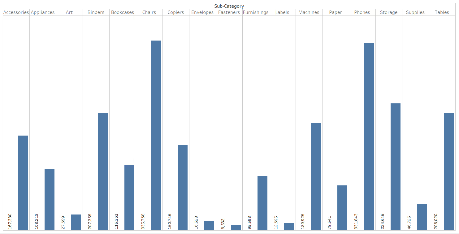
In the image below, the Sales marks card is just labelled using the ‘out of the box’ labelling functionality. The inside of the bar is then labelled with the row header (in this case Category) rather than the sales value, and the Category column has then been hidden from the display.
This helps to save width, but can cause issues if the label inside the bar is longer than the bar itself, which is what happens when using the Sub-Category dimension.
So instead, you might try to position the Sub-Category label above the bar on the left hand side (using MIN(0) and Measure Names on rows).
Summary
Hopefully this blog has given you the building blocks you need to get your labels just where you want them. But sometimes you will have to compromise. Using a dual axis for example, just to position your label, means you can’t use that axis for other purposes.
You also do have the option of manually moving labels, simply by clicking on the label and dragging them to your desired location. However, this is really only recommended if the data you are working with is static and isn’t going to change, and you only have a handful of labels to move.
A workbook to accompany this blog post which features all the examples discussed above can be accessed from here.


