

.avif)

In Tableau, you can use any image as the background of a worksheet and plot data points on top of it. The technique works because every Tableau map is, underneath, a scatter plot with an image loaded behind the marks. By providing X and Y coordinates for each point, you can map data onto floor plans, site layouts, equipment diagrams, stadiums, vehicles, or any other custom image. This guide walks through the full build in 4 steps.
What is a custom background image in Tableau?
A custom background image in Tableau is any image (JPEG, PNG, or hosted via URL) loaded behind a worksheet's marks to act as the canvas for a scatter plot. Instead of mapping points to longitude and latitude on a world map, you map them to pixel coordinates on your own image.
This unlocks a wide range of non-geographic mapping use cases:
- Floor plans to plot desk occupancy, sensor readings, or foot traffic.
- Site maps and warehouses to track equipment, inventory, or incidents.
- Equipment or vehicle diagrams to flag faults or maintenance points.
- Sports field layouts to plot player positions or event locations.
- Building exteriors or architectural elevations for facility data.
The underlying mechanism is simple: Tableau treats your worksheet as a scatter plot with an X axis and a Y axis, and the background image fills the plotting area. You define the image's pixel size as the axis range, then provide each data point with its X and Y pixel position. The marks appear on top of the image at the correct location.
What you need before you start
Three things:
- An image file (PNG or JPEG) of whatever you want to use as your background. You can upload it from disk or link to a URL.
- The image's pixel dimensions (width and height).
- A coordinate table in Excel, Google Sheets, or any other data source, with at minimum three columns: a name for each point, its X coordinate, and its Y coordinate.
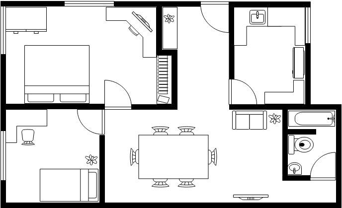
For this tutorial we will use a floor plan image with the following coordinate table:

How to use a custom background image in Tableau in 4 steps
Step 1: Prepare your image and find its pixel dimensions
You need to know the exact pixel width and height of your image because those numbers define the axis range when you load it into Tableau.
- On Windows: right-click the image in File Explorer, select Properties, and check the Details tab.
- On macOS: open the image in Preview and click the i (information) icon in the toolbar.
Note these two numbers down. Our example image is 688 x 419 px.
Step 2: Build and connect the coordinate table
Create a spreadsheet with one row per point you want to plot, and three columns: a name (or whatever dimension you want to label the points by), a Location X value, and a Location Y value.
If you do not yet know the exact coordinates, you have two options:
- Trial and error: estimate where each point should land on the image (use the pixel dimensions as your guide, with 0,0 at the bottom-left corner), enter your best guess into the spreadsheet, plot them in Tableau, and refine until they sit where you want.
- Annotate inside Tableau: enter a placeholder row (for example
1, 1) so you have something to plot, load the background image (Step 3), then right-click the spot on the image where you want a point and choose Annotate > Point. Tableau will display the X and Y values of that location. Note them down, update your spreadsheet, and refresh the data source.
The annotation method is faster and more accurate for anything beyond a couple of points.
Once you have your coordinate table ready, connect to it in Tableau as you would any other data source.
Step 3: Add the background image in Tableau
Open a new worksheet and go to Map > Background Images in the top menu. Tableau will show a list of data sources in the workbook: pick the one with your coordinate table.

In the Background Images dialog box, click Add Image. In the Add Background Image window:
- Name the image something descriptive.
- Upload the file with the Browse button, or paste a URL if your image is hosted online.
- Set the X Field to your X coordinate column. Enter
Left: 0andRight: <image width in pixels>. For our example: Right = 688. - Set the Y Field to your Y coordinate column. Enter
Bottom: 0andTop: <image height in pixels>. For our example: Top = 419.

The Left and Bottom values are normally 0, unless your coordinates do not start from the origin.
In the Options tab, configure these:
- Lock Aspect Ratio: tick this to keep the image from being stretched or squashed.
- Always Show Entire Image: tick this so Tableau renders the full image even if your data points do not cover the whole range.
- Only show when: optional condition to control when the image appears, useful if you have multiple images (one per floor of a building, for example).

Click OK, make sure the tick box next to your image is selected in the Background Images list, and click OK again.

Step 4: Plot the points and format the view
Back in the worksheet:
- Drag your X field to Columns.
- Drag your Y field to Rows.
- Drag the dimension you want to split your data by (in our example,
Room) onto the Detail mark.
Your image should appear behind the marks. The points will sit at their respective X and Y coordinates.
To make the view look like a custom-mapped diagram rather than a scatter plot:

- Remove the gridlines (right-click the view background and select Format > Lines > None).
- Hide the headers on both axes (right-click each axis and uncheck Show Header).
- Adjust the mark size, shape, and colour to make the points stand out. A filled circle in a contrasting colour works well.
- Use the zoom controls to crop the view to the most important area of the image.
For dashboards that combine this view with other charts, our guide on Tableau dashboard layout containers explains how to keep everything aligned cleanly.
For more advanced mapping techniques like layering multiple sets of marks on the same canvas, see our guide to Tableau Map Layers.
Frequently Asked Questions
What is a custom background image in Tableau?
A custom background image in Tableau is any image (PNG, JPEG, or URL-linked) loaded behind a worksheet's marks. You then plot data points on top of it using X and Y pixel coordinates, treating the worksheet as a scatter plot with the image as its canvas. Common use cases include floor plans, equipment diagrams, sports fields, and site maps.
How do I find X and Y coordinates for points on a Tableau background image?
The fastest method is to load the image with a placeholder point, then right-click the spot on the image where you want a point and choose Annotate > Point. Tableau will display the exact X and Y coordinates of that location. Note them down, add them to your data source, and refresh.
Why is my background image not showing in Tableau?
The most common causes are: the X and Y fields are not on Columns and Rows, the tick box next to the image is not selected in the Background Images list, or your data points fall outside the X and Y range defined for the image. Check all three.
Can I use multiple background images on the same Tableau worksheet?
Yes. Add each image in Map > Background Images, then use the Only show when condition in the Options tab to tie each image to a filter value. This is how floor-plan dashboards swap between floors based on user selection.
Conclusion
Custom background images turn Tableau into a flexible canvas for any kind of spatial data, not just geographic. Floor plans, equipment diagrams, stadium charts, warehouse layouts: anything you can photograph or render can become a Tableau map. The trick is remembering that under the hood, you are just building a scatter plot with an image behind it, which means anywhere you can identify with X and Y coordinates, you can plot data.
If you want help applying these techniques to a real dashboard, get in touch with the Biztory team and we will help you build it.


