


To build a custom hex map in Tableau for any country, sketch your layout on paper first using a grid of hexagons, then assign Row and Column coordinates to each region.
You then have two build options: the polygon method (draw each hexagon from six coordinate points, requires data blending) or the shape method (plot one centre point per region and apply a hexagon custom shape, no blending required).
Both produce a clean, equal-weight map that works for countries with no plug-and-play template available.
Let's dig deeper...
What Is a Hex Map in Tableau?
A hex map is a stylised map where each geographic region is represented by a hexagon of equal size, arranged in a grid that roughly preserves the real-world position of each region.
Instead of drawing accurate geographic borders, every region — whether it's Texas or Rhode Island, Flanders or Brussels — gets exactly the same visual weight on the canvas.
The trade-off is intentional. You lose precise geographic accuracy. In exchange, you get a map where every region is equally easy to see, click, and compare. That's particularly powerful when your data story depends on small regions that would otherwise disappear next to large neighbours.
Most online hex map tutorials cover US states, using ready-made coordinate templates first popularised by Tableau Zen Master Matt Chambers. If you're mapping any other geography — Belgium, Germany, the EU, Canadian provinces, postal-code regions, internal sales territories — you'll need to build the layout yourself.
That's exactly what this guide covers.
How to build your own HEX map in Tableau: Step-by-step
I was tasked by a client to build a dashboard that will be mainly displayed on the company's TV screens in the office. Which meant that I had 1-2 seconds to catch the attention of walking employees, and a few more seconds to convey my message.
And I had two issues with my regular map:
- I didn't want my map to look like the weather forecast and traffic maps that are also present on those TV, failing to catch the attention straight away.
- The key component of my message was the results in the smallest region of the map, which wasn't really jumping out as it was so small compared to other areas.
That's when I knew a HEX map would solve both issues for me. I'll outline my approach step by step below:
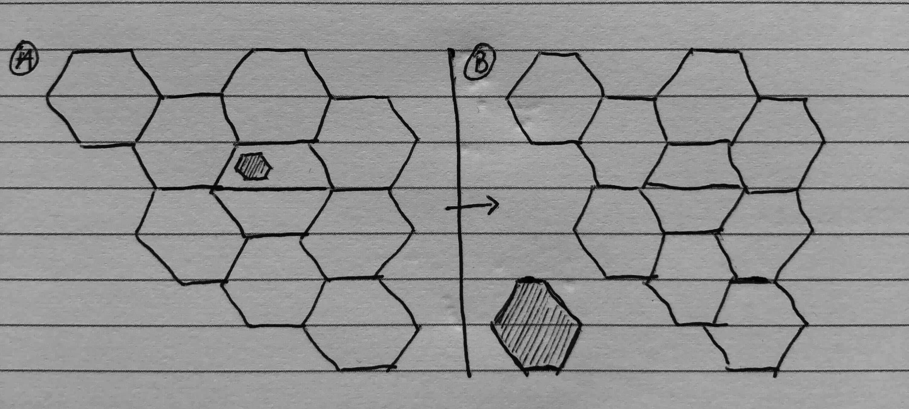
Step 1: Draw your map and be ready to compromise
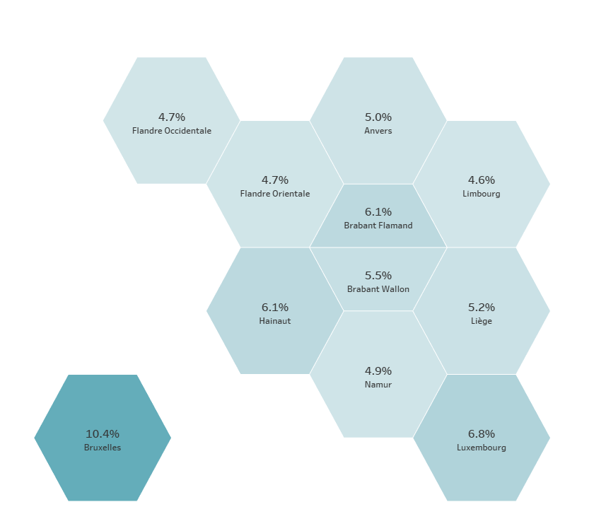
I grabbed pen and paper, drew vertical and horizontal lines and started with my first hexagon (West Flanders). It was pretty straightforward from there, until I faced the Brabant area: three areas (Flemish Brabant, Walloon Brabant and Brussels) but only space for one.
I tried fitting this Death Star shape into the hole, but it was way too crowded and labelling will be a nightmare (Option A).
I ended up doing what we Belgian do best: compromise.
The two Brabant will each have one half of the hexagon, and Brussels will sit on the side, as an island (Option B).
The cool thing is, you are about to find out how to do this yourself and will be be able to come up with your own version of how to hexify your country.
Step 2: The polygon option (blending required)
My first thought was to use polygons to draw my HEX map. To do that, I am writing the coordinates of the 6 points that makes up each hexagon to a Google spreadsheet, that I will blend with my main data source later on. I am including a Path column, giving each point a value from 1 to 6, so Tableau knows how to connect each points. For the half-hexagons, I used four rows instead of six.
I can now bring my [ROW] and [COLUMN] onto the view, make sure they are continuous dimensions, select polygon marks, bring [Path] onto Path and my Province name on Detail. Resize a bit and that's is.
However, each area is now a set of 6 points on the edges: I can't label in the centre. To fix this, I will simply create an extra column in my dataset and use it as a dual axis. Create an extra row for each area, filling the coordinate of the center of the hexagon in the same ROW column as for the 6 points, but the COLUMN values this time goes into my newly created LABEL column. I can now create a dual axis with LABEL and COLUMN as they share the same ROW coordinates, and bring Province Name on the text mark.
You can now blend this HEX map with your actual data source! It's usually at this point that you will realise that you wanted to use a gradient based on a distinct count, something which isn't supported by blending. Fear no more, there is another way.
Step 3: The shape option (blending free)
Another way of building a HEX map is to simply calculate the coordinates of the centre of each hexagon, plot them, and bring on an hexagon shape. So two big CASE statements that would return, for each area, the ROW or COLUMN value.
Even though I was only dealing with 11 areas, I still automated my two case statements by concatenating my LABEL rows with strings of "WHEN" and "THEN" in my spreadsheet. This way, I only had to write one case statement, drag the formula for all areas and paste the whole thing.
For the Shape, I created a black hexagon in PowerPoint (holding the shift key to make it was perfect). Save the picture in my Shapes repository (usually at \My Tableau Repository\Shapes) and voilà. Hold on, what about the two half hexagons? Right, back to PowerPoint, create two hexagons, edit points and remove the two extra points to create a top half and a bottom half hexagon.
Next step is to have Province Name into shape so you can assign a full hexagon to all bar the two half ones.
Wrap-up
The first method will be visually more robust and flexible: if you don't have enough height for your viz, your polygons will be slightly larger than taller and still look awesome. This isn't the case when using shapes, where the height/width ratio demands to be the same, but you should also be aware of the size.
However, the second method is more straightforward: no extra dataset and blending, the dual axis option is still available and it's quite easy to tweak


