


Dynamic dimensions in Tableau let users switch the field shown in a chart — for example, toggling between Customer, Product, or City — without building separate worksheets for each one. You create them by combining a string parameter with a CASE statement inside a calculated field, then placing that calculated field on the Rows or Columns shelf instead of a fixed dimension.
Add a set to filter the Top N values and a parameter action triggered by a custom button worksheet, and you get a clean, interactive dashboard that swaps dimension, filter, and visual highlight in one click.
What Are Dynamic Dimensions in Tableau?
Dynamic dimensions are dimensions in a Tableau chart that change based on a user's parameter selection. Instead of building one worksheet per dimension (one for Customer sales, one for Product sales, one for City sales), you build a single worksheet whose dimension swaps in response to a parameter — controlled by a dropdown, a button, or any other interactive element.
The technique relies on two Tableau building blocks working together:
- A parameter, which is a user-controlled value (string, integer, date, or boolean) that lives at the workbook level
- A calculated field, which uses a CASE or IF statement to translate the parameter selection into an actual dimension reference
Drop the calculated field onto the Rows or Columns shelf in place of a fixed dimension, and Tableau will swap the field shown whenever the parameter value changes.
The result: fewer worksheets, less dashboard real estate spent on duplicate views, and more analytical power in the hands of the end user.
When to Use Dynamic Dimensions (and When Not To)
Dynamic dimensions are powerful, but they're not the right answer to every "users want to switch the view" problem. Here's how to decide.
Use dynamic dimensions when:
- Users want to compare the same measure (e.g. Sales) across different dimensions (Customer, Product, City)
- The dimensions involved share the same data type — all strings, ideally
- You want to keep dashboard layout consistent regardless of which dimension is selected
- You want to reduce the number of worksheets you maintain
Use a regular filter instead when:
- Users just want to narrow down the existing dimension, not change it
- The "switch" is between values within one dimension (e.g. show only Technology category)
Use sheet swapping instead when:
- Each view needs a fundamentally different chart type or layout
- The measures, formatting, or mark types should change alongside the dimension
Use an LOD expression instead when:
- You want the dimension to swap based on the current filter context (e.g. show Department when nothing is filtered, show Category when a department is filtered) — InterWorks has a great example of this hot-swapping technique
For everything else — particularly the classic "let me toggle between three dimensions in one chart" use case — dynamic dimensions are the cleanest, lowest-maintenance solution. That's what the rest of this guide walks through.
How to use dynamic dimensions in Tableau: Step-by-step
What You'll Need Before You Start
- Tableau Desktop (any version from 2019.2 onwards supports parameter actions, which the buttons step relies on)
- The Sample – Superstore dataset, which ships with Tableau Desktop
- Basic familiarity with parameters, calculated fields, and dashboard actions
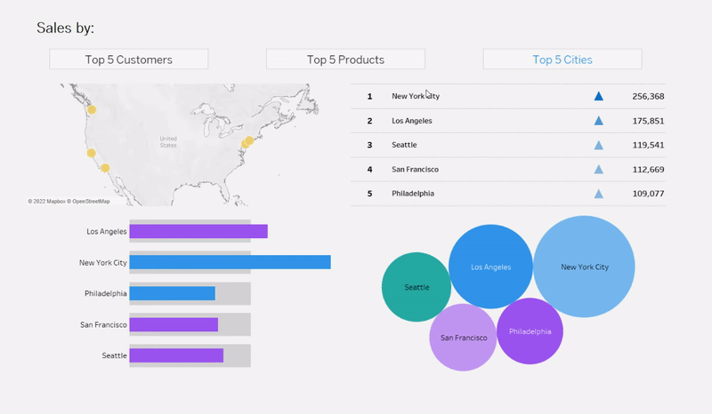
The example below builds a dashboard that lets users see Top 5 Sales by Customer, Product, or City, switching between the three with a click.
Step 1: Create the Dimension-Swap Parameter
The parameter is the control your user will interact with. It holds the current selection — Customer, Product, or City — and feeds that selection to the calculated field in Step 2.
To create it:
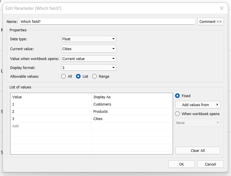
- In the Data pane, click the dropdown arrow next to the search bar and choose Create Parameter.
- Set Name to
Dimension Selector. - Set Data type to
String. - Set Allowable values to
List. - Add three values:
Customer,Product,City. Leave the "Display As" labels matching the values for now. - Click OK.
Right-click the parameter in the Data pane and choose Show Parameter to display it as a dropdown in the worksheet. You'll hide this later when you build custom buttons, but it's useful during development.
A note on data type: an integer parameter (1, 2, 3 mapped to display labels) is slightly faster for Tableau to process, but a string parameter is easier to read in calculated fields and easier to debug. For three or four values, the performance difference is negligible — use whichever you prefer.
Step 2: Create the Calculated Field for Dynamic Dimensions
This is where the parameter gets translated into an actual dimension. Create a new calculated field called Dynamic Dimension with this formula:
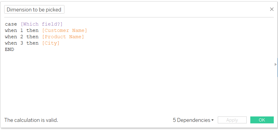
The CASE statement reads the current parameter value and returns the matching dimension. When the user picks "Customer", the field returns Customer Name; when they pick "Product", it returns Product Name; and so on.
Critical: every dimension referenced in the CASE statement must share the same data type. Customer Name, Product Name, and City are all strings in Superstore, so this works cleanly. If you need to include a numeric or date dimension, wrap it in STR() to convert it to a string first.
Click OK. You now have a dimension that changes based on user input.
Place the calculated field in your viz.

Step 3: Build a Set to Filter the Top 5
Showing every customer, product, or city in a single chart would be unreadable. The goal is to show the Top 5 by Sales for whichever dimension is currently selected.
Sets are the cleanest way to do this. You'll need one set per dimension.
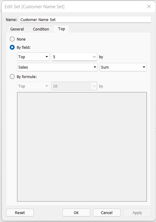
For each of Customer Name, Product Name, and City:
- Right-click the dimension in the Data pane and choose Create > Set.
- Name it descriptively — e.g.
Top 5 Customers by Sales,Top 5 Products by Sales,Top 5 Cities by Sales. - Click the Top tab.
- Select By field, set the count to
5, chooseSalesas the field, and set the aggregation toSum. - Click OK.
You now have three sets, each returning the top 5 members of its dimension based on Sales.
Next, create a calculated field called Top 5 Filter that combines them based on the parameter:
CASE [Dimension Selector]
    WHEN "Customer" THEN [Top 5 Customers by Sales]
    WHEN "Product" THEN [Top 5 Products by Sales]
    WHEN "City" THEN [Top 5 Cities by Sales]
END
This calculated field returns a Boolean (true if the row belongs to the currently active top-5 set, false otherwise). Drag it onto the Filters shelf and set it to True. The chart will now show only the
Top 5 of whichever dimension is active.
Step 4: Apply the Dimension and Filter to Your Visualisations
Now stitch it together:
- Drag your Dynamic Dimension calculated field onto Rows.
- Drag Sales onto Columns.
- Confirm the Top 5 Filter calculated field is on the Filters shelf, set to True.
- Sort by Sales descending so the Top 5 always appear in order.
Toggle the parameter dropdown to test. The bar chart should rebuild itself with the new dimension and the new Top 5 each time you change the selection.

Repeat for every chart in the dashboard that should respond to the parameter — a tree map, a highlight table, a KPI summary.
They all reference the same Dynamic Dimension and Top 5 Filter fields, so they all swap together. This is what makes the technique so much lower-maintenance than building three separate dashboards.

A few finishing touches worth applying:
- Sort by Sales descending on every chart so the Top 5 always reads top-to-bottom in ranked order.
- Use Dynamic Axis Titles (Tableau 2023.1+) so the chart titles update with the parameter — right-click the axis, choose Edit Axis, and reference the parameter in the title.
- Apply the filter to all related sheets by right-clicking the filter and choosing "Apply to Worksheets > Selected Worksheets" so a single filter controls all the linked visuals.
Step 5: Build Custom Interactive Buttons With Parameter Actions
The default parameter dropdown works, but custom buttons feel more polished — and a button strip that highlights the active selection is a recognisable UX pattern users instantly understand.
Here's how to build it.
Create the button worksheet
Open a new worksheet. This sheet will hold all three buttons. To create the underlying data points, you need a mark for each button — the simplest way is to use MIN(1) as a placeholder measure that creates one mark per button label.
- Drag
MIN(1)(an ad-hoc calculation) onto Columns. - You'll need three marks — one for each button. Either type them in as ad-hoc dimensions or use a small CSV/Excel file with three rows: Customer, Product, City.
Set the mark type to Text.
Write the show/hide text calculations
Now create one calculated field per button that controls when its text appears and what colour it takes. For the Customer button:
Customer Button Text:
IF [Dimension Selector] = "Customer" THEN "Customer" END
Other Buttons Text (Customer):
IF [Dimension Selector] != "Customer" THEN "Customer" END
The logic: when the user has the Customer view selected, show the "Customer" text in the highlighted colour (using the first field); otherwise show it in the default colour (using the second field). Repeat the pair for Product and City, swapping the string in the IF condition.
Drag both Customer-related fields onto the Text mark. In the text editor, format the highlighted version in your accent colour (e.g. blue, bold) and the non-highlighted version in your default colour (e.g. grey or black). Repeat for Product and City buttons.
The visual effect: the button matching the current parameter value lights up in your accent colour, while the others stay neutral. Users can see at a glance which dimension they're viewing.
Set up the parameter action
The buttons need to actually change the parameter when clicked. That's a parameter action.
- Place the button worksheet on your dashboard alongside your charts.
- Go to Dashboard > Actions > Add Action > Change Parameter.
- Set Source Sheets to your button worksheet.
- Set the action to Run on Select.
- Set Target Parameter to
Dimension Selector. - Set the Source Field to the dimension field that contains the button labels (Customer, Product, City).
- Click OK.
Click a button. The parameter updates, the charts redraw with the new dimension and new Top 5, and the active button highlights. One click, three things change.
Tip: parameter actions can also be combined with set actions, filter actions, and reference lines to drive much more complex interactions. Our guide on 5 ways to level up your bar chart using Tableau parameter actions walks through several creative patterns built on the same foundation.
Conclusion
Dynamic dimensions are one of the highest-leverage techniques in Tableau: one parameter, one calculated field, and one set of charts that can show three (or ten) different views without duplicating worksheets. Layer on a Top N set for tidy filtering and custom buttons for a polished interaction, and you've built a dashboard that punches well above its complexity.
The technique scales beautifully. Once you've mastered the pattern, you can swap dimensions, measures, and even filter logic with the same approach — building dashboards that feel responsive and considered rather than crowded.


