18 October, 2024
min reading time
Sam Parsons
Tableau Visionary | Iron Viz 2021 Global Runner-up | Biztorian | SW England TUG Leader | #CertifablyTableau | Adobe AI & AE Pro Certified
Have you ever found yourself perusing the many visualisations on Tableau Public for inspiration for your latest project, and then came across some mind-blowing visualisation that you just cannot fathom how it was done?
If the visualisation was produced after version 2020.3 then it is highly likely that the Tableau wizardry you are looking at has taken advantage of the ‘Multiple marks layer support for maps’ feature introduced in 2020.4.
But hold on! The visualisations you are looking at are not showing a map at all – how is that possible then?
Well, continue reading this blog dear reader, and I will explain it all!
1. What are Tableau Map Layers?
In version 2020.4, Tableau introduced a new feature called ‘Multiple marks layer support for maps’. This feature was designed to allow developers to add more and more mark types onto maps, allowing for greater flexibility in what you could create and produce for your stakeholders. A great example of these is by Tableau Visionary – Marc Reid, who created this viz: Marc Reid - Tableau Map Layers.
In the picture below you can see the ‘Layer Control’ that lists six marks layers, which in Tableau terms are individual marks cards on the worksheet. Those marks layers are various applications of polygons, lines and circle marks. Each of them represents a different element of the data and when layering one over the other it starts to build a picture of the data. The Layer Control gives the user the ability to turn each layer on and off, to customise the view to their liking.
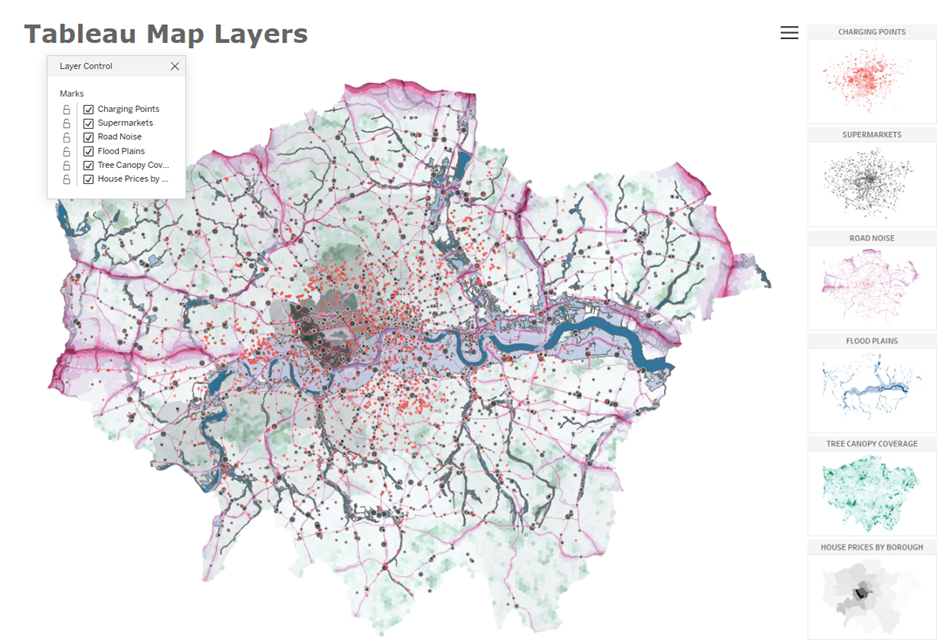
Previously in Tableau versions before it would have been extremely difficult to produce a visualisation of this nature without layering floating worksheets over the top of each other in a dashboard.
1.1 Bending the rules of Tableau Map Layers
This was Tableau’s intended use for the feature. Tableau has a blog: Create Geographic Layers for Maps that explains this intended use when the feature was released. However, as with a lot of new features Tableau provides us, the Tableau community will find a way to ‘bend’ the feature to their will and that’s where this blog trilogy begins!
Soon after the 2020.4 release, Tableau Hall of Fame Visionary, Jeffrey Shaffer went to twitter to vocalise his discovery of how to ‘bend’ this new feature: Jeff Shaffer - Twitter.
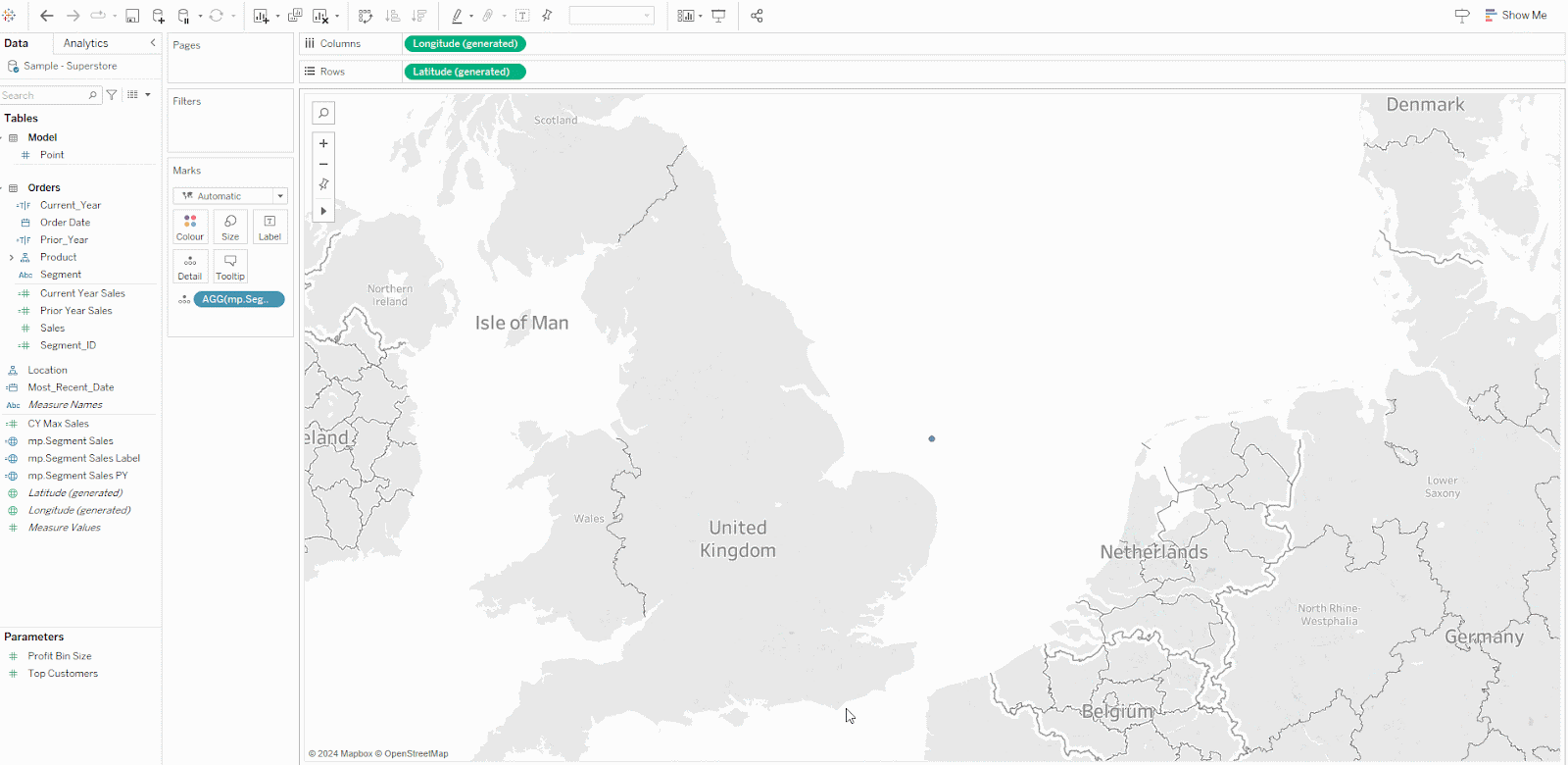
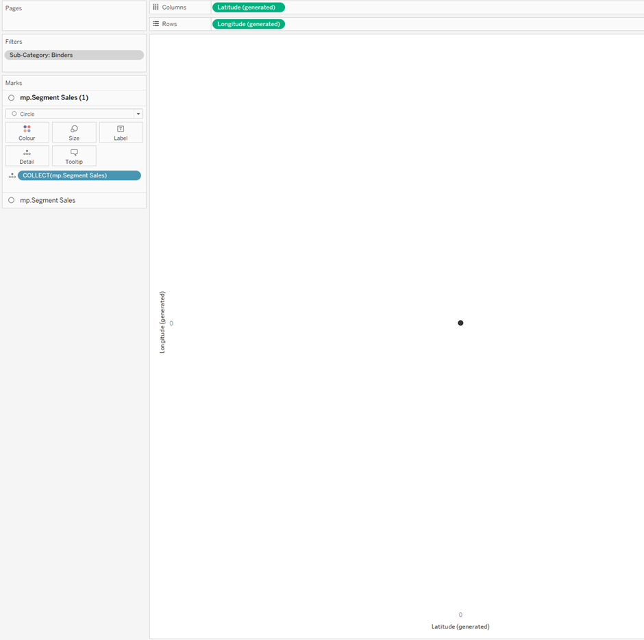
Map Layers works using the function MAKEPOINT (previously brought in to help draw lines on a map). With Makepoint you assign Longitude and Latitude values to plot a coordinate on the map. When you double-click the Makepoint pill to add it to your Worksheet, Tableau will interpret this Geographical calculation and automatically places a Longitude pill on Rows and a Latitude pill on Columns, and ta-dah you are presented with a map visualisation!
Jeffrey’s bending of the rules was simply to switch the Longitude and Latitude pills over from Rows to Columns and visa-versa. When doing this instead of being presented with a map, you are presented with a scatter plot with the normal two axis (one for Latitude and one for Longitude).
This is shown here:
IMPORTANT! There is a second element to this trick. If you only have the single marks card when you switch the axis pills over, then you lose the ability to add more marks cards. If you have two or more marks cards on your map and then switch the axis pills across, you will retain the functionality to add more mark card layers.
See this example:
This is in essence the trick we need to utilise to allow us to start creating more interesting and complex visuals using a single sheet in Tableau.
2. Tableau Map Layers: Getting started with the basics
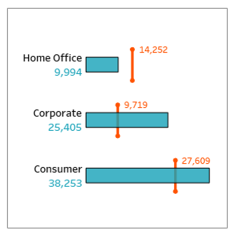
Let’s build out a variation on a bar chart that otherwise would be difficult to create in Tableau through the normal means. This bar chart has been created to fit a tile of 300px x 300px. I will explain why I mention the sizing at the end.
To begin with we are going to start with the above step of placing two Makepoint calculations onto the Worksheet to allow us to switch the axis and add more Mark Layers. As a placeholder calculation, which we will alter as we continue, use this:
//Mp.Segment Sales
MAKEPOINT(0,0)
Once you have created this calculation, double click the calculation in the data panel on the left and it will automatically be added to the worksheet. To add another drag the calculation pill over to the chart area and place it in the top left corner where indicated.
You should then have a view something like this:
2.1 Tableau Map Layers: Data Densification
Now to build out the bar chart using Map Layers, we actually need to draw each bar using Polygons, meaning we need to draw each corner of the bar. In order to do this, we actually will need to densify / scaffold our data. I know, this seems like a point where you will question “What is the point, if we can already make a bar chart using standard Tableau processes?”, I completely agree that exploding your data for this would like counter-intuitive, but I would also take the opportunity to remind you that the bar chart we are making is not an easy build using normal Tableau setups, and this tutorial will expand into bigger and better things.
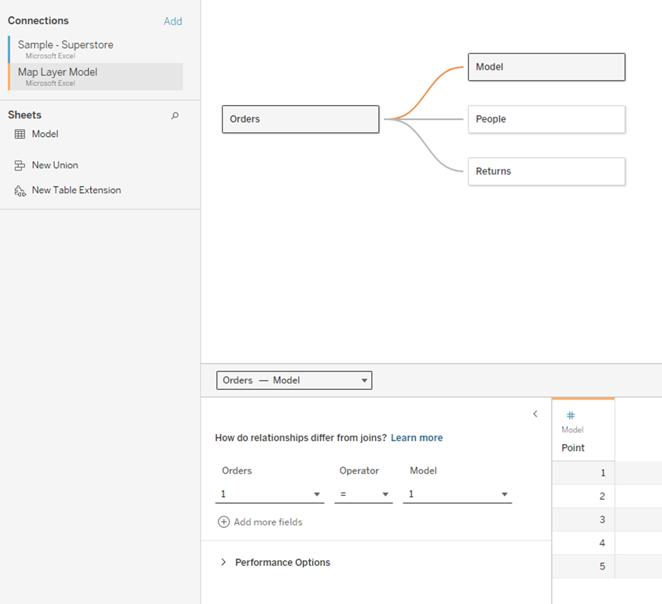
So to densify the data, all we need to do is create a Table (I used Excel) and have a single column with numbers 1 to 5 put into rows 1 to 5. These 5 rows will be joined with your original data set (in our case Superstore) effectively duplicating the Superstore data source 5 times.
To do this, we will make a new connection to our Excel file, drag the table we want into our Data Pane and when Tableau establishes a Relationship between the two, we want to create a Custom Calculation for each side of the join and use a character or string that is the same in both Calculations – I used the Number “1”.
This gives a Relationship that will join each row of our Densification Model to the Superstore Dataset.
As we are using a Relationship in the Data Source pane, we only need to worry about our primary data source (Superstore) being duplicated when we bring through any fields from the Densification Model into the visualisation Worksheet. This allows us some degree of control on performance of the end visuals & dashboards.
2.2 Tableau Map Layers: Set up Calculations
Before we go any further, to create the bar chart we first need to create some simple calculations to allow us to identify the current year sales and prior year sales.
Without explaining all the calculations these are what you will need:
//Most_Recent_Date
{MAX([Order Date])}
//Current_Year
DATEPART('year', [Order Date]) = DATEPART('year', [Most_Recent_Date])
//Prior_Year
DATEPART('year', [Order Date]) = DATEPART('year', [Most_Recent_Date])-1
//Current Year Sales
IF
[Current_Year]
THEN
[Sales]
ELSE
NULL
END
//Prior Year Sales
IF
[Prior_Year]
THEN
[Sales]
ELSE
NULL
END
2.3 Specific Calculations for Map Layers
Here we need another couple of calculations that will help us specifically deal with the Map Layer setup.
Calculation #1: Level of Detail
The first is an LOD (Level of Detail) calculation that we will use to help normalise the Sales we are visualising between 1 and 0.
Why do we need to do this? Well, remember that our MAKEPOINT calculation is returning Longitude and Latitude pills that are placed on Rows and Columns. Long and Lat have limits on a map for their highest value. So, if we tried to visualise sales on a Bar that was valued at 4 million, our furthers point of the Bar would be off the end of the map. If we however ‘normalise’ the sales numbers using the Max Sales we can effectively return all Sales results between values 0 and 1. These would cause us no issues when placing them on a Longitude and Latitude scale.
Note: If I were normalising the data properly, I would also take into account the prior year sales into the equation and if you want to normalise Profit, then it becomes even more complicated. But for ease of use and knowing this data set well, just using the CY Sales maximum will suffice – before anyone shouts at me!
//CY Max Sales
{MAX([Current Year Sales])}
Calculation #2: ID Number
The other calculation we need to set up is an ID number field based from Segment. Because we want to visualise a separate bar per Segment, it is helpful to number the Segments, so we can separate them from each other using the ID number.
Note: Ideally in a real-world situation, you would handle these discrete IDs through your database before it hits Tableau.
//Segment_ID
CASE [Segment]
WHEN "Consumer" THEN 1
WHEN "Corporate" THEN 2
WHEN "Home Office" THEN 3
END
Calculation #3: MAKEPOINT
Now for the fun!
We are going to update our MAKEPOINT calculation to now utilise the densification model to allow us to draw our bars point by point.
For a way of explaining this calculation, remember that MAKEPOINT allows us to definite a position on a map through Longitude and Latitude coordinates:
MAKEPOINT([Latitude],[Longitude])
Also, remember that we have switched our Lat and Longs over on the Rows and Columns, so now the Lat part of the equation now refers to the horizontal (x-axis) and the Long part of the equation now refers to the vertical (y-axis).
We use a CASE statement to define what happens for each number (Point) in our densification model. Where do we want that point to be placed on both Lat and Long?
We also use 5 points, even though a bar has 4 corners, to use to the 5th point to return back to the same place as the 1st point was defined. This will close the loop of the polygon we are drawing.
To break this calculation down, the first section for [Latitude] is either starting at Zero or the two farthest points of the bar are placed at the normalised value of the Current Sales.
The second section for [Longitude] is using a value of 0.4 – which is completely arbitrary and one you may which to play around with for the thickness of the bars and back to zero. We then add the 0.4 or the zero to the ID number for each segment, so that each segment bar is separated from each other.
//mp.Segment Sales
MAKEPOINT(
CASE AVG([Point])
WHEN 1 THEN 0
WHEN 2 THEN SUM([Current Year Sales])/AVG([CY Max Sales])
WHEN 3 THEN SUM([Current Year Sales])/AVG([CY Max Sales])
WHEN 4 THEN 0
WHEN 5 THEN 0
END
,
CASE AVG([Point])
WHEN 1 THEN 0.4
WHEN 2 THEN 0.4
WHEN 3 THEN 0
WHEN 4 THEN 0
WHEN 5 THEN 0.4
END
+
AVG([Segment_ID])
)
After you have updated this calculation, you will find very your view has not changed very much at all, but you should notice the Axis in view will have now moved from both being zero.
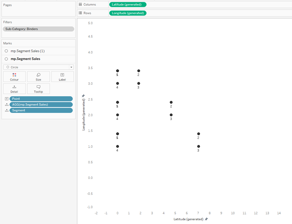
Hopefully you are seeing a single circle on screen, but actually 2 marks (because we have two marks cards from the 2 map layers we created at the start). Now even though we have written our Makepoint calculation to work for each corner of the bars we actually need to enable Tableau to use that calculation by placing the required discrete pills onto the marks card.
Next place [Segment] onto Detail and [Point] onto Label. You will see the number of marks increase to 16 and the circles starting to show in each corner of each bar.
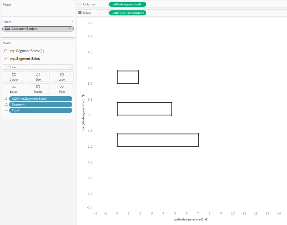
If we were to change the visualisation type from Circle to Line and then update the [Point] dimension to be assigned to Path we would then connect the points around each bar.
Switching the visualisation type to Polygon, allows us to fill the bar in with colour. Try the colour: #17a2b8 at 80% opacity, with a black border line.
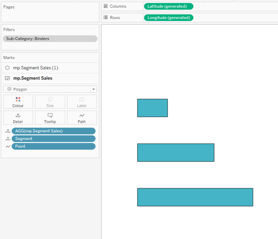
This is now essentially our basic bar chart. Anything we add from here on in, is the customisation that using Map Layers affords us.
Adding customer labelling to Tableau Map Layers
Let’s add a custom Labelling to the bars, something that wouldn’t be particularly easy to add if you were to build this in the normal fashion (we might as well take advantage of the method we are using right!?).
To add in a label to each bar, we want to make use of the 2nd Marks card that we haven’t used yet. We actually want to update the MAKEPOINT calculation for that marks card to specifically work for where we want to position the labels.
Let’s now write a new calculation for the labelling positions. The x-axis position will be Zero and the Y-axis will be half the maximum we used for the bars (0.4), so we will use 0.2 instead. This will keep the label position in the middle of the bar.
//mp.Segment Sales Label
MAKEPOINT(
0
,
0.20
+
AVG([Segment_ID])
)
With this calculation we want to drag [mp.Segment Sales Label] onto the [mp.Segment Sales] pill in the Marks Card – effectively replacing the original MAKEPOINT calculation with the one we have just written.
Then we add the [Segment] dimension to Label.
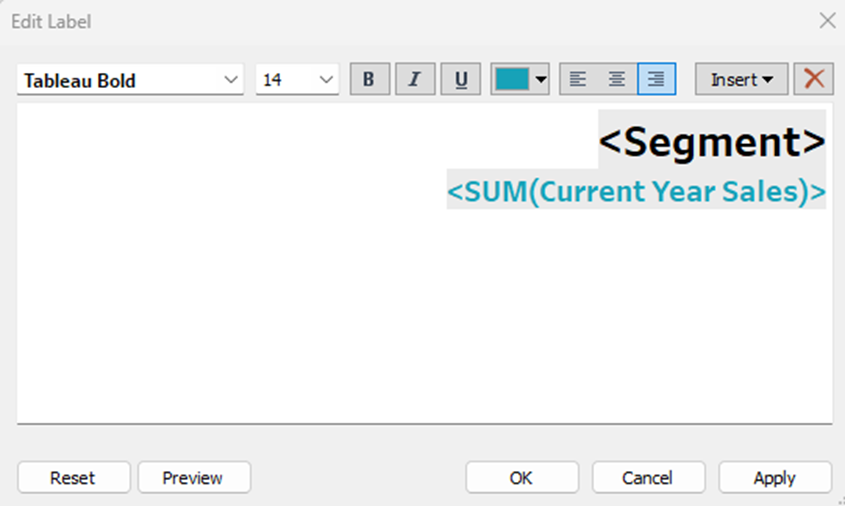
Also add the [Current Year Sales] measure to Label, and aggregate using SUM.
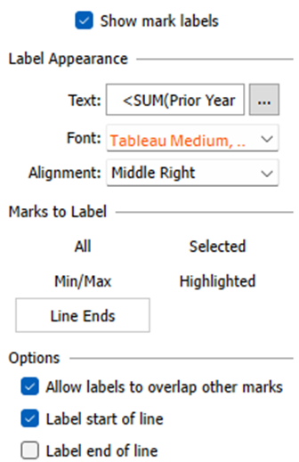
We can then on the label card we want to update the settings to this:
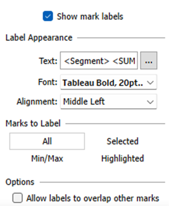
And then format the text to this:
Segment = Tableau Bold, 20pt, #000000
Current Year Sales = Tableau Bold 14pt, #17a2b8
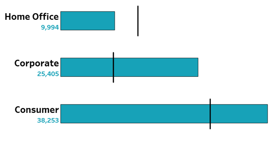
After that formatting we should be seeing our visualisation as:
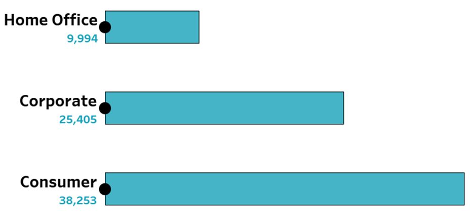
The circles are showing where our new MAKEPOINT calculation was positioned. If we reduced the Opacity of the circle marks to 0% they would disappear and we can even control using Map Layers the user interaction with each Marks Card. I don’t want anyone to click on these Label circles, so I will ‘disable selection’, on this marks card, like this:
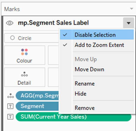
As we mentioned at the start the bar chart has been created to fit a tile of 300px x 300px. This is because of the Labelling above, if you reduce the size of the tile so it is smaller, the labelling will move and not fit as well. This is just a consideration you need to make as you would normally with other charts you build.
Adding a Marks Card
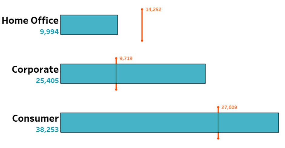
Let’s now add in another Marks Card, to allow us to place the Prior Year Sales, as line crossing the bars. So, another MAKEPOINT calculation needs to be written:
//mp.Segment Sales PY
MAKEPOINT(
CASE AVG([Point])
WHEN 1 THEN SUM([Prior Year Sales])/AVG([CY Max Sales])
WHEN 2 THEN SUM([Prior Year Sales])/AVG([CY Max Sales])
END
,
CASE AVG([Point])
WHEN 1 THEN 0.52
WHEN 2 THEN -0.12
END
+
AVG([Segment_ID])
)
Note: in this calculation event though we are using [Point] from our densification model to allow for different calculations at different points, we are only using two of the available five points. This is fine, no issues will arise from not using the remaining 3 points. We only need two points to draw a line from one side of the bar to the other.
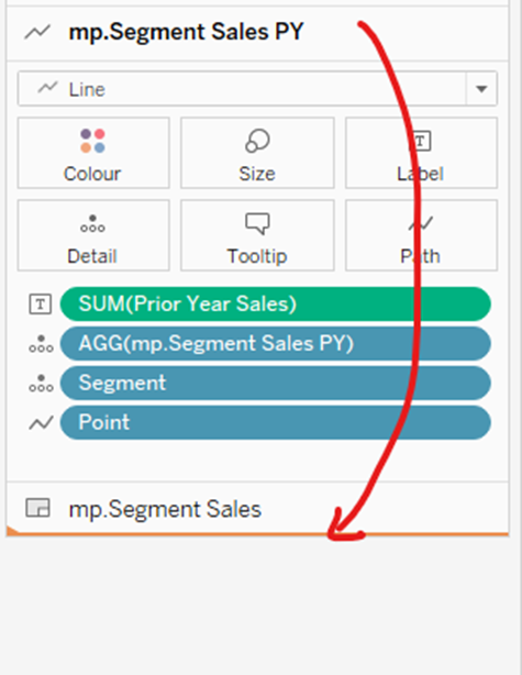
We can now drag our [mp.Segment Sales PY] pill onto the worksheet canvas in the top left corner to add a new Marks Card (Map Layer).
Once that has been done, add [Segment] and [Point] to detail and change the chart type to Line. Then update the [Point] to Path.
You will then see your chart as:
We can now update the formatting of these lines:
Colour = #ff5300
Line markers = show
Drag [Prior Year Sales] to Label and aggregate with SUM.
Change the Label to work with Line Ends and only the start of the line.
Lastly, drag the Marks card for the PY Sales line down to the bottom of the Marks Card list – this will place the PY Sales Lines at the ‘back’ of the visualisation, so they are behind the other marks.
This is STEP 1 in your learning for how to use Map Layers. Look out for the next blog posts in this trilogy of blogs for taking this learning to the next level where we will look at building some different chart types.
Tableau Map Layers: Building Different Charts (2/3)
Tableau Map Layers: Pulling Everything into one view (3/3)
See you next time!
Sam
Author
Sam Parsons
Tableau Visionary | Iron Viz 2021 Global Runner-up | Biztorian | SW England TUG Leader | #CertifablyTableau | Adobe AI & AE Pro Certified
Read more articles of this author
Let's discuss your data challenges