Making great data visualizations is not an easy task. It requires bringing together a lot of different components and you only get better with experience. I’ve had to go through a growth curve as did many others and there is no shame in that. It always puts a smile on my face when I can see the evolution of someone’s data visualization skills via their portfolios, mainly through Tableau Public.
So without further ado, here are 10 of my best expert tips I’d like to share with you on improving your data visualizations based on my experience so far.
10 Tips to improve data visualisations
Tip #1: Know your audience
So many people skip over this step but it’s a crucial first step in establishing what kind of end product you will provide. If you have multiple target audiences that have varying expectations, it makes sense to consider creating different versions tailored to them.
Otherwise, you might end up with users who stop using it because they don’t get what they’re looking for. For example, your management team will probably be more interested in fully aggregated KPI numbers and targets while your sales representatives are looking for sales numbers on a customer level.
Tip #2: Think of a logical flow that your audience can resonate with
It might seem appealing to put all your best-looking visuals together but are they actually connected in some shape or form? The way I approach this with my clients is to first understand their current way of working.
That becomes a starting point in the conversation to try to understand how our visuals could help them achieve their goals easier. What makes the most sense to you is not always what your audience can resonate with. Most of the time, I end up with a solution that combines my knowledge of what’s possible in the realm of visualization with their knowledge of the business.
Tip #3: Leave clear and guiding instructions on how to use your dashboard
You’ve been working tirelessly on this dashboard so you know the ins and outs of it by now. The people you had those conversations with and who probably tested it are also pretty familiar with it. But if you intend on releasing this to a wider audience, it makes a lot of sense to make sure that your end users know how to use your dashboard. For example, if you’re able to filter one visual by clicking on another one, make sure you put that in a subtitle somewhere so they know that feature is available.
Tip #4: Less is more
This is probably my favorite thing to say when it comes to data visualisation best practices because it is so powerful and applies to so many different things also outside of our topic. In essence, try to not put too much in there that’s not necessary or adding value. Another way to look at this is by checking the amount of ink you’re using. If you can achieve the same thing with less ink, that’s probably the way to go.
Tip #5: Pay Attention to where you position your visuals
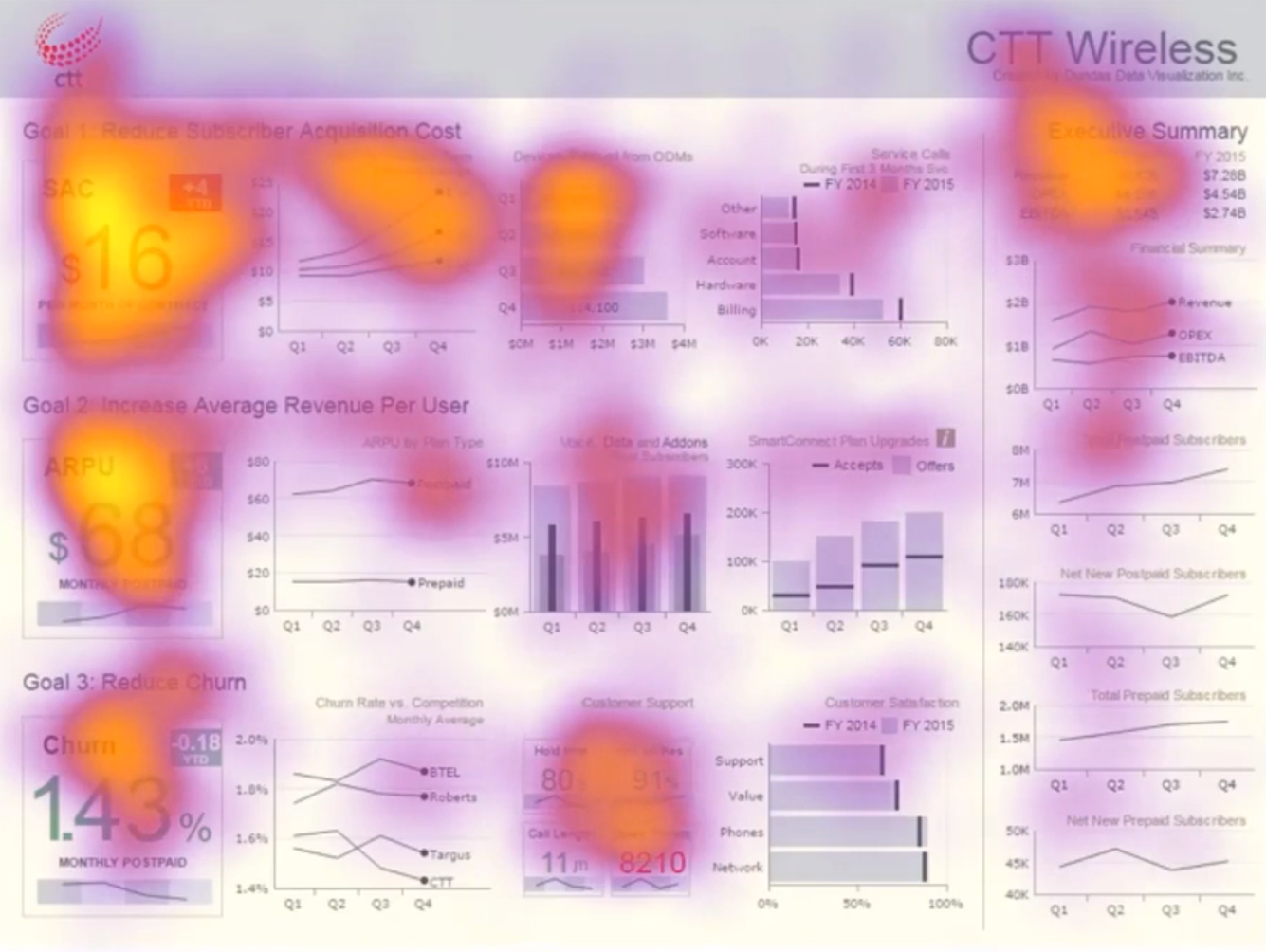
If you’ve seen a dashboard or two, you probably noticed how the KPIs usually are placed at the top. Have you ever wondered why though? There have been numerous eye-tracking studies to examine where people look first when presented with e.g. a dashboard.
In the western part of the world, most people tend to start at the top left side and continue from there to the right. This is probably due to our alphabet as in the Arabic world this is the other way around (from right to left) which is in line with how you read sentences in their language. That’s why it makes sense to put the most important information at the top and left-hand side.
Tip #6: Use whitespace
Giving your visualizations some space to breathe really makes it look a lot more visually appealing. Try adding some padding to your visuals so your axes and titles don’t stick to the edges of your visual. Also make sure there’s enough space between your visuals and other objects in your dashboard to ensure that slick design
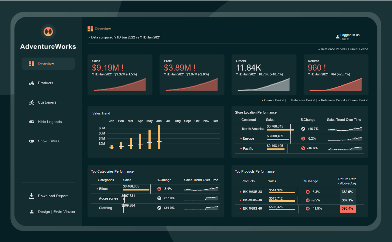
Tip #7: Use color in a meaningful way
Looking at a colorful dashboard might give a positive impression when you look at it at first. But after really processing what you’re seeing, how easily were you able to interpret the information that’s being displayed?
If you use color in a meaningful way consistently, it makes it a lot easier for your end users to gain insights at a first glance. For unrelated things, you could use different tints of neutral colors so that it doesn’t form a distraction.
Source: Tableau Public (by Ervin Vinzon)
Tip #8: Incorporate the Gestalt principles
This is one of the most essential concepts to grasp when it comes to data visualization best practices. The Gestalt principles give you some guidelines that will help you create visualizations that your end users can understand more easily.
The foundation of these principles is found in the way our brain processes information and looks for patterns in the objects it perceives. One of those principles talks about how our brain assumes that connected items are related to each other. Below there is a line chart showing the sales per sub-category. Due to the line going from one sub-category to the other, we initially are struck with the idea that this is how the sales numbers have evolved.
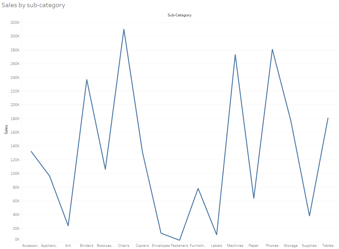
This is of course not the case so it would be better to use a bar chart here instead of a line chart. There are many resources available that discuss the other principles in detail so I invite you to go through these as I believe it would help you immensely!
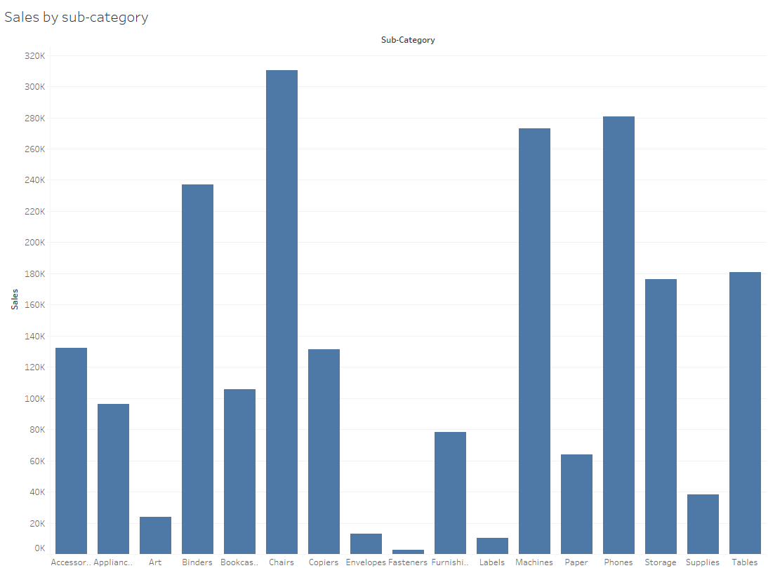
Tip #9: Choose the appropriate chart type
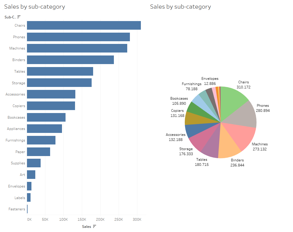
Choosing the appropriate chart type is very important because it has a big impact on how you present the data. As mentioned in the previous tip, if you’re not looking to do a time series, it doesn’t make a lot of sense to create a line chart. Continuing with that same use case, if we were to show this in a pie chart that would be very difficult to compare as there are many sub-categories.
Tip #10: Think of how your end-users will consume your content
Lastly, considering what devices it will be displayed on can help optimize the user experience. If there are people who will be displaying it on their mobile devices, you could create a separate mobile layout.
Otherwise, it might be difficult to navigate on a screen that is much smaller than it was designed for. Even if all your end users will be accessing it through their laptop or monitor, there are still big differences between those devices in terms of resolution.
Depending on the possibilities that your tool allows, try to look for a solution that satisfies the biggest part of your audience. You could for example take the smallest resolution and use that as a size. In Tableau there’s also the possibility to set a range of sizes so that could also be an interesting one to try.
Author
Let's discuss your data challenges