BI & Analytics
Blog
Tableau
3
min read

How to Dynamically Mask Sensitive Data in Tableau

Learn how to dynamically mask sensitive data in Tableau using LOD calculations, threshold suppression, and custom number formatting for compliance.
Author
Tim Franken
Tim Franken
Analytics Engineer
How to Dynamically Mask Sensitive Data in Tableau
Share article

Dynamic data masking in Tableau is a technique that hides individual cell values in a visualisation when the underlying data falls below a privacy threshold, replacing them with a placeholder like (*). Unlike Row Level Security, which restricts access to entire rows based on user identity, dynamic masking responds to how the data is filtered and grouped in the viz — so it works for anonymous viewers and protects against re-identification through drill-down.

This guide walks through the technique using EXCLUDE-level LOD calculations and custom number formatting, with a worked example based on a real client requirement.

What is dynamic data masking in Tableau?

Dynamic data masking is the practice of hiding cell values in a dashboard when those values would expose information that should remain private, based on rules that respond to how a user is currently slicing the data.

The most common example is k-anonymity / threshold suppression: if a single cell represents fewer than k underlying records (often 5, 10, or some agency-mandated number), the cell is suppressed so individuals cannot be re-identified.

The technique is widely used in:

  • Healthcare reporting — patient counts below the disclosure threshold get suppressed.
  • Public-sector dashboards — student, citizen, or demographic counts under a legal floor are masked.
  • HR analytics — small team breakdowns that could identify individual employees get hidden.
  • Survey results — response counts below the privacy threshold are concealed.

Tableau does not have a native "mask if below threshold" feature, but you can build one with a combination of EXCLUDE-level LOD calculations and custom number formatting. The technique below is the one our consulting team uses when clients raise this requirement.

Dynamic masking vs Row Level Security

The first question to answer: do you actually need dynamic masking, or do you need Row Level Security (RLS)?

Row level security vs dynamic data masking in Tableau

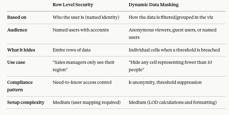
RLS and dynamic masking are not mutually exclusive — many enterprise dashboards use both. RLS controls what data the user can query in the first place. Dynamic masking adds a second layer that protects against re-identification once the user starts drilling down inside their allowed slice.

The two methods to display masked values

Before building the calculations, you need to decide how a masked cell will be displayed. There are two viable approaches in Tableau, and which one you choose depends on what's already in your data.

Method 1: Convert masked values to NULL. Then use Format > Special Values to display (*) whenever a value is NULL. This is clean and readable, but it only works if your source data does not already contain NULLs. With this method, you can't distinguish a masked value from a genuinely missing one.

Method 2: Convert masked values to a large negative number (such as -999999). Then use a custom number format like 0.00;(*);0 to display values below 0 as (*). This works as long as your source data does not contain negative numbers.

The decision tree is simple:

  • Do you have NULLs in your data? → Use Method 2 (negative number + custom format).
  • Do you have negative numbers in your data? → Use Method 1 (NULL + Special Values).
  • Neither? → Either works. The team's default is Method 2 because the custom format is more portable across worksheets.

The worked example below uses Method 2.

How to build dynamic masking with LOD calculations

Since masking decisions depend on how the data is currently partitioned in the viz, they cannot be pre-calculated in the data source. You need either an EXCLUDE-level LOD (not FIXED — the masking has to respect the user's filters) or a table calculation. EXCLUDE LODs are the more flexible choice for this scenario and the one used below.

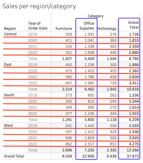
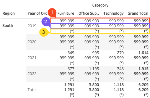
The worked example uses Tableau's Sample Superstore dataset, displaying quantity by Region (rows) and Category (columns), broken out by Year. The two privacy rules:

  • Privacy Rule 1: If the total quantity for a region/year combination is below 1,400, mask every cell in that row, plus the subtotal and grand total.
  • Privacy Rule 2: Because Office Supplies is a sensitive category, mask the row if the Office Supplies value differs from the row total by less than 750 (which would mean Office Supplies dominates that row and could identify the underlying data).

Step 1: Define the privacy rules in plain language

setup the masking calculations in Tableau

Before writing any calculations, write the rules out as plain-language conditions. This sounds obvious but it's the step most analysts skip, and it's where 90% of masking bugs come from. For this example:

  • Rule 1: Mask if SUM(Quantity) by region+year < 1400
  • Rule 2: Mask if (SUM(Quantity) by region+year) − (SUM(Quantity) for Office Supplies in that region+year) < 750
  • Final masking: Cell is masked if either rule fires.

Step 2: Build the threshold calculation (Privacy Rule 1)

Create a calculated field called Privacy Rule 1:

Setting privacyrul 1 in Tableau for data masking

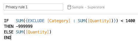
The EXCLUDE [Category] part removes Category from the level of detail, so the calculation evaluates the row total (the region/year combination) rather than the cell value. If that total is below 1,400, we return -999999 (our masking flag). Otherwise we return the actual SUM(Quantity).

Step 3: Build the sensitive-category calculation (Privacy Rule 2)

Create a second calculated field called Privacy Rule 2:

Privacy rule 2 for data masking in Tableau

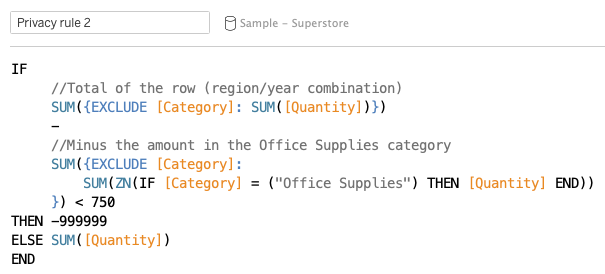
The inner subtraction calculates the row total minus the Office Supplies contribution to that row. If the difference is less than 750 (meaning Office Supplies makes up the bulk of the row), the cell is masked.

Step 4: Consolidate the rules

Now combine the two rules into a single field that the viz will use. Create Privacy Rules Consolidated:

Consolidated privacy rules for dynamically masking sensitive data in Tableau

This is the field you drop on Text (or Rows/Columns) in your viz. It returns -999999 whenever either rule fires, and the actual quantity otherwise.

A subtlety to be aware of: subtotals and grand totals also need to respect the masking. If any cell in a row is masked, the row's subtotal should be masked too — otherwise users can back-calculate the hidden cell. The EXCLUDE-level LODs above handle this automatically because they evaluate at the row level, not the cell level.

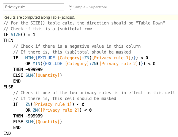
Step 5: Show the masking calulcations

When we then display these three calculations, it becomes clearer what we’re actually doing:

Showing masked calculations

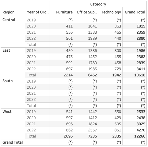
The final result should look like this:

final result of dynamically hide sensitvie data in Tableau

Frequently Asked Questions

What is dynamic data masking in Tableau?

Dynamic data masking is the practice of hiding individual cell values in a Tableau dashboard when they breach a privacy threshold (for example, when a cell represents fewer than 10 underlying records). It uses EXCLUDE-level LOD calculations to evaluate the threshold based on how the user has filtered and grouped the data, then replaces the breaching values with a placeholder like (*) using either NULL formatting or custom number formatting.

When should I use data masking instead of Row Level Security in Tableau?

Use Row Level Security when you need to control what data each user can access based on their identity (sales managers see their region only). Use dynamic masking when you need to protect against re-identification through drill-down for anonymous or guest viewers, or when your privacy rule depends on aggregate thresholds rather than user permissions. The two are complementary — many compliance-sensitive dashboards use both.

Can users bypass Tableau data masking by exporting the data?

Yes, if you don't lock down permissions. The masking technique hides values in the rendered viz, but the underlying data is still in the workbook. Before publishing, disable Download Full Data, Download Workbook, Web Edit, and Run Explain Data for the relevant user roles. Test with a real viewer account to confirm no bypass exists. For maximum security, apply masking at the data-source level (using SQL views or row-level database filtering) rather than relying only on workbook calculations.

Should I use LOD calculations or table calculations for dynamic masking?

Use EXCLUDE-level LOD calculations as the default. They respond to the user's filters and grouping (which is what you want for dynamic masking) and they're easier to share across worksheets and dashboards. Table calculations work for some scenarios but are evaluated later in Tableau's order of operations and behave differently when subtotals or grand totals are involved. Avoid FIXED LODs for this use case — they don't respect dimension filters, so they will mask cells incorrectly when the user drills down.

Facts & figures

About client

Testimonial

Blogs you might also like

Tableau Naming Conventions
Arrow icon darkArrow icon dark

Tableau Naming Conventions

A practical guide to Tableau naming conventions for calculated fields, sheets, and actions. Includes a copy-paste abbreviation cheat sheet.

BI & Analytics
Blog
Tableau
How to Automate Tableau Server: 3 Modern Approaches
Arrow icon darkArrow icon dark

How to Automate Tableau Server: 3 Modern Approaches

Compare 3 ways to automate Tableau Server tasks in 2026: PowerShell scripts, the REST API, and no-code dashboard automation with Autom8 by Biztory.

BI & Analytics
Blog
Tableau
How to Use a Custom Background Image in Tableau
Arrow icon darkArrow icon dark

How to Use a Custom Background Image in Tableau

Learn how to use a custom background image in Tableau to plot data on floor plans, diagrams, or any image. Step-by-step tutorial with coordinates.

BI & Analytics
Blog
Tableau
Parameters vs Filters in Tableau:
Arrow icon darkArrow icon dark

Parameters vs Filters in Tableau:

Learn the difference between parameters and filters in Tableau, and how to mask a parameter as a date filter to compare current and previous year data.

BI & Analytics
Blog
Tableau
How to Create an Interactive Calendar in Tableau
Arrow icon darkArrow icon dark

How to Create an Interactive Calendar in Tableau

Learn how to create an interactive calendar in Tableau in 4 steps using a date scaffold and Set Actions. Step-by-step tutorial with calculations.

BI & Analytics
Blog
Tableau
How to sheet swap in Tableau in just 5 steps
Arrow icon darkArrow icon dark

How to sheet swap in Tableau in just 5 steps

Learn how to sheet swap in Tableau in 5 steps. Dynamically show/hide worksheets using parameters, save dashboard space, and fix common issues.

BI & Analytics
Blog
Tableau
Tableau Custom Number Formatting
Arrow icon darkArrow icon dark

Tableau Custom Number Formatting

Master Tableau custom number formatting with copy-paste examples. Learn the syntax for positive, negative & zero values.

BI & Analytics
Blog
Tableau
Introducing Autom8: Automated workflows from within Tableau
Arrow icon darkArrow icon dark

Introducing Autom8: Automated workflows from within Tableau

Autom8 is here. Trigger workflows, sync data, and act on insights — all without ever leaving your dashboard.

BI & Analytics
Blog
Autom8
Tableau's order of operations
Arrow icon darkArrow icon dark

Tableau's order of operations

Learn more about Tableau's order of operations: or what happens when and how. Read the full blog here.

BI & Analytics
Blog
Tableau
Tableau Next features: the complete guide
Arrow icon darkArrow icon dark

Tableau Next features: the complete guide

Learn about the different features in Tableau Next and how they drive faster decision-making.

BI & Analytics
Blog
Tableau
5 Ways to Level Up Your Bar Chart Using Tableau Parameter Actions
Arrow icon darkArrow icon dark

5 Ways to Level Up Your Bar Chart Using Tableau Parameter Actions

Tableau Parameter Actions are a great feature in Tableau. Read all about it in our latest blog.

BI & Analytics
Blog
Tableau
Everything you need to know about Tableau Certifications
Arrow icon darkArrow icon dark

Everything you need to know about Tableau Certifications

Thinking of taking one of the Tableau Certifications? We explore how to get ready in our latest blog. Read all about it here.

BI & Analytics
Blog
Tableau
Personalise your Tableau Dashboard with Custom Titles
Arrow icon darkArrow icon dark

Personalise your Tableau Dashboard with Custom Titles

Learn about how to add the personal touch to your Tableau Dashboard with custom titles.

BI & Analytics
Blog
Tableau
Bar Charts: The Good, the Bad, and the Ugly
Arrow icon darkArrow icon dark

Bar Charts: The Good, the Bad, and the Ugly

Why can bar charts be effective and how to use them to get answers easier, and faster!

BI & Analytics
Blog
Tableau
How to create a waterfall chart in Tableau
Arrow icon darkArrow icon dark

How to create a waterfall chart in Tableau

Learn how to create your own waterfall charts in Tableau Desktop by following these steps.

BI & Analytics
Blog
Tableau
The Ultimate Guide to Embedded Analytics
Arrow icon darkArrow icon dark

The Ultimate Guide to Embedded Analytics

Discover what embedded analytics is all about and how it can drive additional revenue streams for your business.

BI & Analytics
Blog
ThoughtSpot
How to label pie charts in Tableau
Arrow icon darkArrow icon dark

How to label pie charts in Tableau

Learn more on how to label pie charts in Tableau like a pro.

BI & Analytics
Blog
Tableau
How to label bar charts in Tableau
Arrow icon darkArrow icon dark

How to label bar charts in Tableau

Learn how to label bar charts in Tableau like a pro and level up your dashboard design. Read the full article here.

BI & Analytics
Blog
Tableau
How to create a donut chart in Tableau
Arrow icon darkArrow icon dark

How to create a donut chart in Tableau

Looking to create a donut chart in Tableau? Read our in-depth guide on how to level up your donut charts in Tableau here.

BI & Analytics
Blog
Tableau
How to ace your ThoughtSpot certifications?
Arrow icon darkArrow icon dark

How to ace your ThoughtSpot certifications?

Learn more about ThoughtSpot certifications and how to ace your exams.

BI & Analytics
Blog
ThoughtSpot
How to stop marks being highlighted when ‘clicked’ in Tableau
Arrow icon darkArrow icon dark

How to stop marks being highlighted when ‘clicked’ in Tableau

Learn how to stop marks from being highlighted when clicked in Tableau.

BI & Analytics
Blog
Tableau
How to Create Multiple Select Parameters in Tableau
Arrow icon darkArrow icon dark

How to Create Multiple Select Parameters in Tableau

Learn how to create multiple select parameters in Tableau to add more control and interactivity to your analysis.

BI & Analytics
Blog
Tableau
How to apply conditional formatting to tooltips in Tableau
Arrow icon darkArrow icon dark

How to apply conditional formatting to tooltips in Tableau

Learn how to apply conditional formatting to tooltips in Tableau with our step-by-step guide. Improve your data visualization skills today with Biztory.

BI & Analytics
Blog
Tableau
Rediscovering Business Intelligence with Sigma Computing
Arrow icon darkArrow icon dark

Rediscovering Business Intelligence with Sigma Computing

Discover how Sigma Computing is reshaping the BI landscape with its user-friendly interface and powerful capabilities.

BI & Analytics
Blog
Sigma
Sigma Computing: Our Favourite Features
Arrow icon darkArrow icon dark

Sigma Computing: Our Favourite Features

Discover our favourite features of Sigma for powerful and fun data analysis.

BI & Analytics
Blog
Sigma
Tableau vs. Power BI: Everything to know
Arrow icon darkArrow icon dark

Tableau vs. Power BI: Everything to know

Compare Tableau and Power BI to determine the best business intelligence tool for your needs.

BI & Analytics
Blog
Tableau
Tableau Map Layers: Getting Started (1/3)
Arrow icon darkArrow icon dark

Tableau Map Layers: Getting Started (1/3)

Learn how to leverage Tableau's Map Layers feature to create complex visualizations.

BI & Analytics
Blog
Tableau
Tableau Map Layers: Pull everything into one view (3/3)
Arrow icon darkArrow icon dark

Tableau Map Layers: Pull everything into one view (3/3)

Use Tableau Map Layers to combine multiple visuals in a single worksheet and create custom dashboard views for enhanced data visualization.

BI & Analytics
Blog
Tableau
Tableau Map Layers: Building Different Charts (2/3)
Arrow icon darkArrow icon dark

Tableau Map Layers: Building Different Charts (2/3)

Learn how to create Pie, Doughnut, Line, and Area charts using Tableau Map Layers.

BI & Analytics
Blog
Tableau