/Biztory_Donna_Coles_120x120_email.png)
A rocket chart is the name given to a line chart which starts at the same point and depicts cumulative data over a period of time for multiple entities. However, the term doesn’t appear to be commonly used (but I’m quite convinced I didn’t make it up). The name comes from the fact the resulting chart looks like the trajectory of rockets fired into the sky, having all been launched from the same point - which ones climb fast, but fizzle out; which ones soar for quite some time?
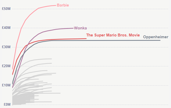
The image below depicts the UK box office takings for films released in 2023 that were in the weekly top 15, and we can see how “Barbenheimer” really did play out during the summer of 2023. Barbie & Oppenheimer were released on exactly the same day and there was a lot of discussion over which would do better at the box office.
Ultimately Barbie won that battle from a revenue point of view, consistently beating Oppenheimer week on week for cumulative sales, but due to a re-release following the Oscar win for Best Picture in March 2024, Oppenheimer was the better film from a longevity point of view.
And then Wonka and Super Mario get added to the mix; while both films were released at very different times of the year (Christmas and Easter respectively), this view allows direct comparison of their performance against, what most would have considered, the biggest films of the year. We can see that surprisingly, both surpassed Oppenheimer in respect of revenue, and both surpassed Barbie in respect of longevity, spending more weeks within the top 15 films.
Building the Rocket Chart in Tableau
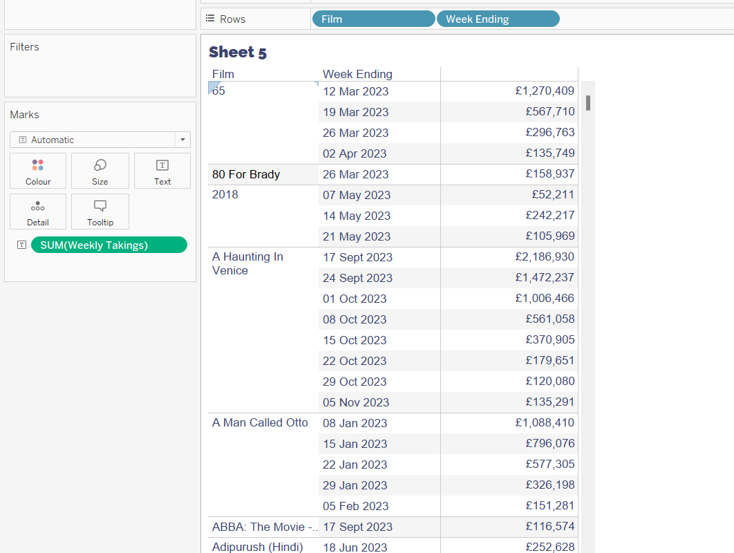
So how do we go about building this, if all we know about the data is:
- The film title
- A date (week ending)
- The weekly sales for the date
Just plotting cumulative sales by the Week Ending date, won’t give us the display we’re looking for.
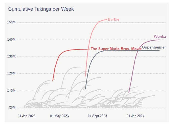
We can start to get a picture. We can see Barbie was more successful on the opening week than Oppenheimer (the line for Barbie starts at a higher point).
We can see that Oppenheimer seemed to have more longevity in the top 15. We can also see that the timing of the releases is important. With the exception of Oppenheimer, the other 3 films in the top 4 have a PG/12A rating and a strong appeal to children. All the films were released to coincide with school holidays:
Super Mario - Easter | Barbie - Summer | Wonka - Christmas
But Wonka ended up being the 2nd biggest film, and the profile of the weekly takings compared to Barbie looks similar, but how close is it? Did it reach its peak before Barbie? Did it last longer in the top 15 than Barbie? We can't easily tell from this chart.
Identify a common starting point
To answer the question, the key is to find a common starting point that we can plot the cumulative weekly takings against, rather than just the Week Ending date directly.
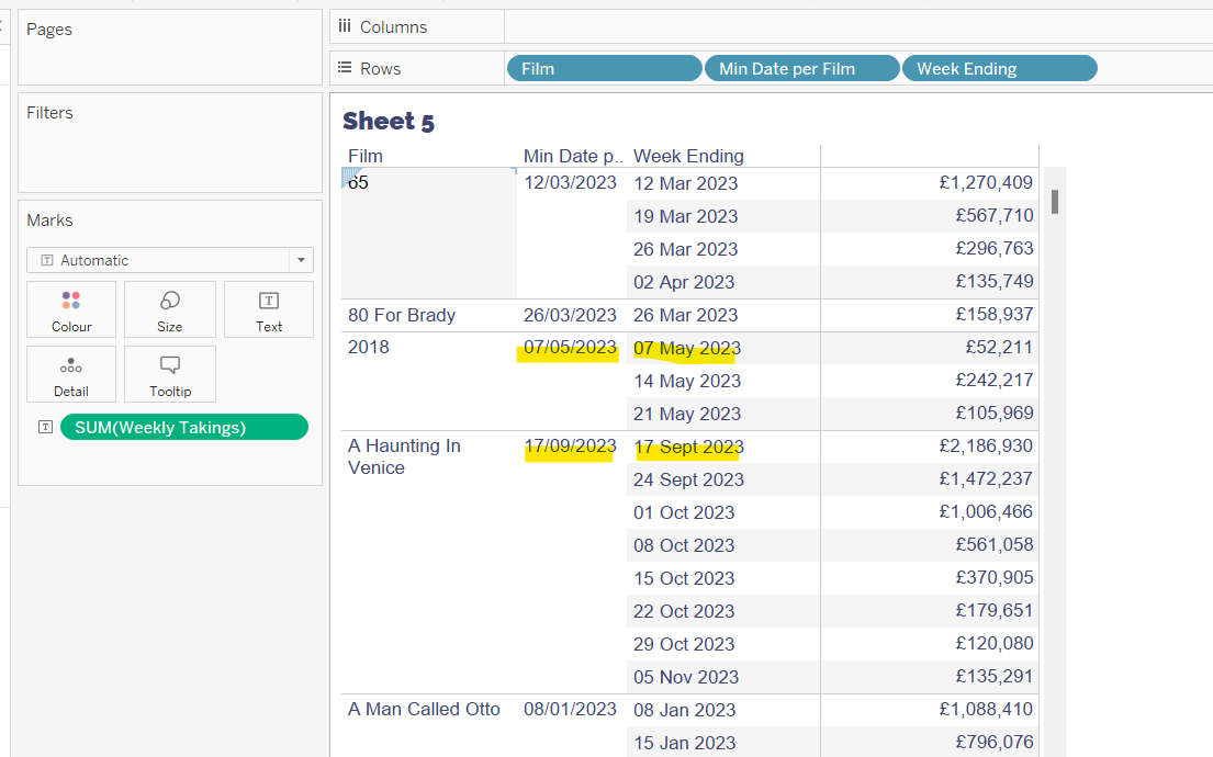
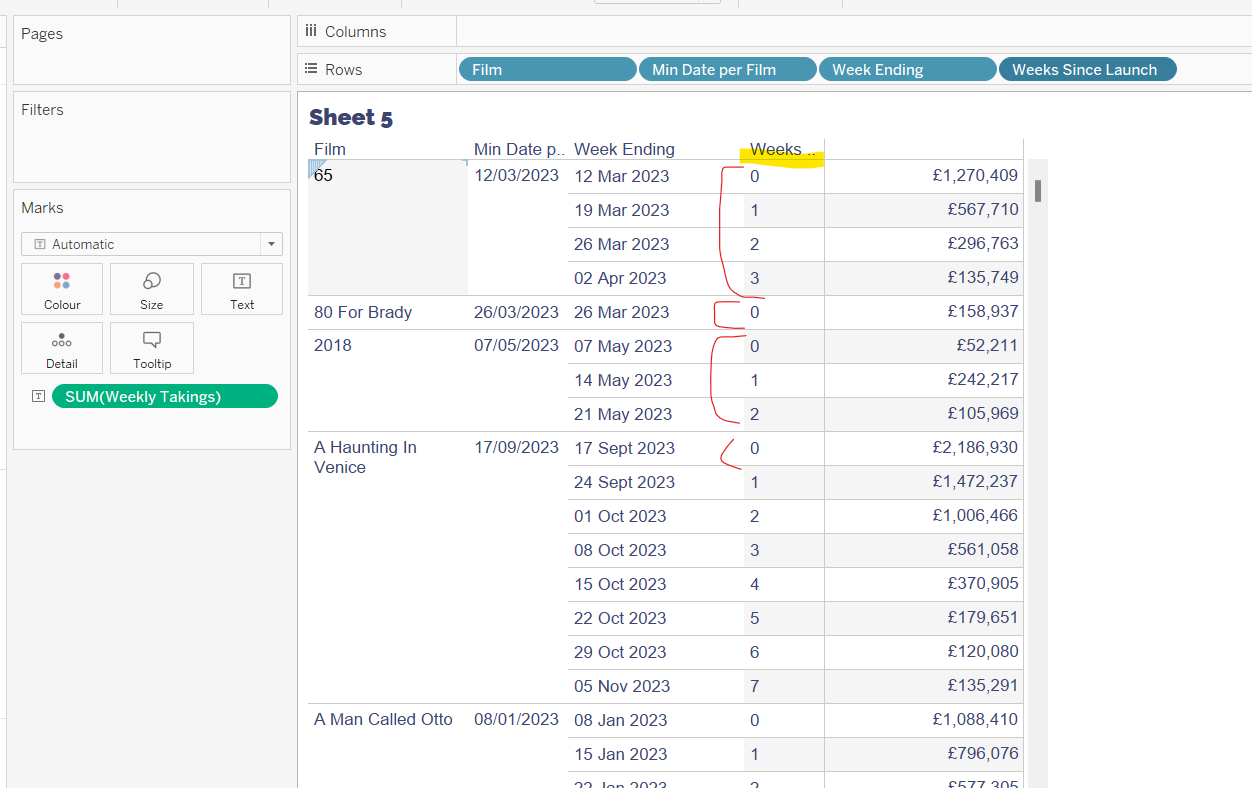
The first thing we need to do is identify the earliest week ending date per film. We can use a level of detail (LoD) calculation for this
Min Date Per Film
DATE({FIXED [Film]:MIN([Week Ending])})
Adding this to the table of data, we can see each row of data associated to a Film has the same date - that of the first Week Ending date.
Using this date, we can then calculate how many weeks exist between the Min Date Per Film (ie the launch date) and the Week Ending date.
Weeks Since Launch
DATEDIFF('week', [Min Date per Film], [Week Ending])
If we add this to the table as a discrete dimension (blue, disaggregated pill) , we can see that we now get a counter from 0 for each row associated with a Film.
We can now use this field to plot on the x-axis.
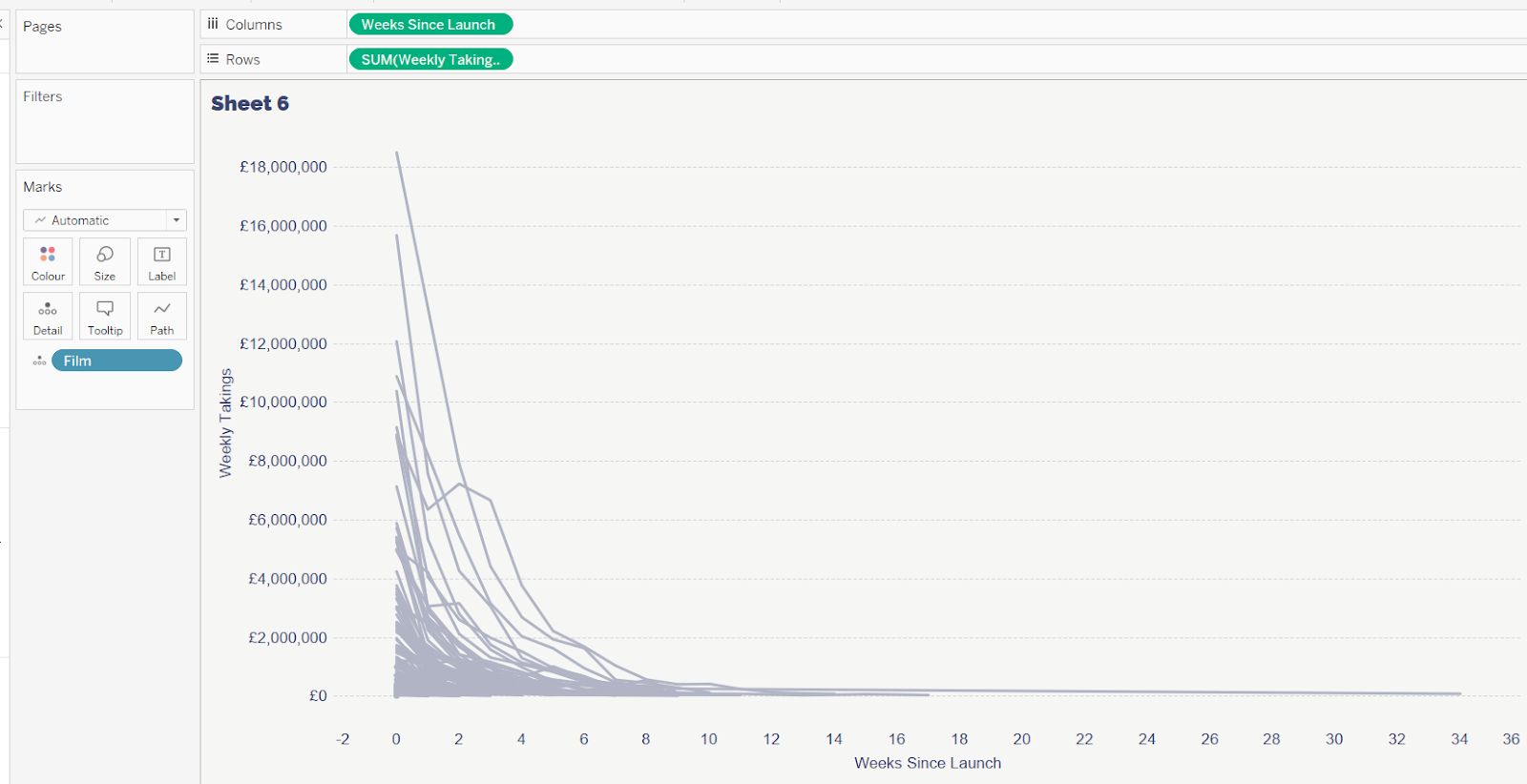
Building the viz
Add Weeks Since Launch to Columns as a continuous dimension (green disaggregated pill). Add Weekly Takings to Rows. Add Film to Detail.
Add a Running Total quick table calculation to the Weekly Takings pill.
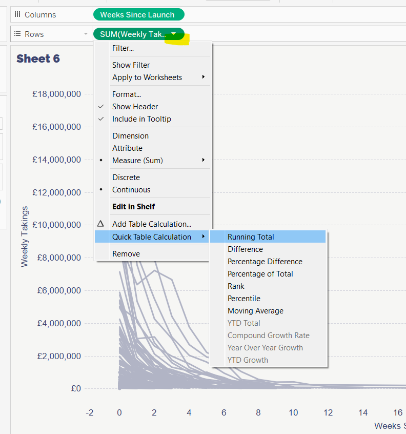
This will change the display so the cumulative sales for each week are plotted instead, and now the ‘rocket trajectories’ are more visible.
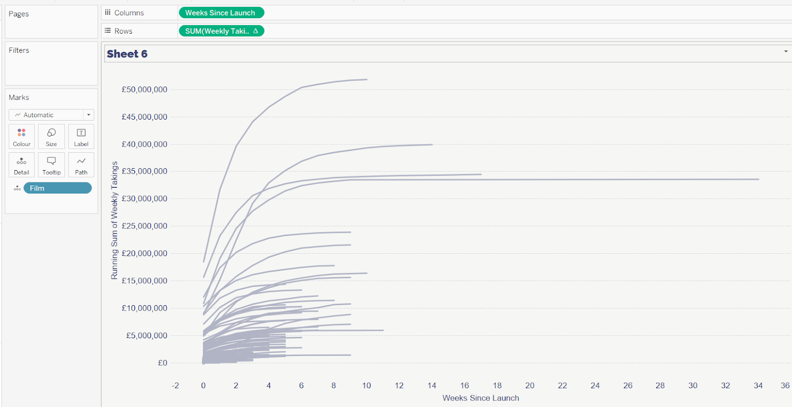
This is the basics required for the chart. I added more features to make the story more compelling, as well as adjusting the x-axis to have a fixed start of 0.
A workbook to accompany this blog post containing the examples discussed can be found on the Biztory Tableau Public Profile page here.