As you may know, there is no built-in way of drawing lines between sheets or objects on dashboards. There are several workarounds, such as the following:
- Create an image of a line (or pixel) and insert it using the Image object. (As mentioned here https://community.tableau.com/message/332404).
- Use a sheet and format it to have borders, manipulate it adequately, then insert it into the dashboard (also in link above).
- Some methods mentioned in a KB article: http://kb.tableau.com/articles/issue/unable-to-add-horizontal-and-vertical-lines-to-dashboards
To be honest, I find that these methods are quite cumbersome, and none of those is a robust or durable way that works every time. In this post I'd like to present an alternative way, which I found works easily in all cases I've used it. Imagine we have the following simple dashboard:
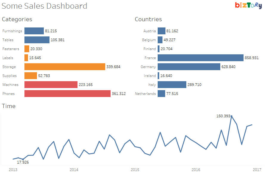
Note that the dashboard is built using vertical and horizontal layout containers, which is a requirement for this technique to work well (see image below). If you're not familiar with layout containers, here's a few links which can help you understand:
- https://www.interworks.com/blog/tspaulding/2013/08/07/understanding-layout-containers-tableau
- http://onlinehelp.tableau.com/current/pro/desktop/en-us/qs_layout_containers.html
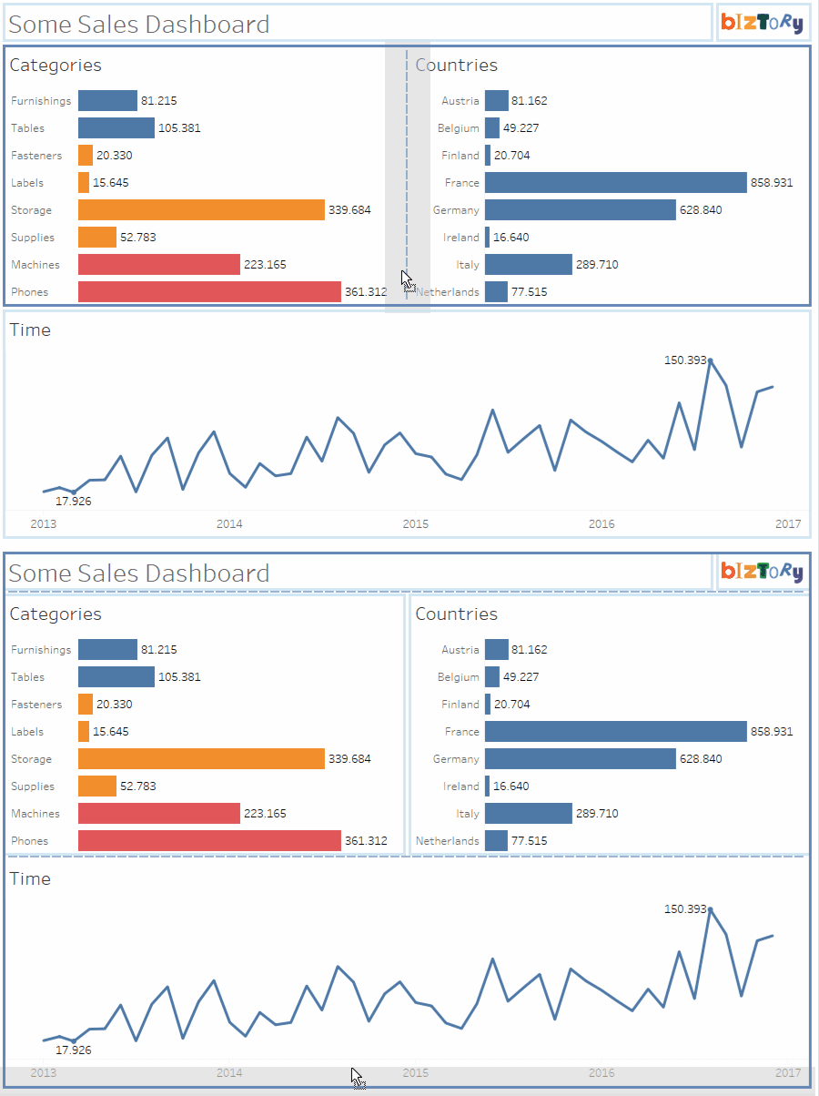
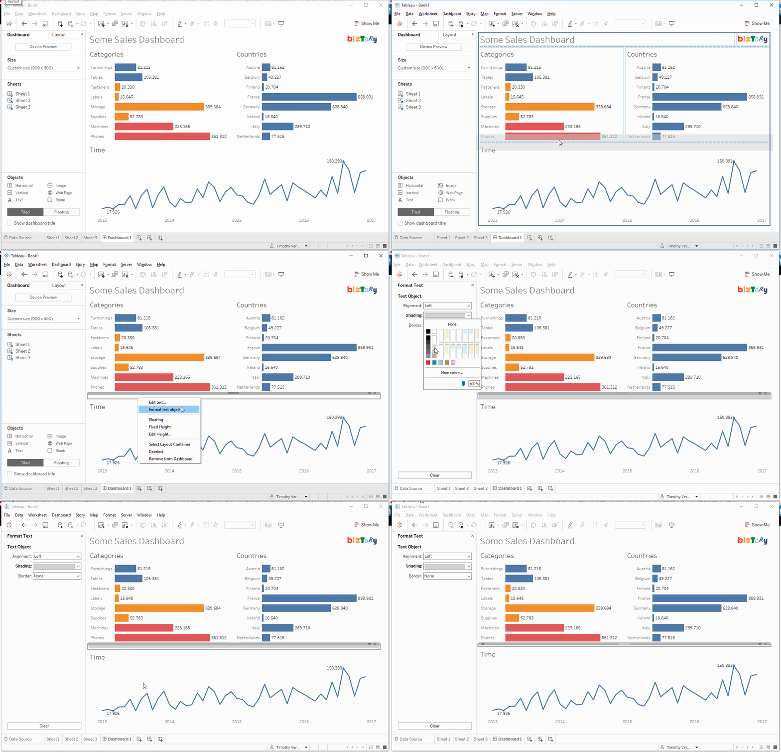
Now, the trick here is very simple. We'll use a text object, of which:
- The contents will be left emtpy.
- The width or height will be set to 1px.
- The background Shading will be set to the right color.
So basically, here's the steps in an animation:
And the result when having added one vertical and one horizontal separator:
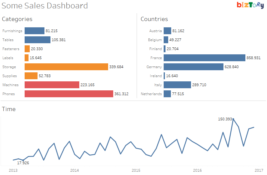
Quite simple isn't it? Now remember though - overusing separators wouldn't be a good way to go, even now you know this great technique. Most of the time, using white space (the Blank object) is a great alternative, also bringing the right balance and structure to the dashboard. Experiment away!

