One thing that is not built into Tableau's mapping capabilities, is the ability to show multiple shapes or symbols on a same location. At the end of this post is an example where this is the case, so go and have a look, then scroll back up. You might want to download the workbook in case you'd want to "dissect" it and see how it was built, or follow the steps below from scratch. Say we have the following data:
| Country | Category | Value |
| Belgium | Farming | 4 |
| Belgium | Industry | 29 |
| Netherlands | Services | 45 |
| Germany | Industry | 12 |
| France | Farming | 76 |
| France | Industry | 69 |
| United Kingdom | Farming | 53 |
| United Kingdom | Industry | 65 |
| United Kingdom | Services | 90 |
| United Kingdom | UFO | 50 |
| Luxembourg | Services | 76 |
Feel free to copy and paste this data into Tableau to follow the steps below! Note that this stuff is completely made up and just serves as an example for this case.
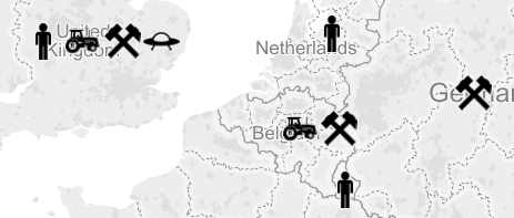
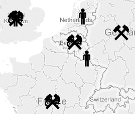
So, what we'd like to do is show an icon on a map for each category that is applicable for each country. The problem is that the default way Tableau would handle this, is by stacking the shapes on top of each other, like this:
The reason is, Tableau plots the icons onto the "center" of the countries by default. The latitude and longitude generated by Tableau based on the country name correspond to this location. What we will do to solve this situation, is we'll apply some kind of jitter to each icon for it to be displayed on a slightly different position than that center of the country. There is one caveat though: we cannot reuse the default latitude and longitude generated by Tableau in a calculation.
To circumvent this issue, we can use the coordinates as a secondary data source. To do so, we can simply select all symbols on the map (CTRL + A), and view the data behind the marks. Again, we can simply copy and paste this data into Tableau. For simplicity, we don't even need to remove the additional dimensions, as we will be using the average of the latitude and longitude in our calculation; unless you run into performance issues, in which case you might want to do this.
| Category | Country | Latitude (generated) | Longitude (generated) |
| Services | United Kingdom | 52,289 | -1,259 |
| Services | Netherlands | 52,426 | 5,721 |
| Services | Luxembourg | 49,671 | 6,113 |
| Industry | United Kingdom | 52,289 | -1,259 |
| Industry | Germany | 51,394 | 9,657 |
| Industry | France | 46,656 | 2,543 |
| Industry | Belgium | 50,773 | 4,809 |
| Farming | United Kingdom | 52,289 | -1,259 |
| Farming | France | 46,656 | 2,543 |
| Farming | Belgium | 50,773 | 4,809 |
Having this data as a secondary data source in Tableau, we can now use the latitude and longitude in our calculations. Additionally, we've created two parameters: one controls the "Jitter Factor", or how much the shapes are spaced apart, and the other allows a user to select whether to place the shapes vertically or horizontally.
We then devised following calculations to generate a new latitude and longitude for each icon.
Longitude (or horizontal coordinate):
AVG([Clipboard_20151108T153150].[Lon]) +
iif([Vertical / horizontal] = "Horizontal",
iif((index()-1) % 2 = 1, int(((index()-1) / 2) + 1), -((index()-1) / 2)) * [Jitter factor]/10,
0)
Latitude (or vertical coordinate):
AVG([Clipboard_20151108T153150].[Lat]) +
iif([Vertical / horizontal] = "Vertical",
iif((index()-1) % 2 = 1, int(((index()-1) / 2) + 1), -((index()-1) / 2)) * [Jitter factor]/10,
0)
Basically, what these do is they go over the different categories and assign different coordinates to each one of them. To get Tableau to do this correctly, don't forget to right click the calculations when you've placed them on the sheet, and select Compute using > Category.
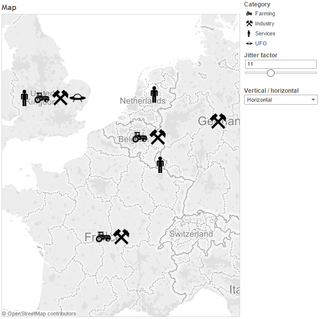
The final result, after some finishing touches on design and layout, is the following (click to interact):
Check the video below for a step by step demonstration on how to achieve this.
https://www.youtube.com/watch?v=1WPbtCnw4R4


