Every visualization is nothing more than a scatterplot. A cloud full of dots. If we connect these dots in the right order, we can actually build anything.
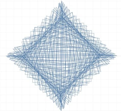
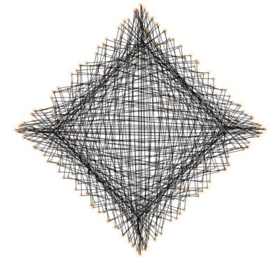
The Tableau Conference in Berlin #TC19Europe was an inspiring place to learn new possibilities of visualization and to meet new interesting people. One of these people was Toan Hoang. He runs the Tableaumagic site and helps people answer many questions. We talked for several hours and showed each other some great visualizations. At some point, he showed me a diagram and asked me if I could do something like this?
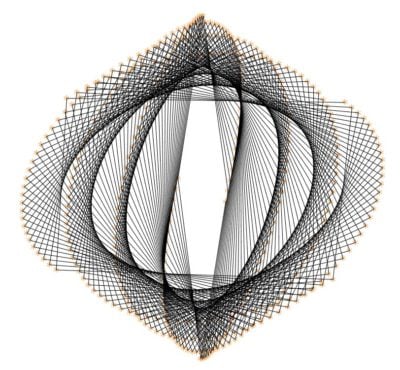
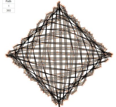 Copyright by Toan Hoang
The visualization did not necessarily have to make sense. But it looked nice and I wanted to rebuild it. Our first bet was born.
He gave me a time limit and told me that the data set should only consist of two rows. 1 and 360.
I built this visualization and showed it to him. I also showed him another diagram with curved bar charts I had built and asked him if he could rebuild it. He did it and showed me my next visualization.
In turn, we took on some tasks and realized that we were both looking for a challenge.
Many may already know WorkoutWednesday, where people try to recreate existing designs. For us it has become a personal WorkoutWednesday with more extreme requirements. It's more like a Vizwar. We will expand this small project in the future and also let other people participate in this challenge. Our goal will be to think beyond our possibilities and find ways to build the impossible.
In this blog series, I would like to go into more detail about the individual visualizations and also show how they were rebuilt. After all, everyone should learn something about new and great possibilities in Tableau.
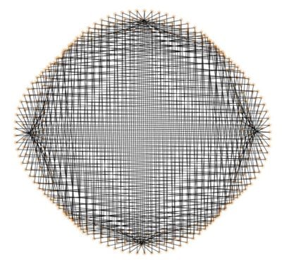
Rebuild No. 1: Art
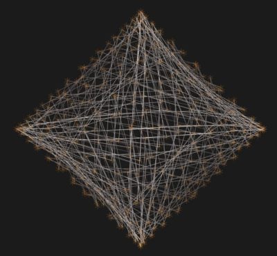
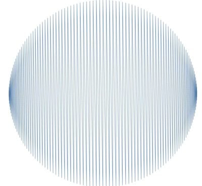
My first thought with this visualization was: "How did he manage to draw so many lines and create a rectangle afterwards? I had often worked with the sinus and cosinus to create circles, but never to create a rectangle. So the first task was to create a point cloud that displays values in a square.
Data Densification
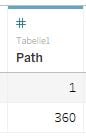
I already mentioned that the data set can only consist of two rows. So I created an Excel file with only two values.
But to have enough points in my visualization afterwards, I had to use a technique called data densification. Normally you can only display values in Tableau that we have somewhere in our data. With Data Densification, we bypass this step and create many new points between the values 1 and 360.
If you want to learn more about the topic, you should check out Toan's blog.
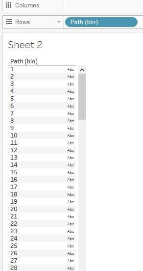
After we have loaded our data into Tableau, we need to do the following to generate the new values.
- Right click on Path, go to Create, select Bins
- Set the name to Path(bin)
- Set the size of bins to 1
So that we can see if everything has worked we do the following:
- Drag Path(bin) to Rows
- Right click on Path(bin) and select "Show Missing Values"
The result should look like this:
Creating Parameters
So that we can play around with the visualizations and create new forms, we first have to create three parameters. The parameters give us a little more freedom later but are not absolutely necessary.
Parameter 1:
- Create a new parameter and set the name to Parameter 1
- Set the Data type to Float
- Set the current value to 11.6
- Set the allowable value to Range
- Minimum: 1, Maximum: 1000, Step size: 0.1
Parameter 2:
- Create a new parameter and set the name to Parameter 2
- Set the data type to Integer
- Set the current value to 122
- Set the allowable value to Range
- Minimum: 1, Maximum: 360, Step size: 1
Parameter 3:
- Create a new parameter and set the name to Rotate
- Set the data type to Integer
- Set the current value to 45
- Set the allowable value to Range
- Minimum: -180, Maximum: 180, Step size: 1
Creating Coordinates
X:
- Create a new calculated field and set the name to X
- write the following in the field: cos(RADIANS([Parameter 2])* INDEX())
Y:
- Create a new calculated field and set the name to Y
- write the following in the field: sin(RADIANS([Parameter 2])* INDEX())
Now we put everything together and look at the result:
- Drag the Path(bin) from Rows to Detail
- Drag X on Columns, right click on X, go to Compute Using and select Path(bin)
- Drag Y on Rows, right click on Y, go to Compute Using and select Path(bin)
- Select Line on the Marks card
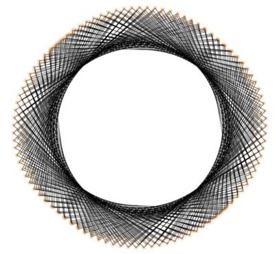
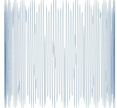
It looks pretty good, but it's not what we want. With that I am back at my initial problem. We want to generate a rectangle and draw the lines between the points.
Therefore we have to change our X coordinate a bit.
- Right click on X and select Edit
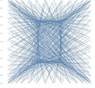
- Changes the formula to: cos(RADIANS([Parameter 2])* INDEX()/sin([Parameter 1]))
That looks a lot better now. But we see that the lines are not really the way we would like them to be. That's because each line follows a path. The easiest way to change that is:
- Drag Path(bin) from Details to Path
Rotation
We're almost done now. The only thing missing is the rotation of the rectangle by 45 degrees. And of course some formatting.
At the beginning we built a parameter for the rotation and want to use it. If you want to know more about the rotation of coordinates, you should have a look at the blog of Mike Cisneros. He describes very well how to rotate a scatterplot by a certain angle.
We have already created our X and Y values and need three more calculated fields that take our coordinates and convert them to new ones.
RotateValue:
- Create a new calculated field and set the name to Rotate Value
- write the following in the field: RADIANS(-[Rotate])
X_2:
- Create a new calculated field and set the name to X_2
- write the following in the field: ([X] * COS([Rotate Value])) - ([Y] * SIN([Rotate Value]))
Y_2:
- Create a new calculated field and set the name to Y_2
- write the following in the field: ([X]*SIN([Rotate Value])) + ([Y]* COS([Rotate Value]))
Now we use our new coordinates:
- Drag X_2 to Rows and Y_2 to Columns
- Right-Click on both and go to Compute Using and select Path(bin)
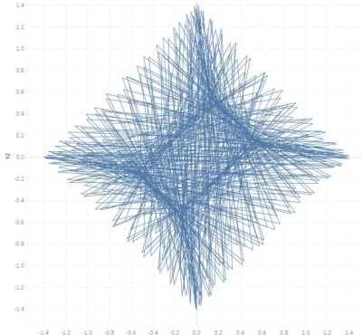
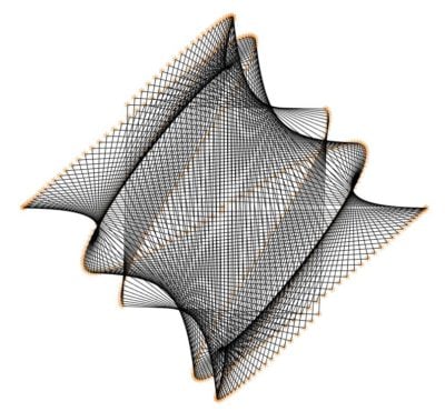
Now we can start playing around with our parameters until we like the result. Personally, I like this:
- Parameter 1: 1.9
- Parameter 2: 89
Formatting
- Click on Color and make it black
- Right click in your visualisation and select Format
- Remove Grid Lines, Zero Lines and Axis Ruler, Column and Row Divider
- Right click on the Axis and uncheck Show Header
Now we create the small orange dots in our visualization. Therefore we will duplicate everything and use a Dual Axis Chart.
- Press CTRL and click on Y_2 in your rows. Drag the value next to the first Y_2 value. With this you duplicate your measure
- Right click on the new measure and select Dual Axis
- Right on the axis and select Synchronize Axis
- Go to the Marks Card and select Shape instead of lines
- Choose a cool shape and give it another color
Of course, you can now play around with the values in the parameters and create your own great visualizations. You can find my version of the Vizwars here. Have fun rebuilding. In the future, there will be more challenges like this.