Are your users missing the most essential information from your dashboard? Do you hear often that your dashboards look cluttered? Do you ever wonder why people rarely check the dashboards you made for them? Visual hierarchy might be the answer to most of these questions.
In an age of abundant data, humans have become exceptionally virtuous at preventing information overload. When interacting with information, it takes the average user about 10 or fewer seconds to scan all of the information that is relevant to their interest and disregard what doesn’t seem important.
To ensure that your users actually pay closer attention to the information you are presenting to them, you should be able to communicate very clearly:
- What are they seeing?
- Why should they care?
- What should they do next?
The good news is that users might stare longer and more frequently at your dashboards, if you manage to provide a satisfactory answer for all of those questions within the first 5 seconds. This is, of course, easier said than done.
Yet, highly-skilled designers are able to carefully craft a visualization that can answer all those questions immediately. They accomplish this by carefully using placing and shaping every element in a way that guides the eye through the information in a specific order.
By the end of this article, you should be also able to understand and employ some of those tricks that designers use to improve your own dashboards.
An Exercise to test your dashboards
Let’s start with a simple exercise. Open one of the dashboards you worked on recently and try to think about the following questions:
- Can you enumerate the top 5 information points your users are likely seeking?
- What are the top 5 most prevalent and eye-catching elements of your dashboard?
- Were the answer to the last two questions exactly the same?
If you are not particularly satisfied with your answer to the last questions, you might benefit from learning the basic rules of visual hierarchy.
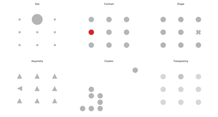
Rule 1: The most unique element will be seen first
According to Gestalt principles, were are generally drawn to:
- Bigger objects
- Contrasting colors (e.g. red in a white canvas or neon yellow in a black canvas)
- Groups or clusters
- Uncommon shapes
- Asymmetry
- Solid fills instead of transparent
Rule 2: Most cultures will start browsing from the upper left corner
Ever since we learned to read, we have trained our eyes to browse from left to right and from the top to the bottom. Sure, you might be able to bypass this rule by overdoing any of the principals mentioned above, but that is not always a good idea.
Generally, you can take advantage of this fact and start placing the most important graphs in the upper left corners of your dashboard.
If you are interested in the topic, I recommend you to check out the outcomes of the Tableau eye-tracking study.
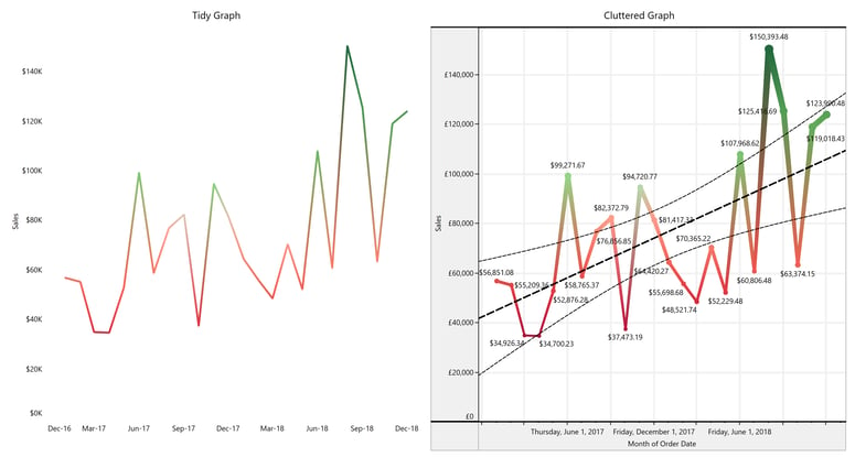
Rule 3: Every element is there to support your point or distract people from it
Imagine you had to pay actual money for every element in your dashboard. Would you still add background lines? Wouldn’t you remove those labels saying “days” or “countries” (assuming this is extremely obvious for your user too)? Would you still prefer an overly complicated graph instead of an intuitive bar chart everybody will understand?
I sincerely hope this tips will help you create a better dashboard. If you have any questions regarding Tableau or the design of dashboards, please don’t hesitate to reach out to me. I am always happy to help and network with a fellow data professional.