Hi reader,
This is Catalina, and today I'm writing my first ever blog which I hope will make your journey with Tableau a tiny bit more exciting. We're going to look into simple linear regressions that Tableau has embedded functions for, but hey, let's take it one step forward and calculate the slope and intercept ourselves.
Hence, starting with the basics
I'm pretty sure at least half of you readers have heard at some point in your education years about linear regressions. Might have sounded boring and complicated at the time ( or maybe not for some of you math geeks out there ) but I found it very useful later on in pointing out the outliers in your business - be it customers, products or any other granular level your data has.
Looking at the mathematics, a linear regression will show you the relationship between a scalar dependent variable and one or more explanatory ( independent ) variables. When you have one independent variable you're looking at a simple ( one predictor ) linear regression - that means that each point in your data can be represented in a Cartesian coordinate system using an x and y axis and the linear regression will be a non-vertical straight line that, to some extent of accuracy, predicts the dependent variable as a function of the independent variable.
We will assume an ordinary least squares regression which means that the slope of the fitted line is equal to the correlation between y and x corrected by the ratio of standard deviations ( checks how much your data deviates from the mean ) of these variables.
The equation
We'll need to find the equation of a straight line that will best fit our data points where :
y = slope * x + intercept
Now that we've been through the 'technicalities', let's go into Tableau and see how this can be calculated.
Hands-on everybody !
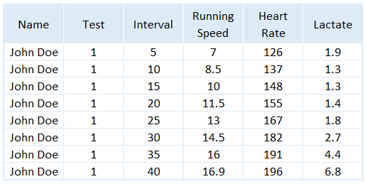
Let's take the following dataset as an example. We have an athlete that's taking a running test and every 5 minutes his speed, heart rate and lactate are being measured.
First, let's see the equation Tableau generates for this athlete. You'll need to build a scatter plot using speed on x axis, heart rate on y axis and the interval on detail. After you've built the view you can drag in the trend line from the Analytics menu.
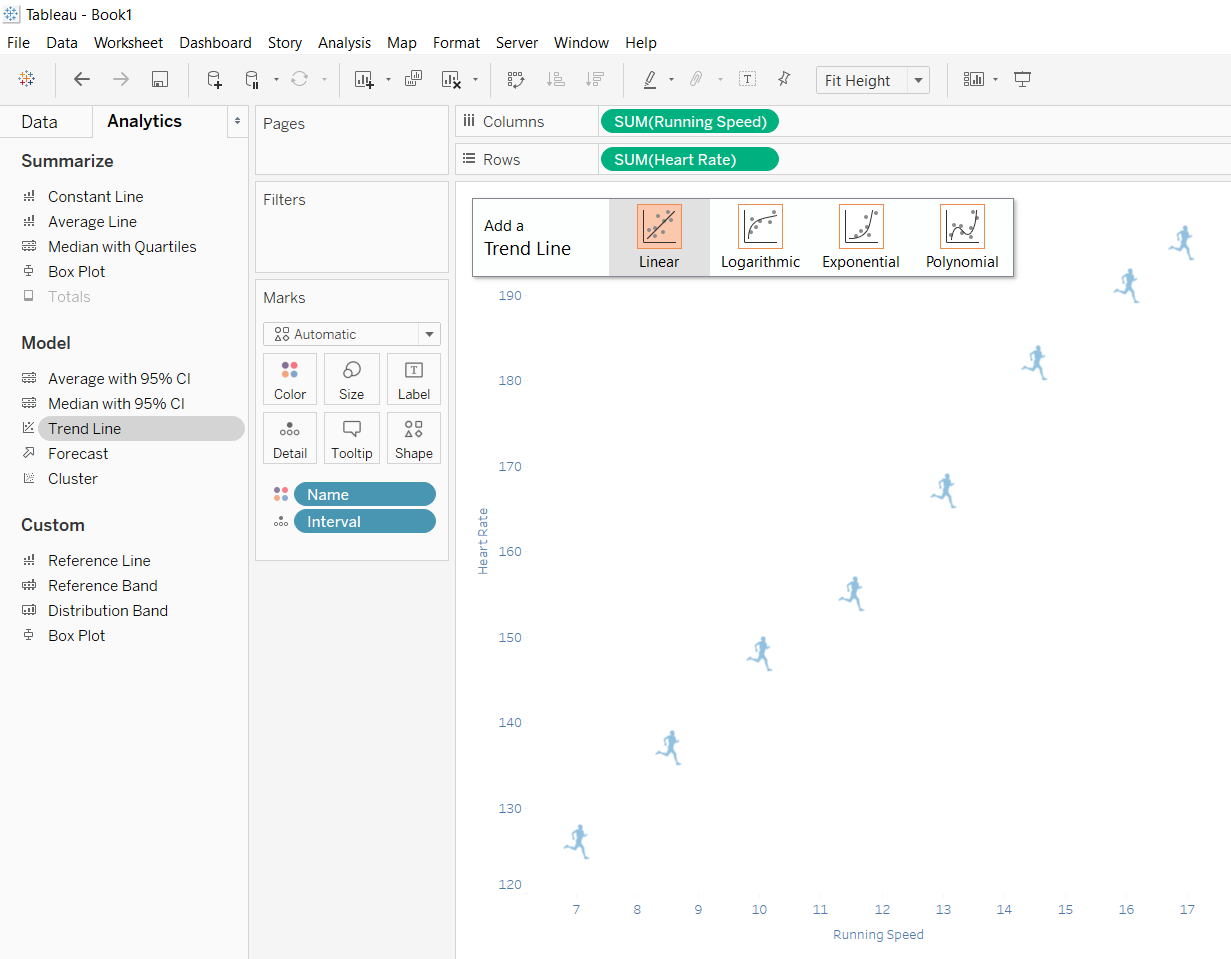
You'll end up with a graph that looks like this ( after you click on the trend line, select edit, and remove the confidence bands ) :
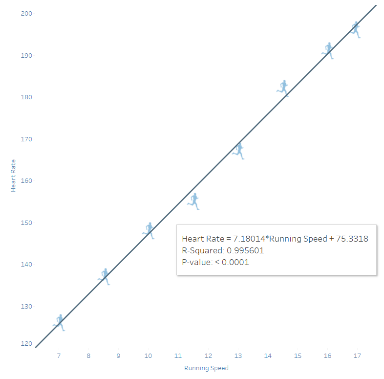
In the tooltip of the trend line we can already see that Heart Rate ( y ) = 7.18 ( slope ) * Running Speed + 75.33 ( intercept ). That's all great ! but how do we get this number into a measure that we can use for analysis ?
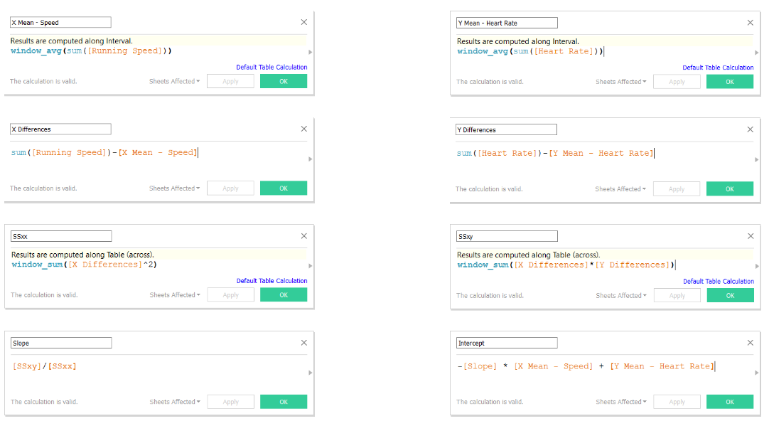
Going back to the mathematics, the formula for calculating the slope is:
slope = SSxy / SSxx
where SS stands for sum of squares for each x,y observation ( SSxy ) and for each x observation ( SSxx).
SSxx = x differences ^ 2
SSxy = x differences * y differences
where differences represent the distance between each point and the median.
x/y differences = x/y - mean x/y
where mean x/y is the average of all data points.
intercept = -slope * x mean + y mean
Now that we have all formulas down, we can build our slope & intercept in Tableau. As some of the measures are being reused in calculating the intercept I advise you to do the calculation in multiple formulas as follows :
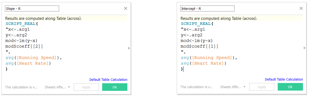
So, that's one way to calculate it. You can also use the mighty R for this and instead of 8 formulas you'll need just two. I'll walk you through the steps below.
First, you'll need to go through the step by step Tableau documentation on how to interact with R via Tableau Desktop.
And second, you can send your data to R and he'll be so kind to return the slope & intercept values.
Cool, you've learned how to calculate the slope & intercept but how are they useful ?
Well...let's look into some use cases
- You can use the regression coefficients to rank your customers / products by how fast they are increasing / decreasing.
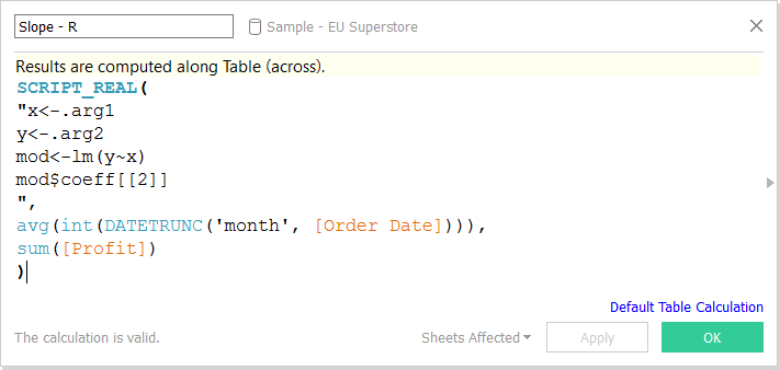
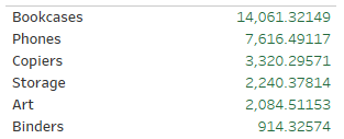
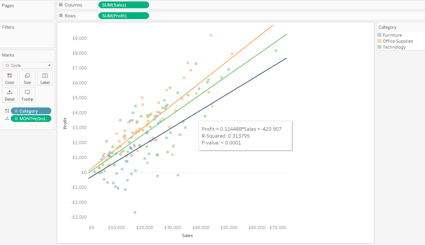
For this example we will use the 'Sample - EU Superstore' Tableau embedded data source and we'll rank the Product Sub-Categories based on the fastest increase / decrease in monthly sales in 2015.
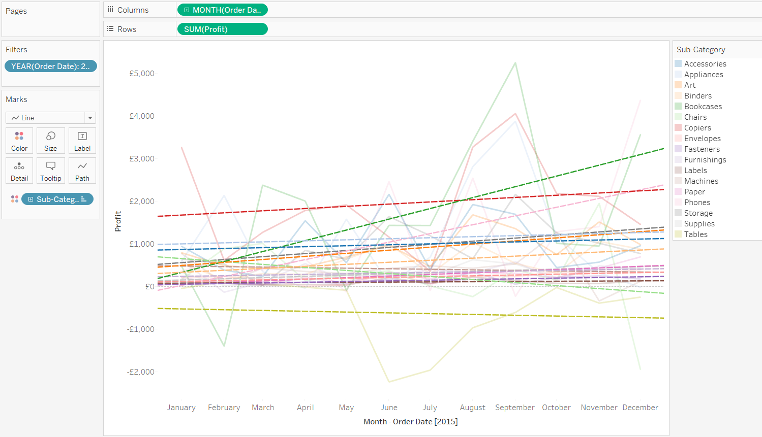
Looking at the image above, we can easily spot that Tables is decreasing ( but that's only because there seem to be no other products with a negative Profit so it makes it an outlier - which is generally easy to see at a glance ), some of the products are stable and Bookcases have increased the fastest. But what about the products in between ? It's quite hard to read this chart due to how busy it is, and imagine what would happen when you'd go to a product level.
So how can we analyse this easy,fast and accurate ?
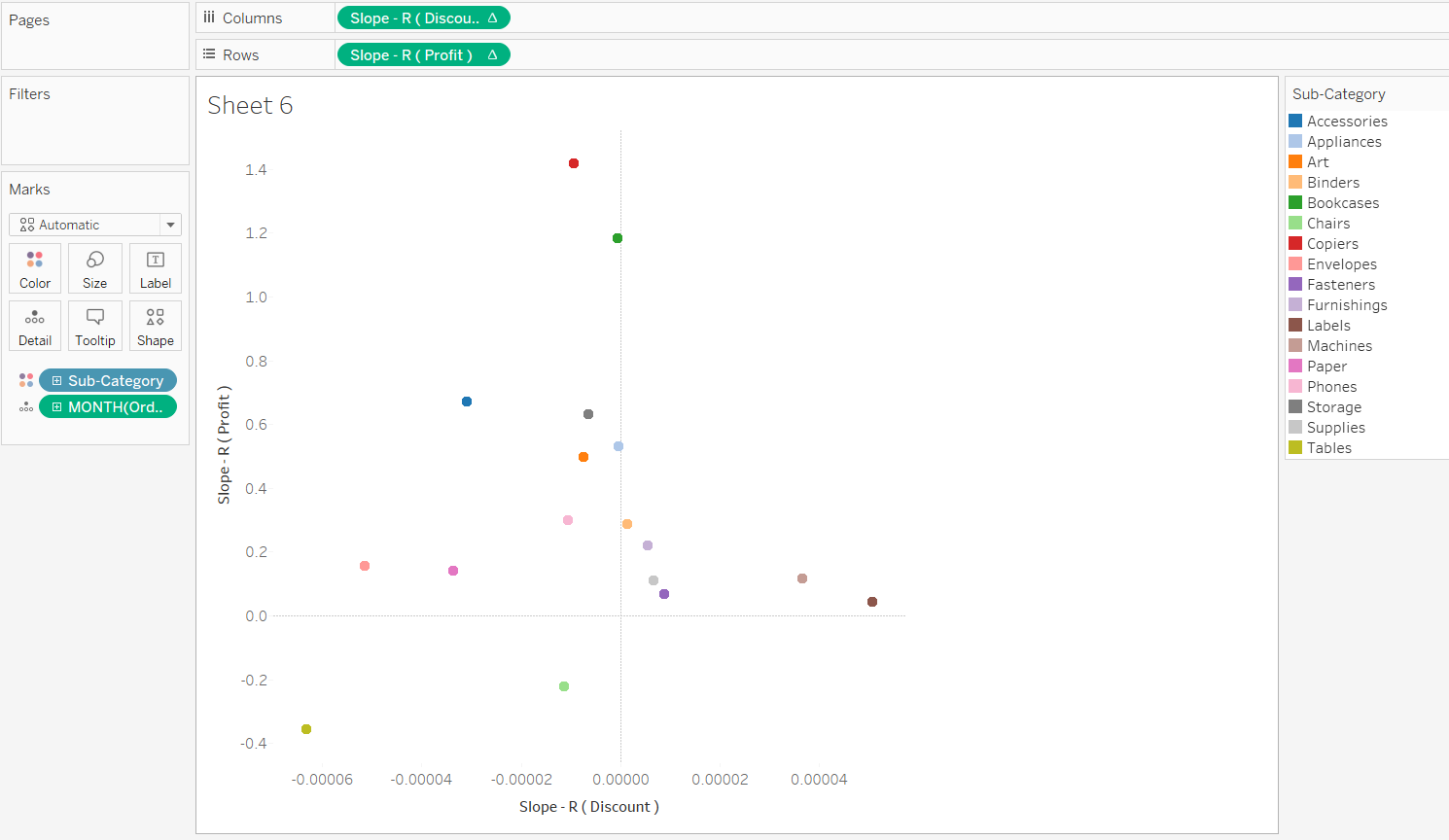
Well, you've guessed it. We're going to use the slope calculated via R.
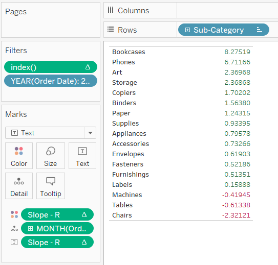
The result above confirms, as we've assumed, that Bookcases had increased most in 2015 and that not only Tables but Chairs & Machines have generally decreased as well. This view is already pretty good as it tells us which product sub-categories are generally going up and which are going down, but what if you'd want to also rank them based on the importance of the product ( which is generally related to the volume of sales / profit ) ?
For that you can calculate an average of monthly profit per product and multiply it by the slope.
Slope - R * abs ( window_avg ( sum ( Profit ) ) )
As the slope already tells us if the product sub-category is going up / down we'll use the absolute profit value for an analysis on profit impact.
You will see now that the order has changed showing that even though Copiers did not increase as much, due to a high profit it will have a higher weight in the overall profit.
- You can predict new values
When you have sufficient historical data and your seasonality is not having a very high impact, you can use the calculated slope and intercept to predict what would happen if the predictor would change. Taking the example below, you can tell, per product category what profit you should expect when estimating an x amount of sales.
- You can analyse the slopes of 2 different KPIs in a scatter plot to see if they are correlated
The view above tells us that in most cases a decrease in the avg discount amount will generate a higher profit ( upper left corner ). There are of course a couple of cases where an increase in discount generates slightly more profit ( upper right corner ) and some cases where taking the discount away will mean a loss in profit ( lower left corner ).
- You can see where 2 trend lines meet ( e.g. see where demand meets offer )
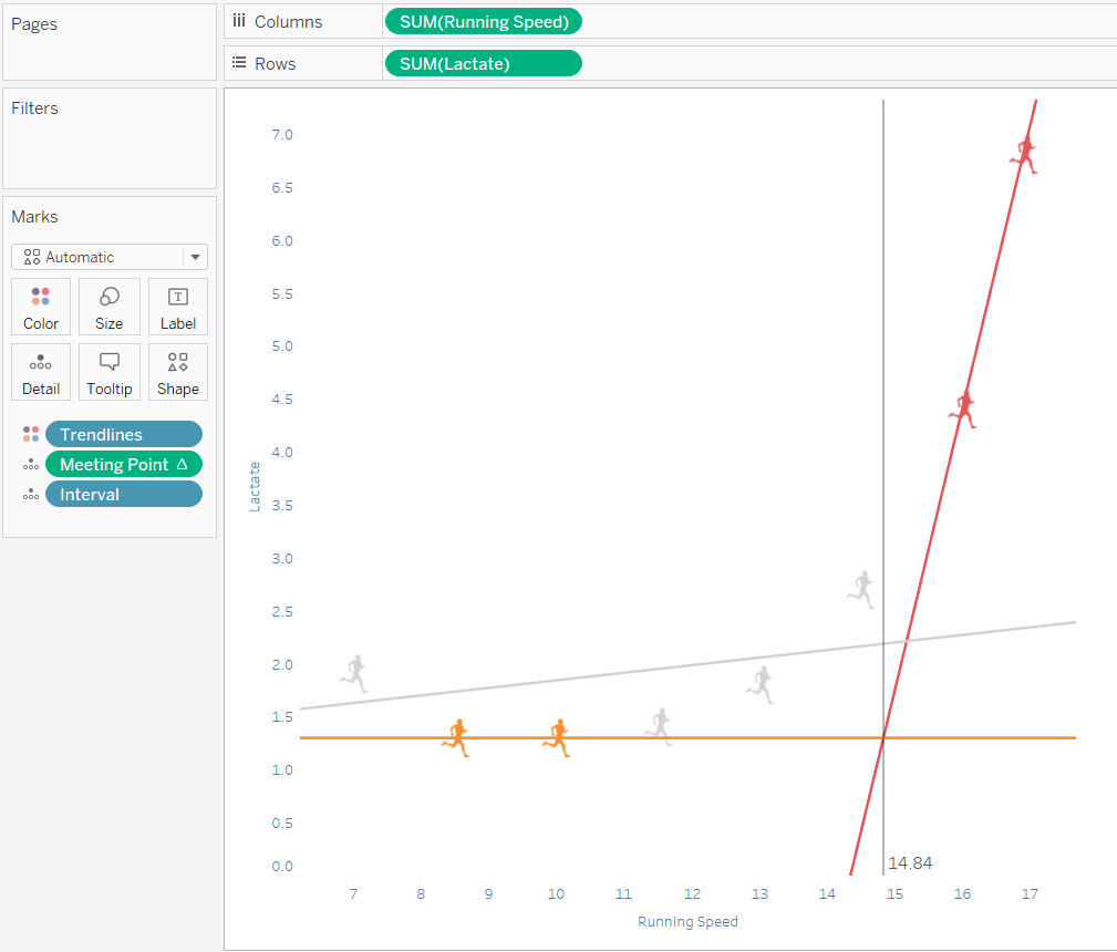
Going back to our athlete data, if for the test data we discussed at the beginning of the article we would like to see what is the optimal speed in order not to have too much lactate in the athlete's blood and we would decide to calculate that by looking at the meeting point of the 2 trend lines drawn ( trend lines are dummy generated by considering interval 10 and 15 as 'T1' and the last 2 intervals as 'T2' ).
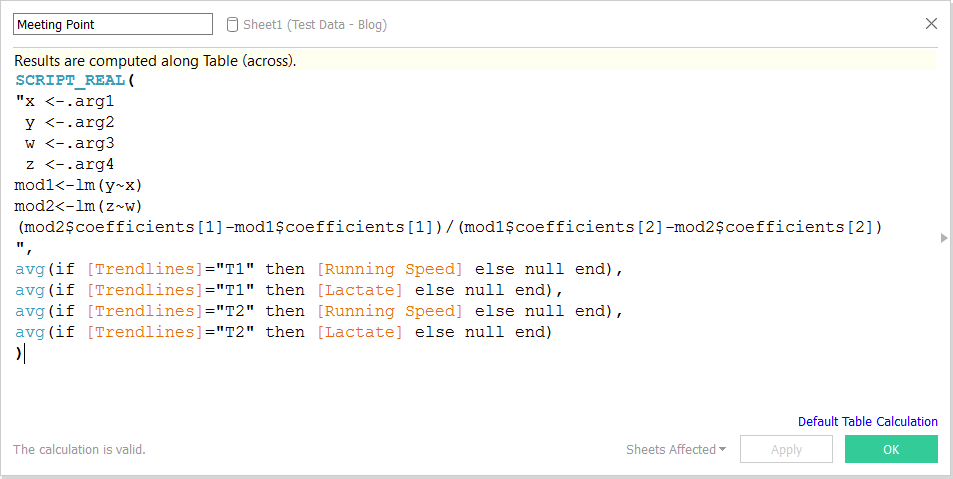
The meeting point can be calculated via R, or if you'd like, directly in Tableau using the following formula :
( Intercept T2 - Intercept T1 ) / ( Slope T1 / Slope T2 )
Thanks for reading !