Makeover Monday
Last year, a phenomenon known as "Makeover Monday" was conceptualized by Tableau Zen Master Andy Kriebel. Originating from his own blog post series where he would educationally review and rebuild visualizations based on best practices, the concept extended to a weekly community-based challenge open to all enthusiasts. Makeover Monday grew in popularity over the year, as over 500 data geeks regularly participated, yielding over 3000 submissions that were then shared on a dedicated website and discussed on Twitter.
In 2017, Andy joined forces with Exasol's Eva Murray, who now both host the weekly challenge. I myself made a "new year's" resolution to start participating in the event steadily, and have had a great time doing so until now. If you aren't participating yet, I'd recommend you get started as soon as possible. Not only you'll see your technical Tableau skills are growing, but you'll find yourself challenged to rethink your knowledge of visualization with various data sets.
105M rows of Chicago Taxi data
In week 6 of 2017, Makeover Monday was based on a rather untraditional data set, as opposed to the regular sized data sets of the other weeks. In fact, Eva took care of hosting The City of Chicago's Taxi Trip data in Exasol, which was made available publicly to all participants of Makeover Monday. Everyone would connect either to the live data that was hosted online, or to the already published and reduced Tableau Extract offered as an alternative.
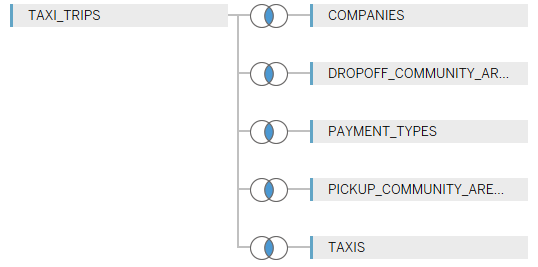
Being interested in experimenting with Exasol and in seeing its acclaimed performance for myself, I opted for the first option. Connecting to the data source in Tableau is straightforward, and after defining my connection to include not only the trips but also some additional information that was provided in other tables, such as companies and payment methods. Here's how this simple model looked:
It was time to start exploring. Using a live connection, I routinely dragged in the Number of Records field to verify the correctness of my joins. Without waiting for the result, which I figured would take at least 15 seconds to come up, perhaps minutes, I went and grabbed a glass of water. Coming back, I was delighted to see the result on the screen, and started exploring further.
Boy, was my initial assessment wrong. As soon as I started scrutinizing the data further, I noticed no delay or very little in my actions when adding fields to the sheet. Turns out they weren't lying. Analyzing 105 million rows of data on Exasol with a live connection was a breeze, a walk in the park! Making use of this asset, I further investigated the data and started building stuff.
Tableau Public's 15M row limit
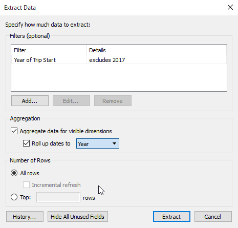
Generally, the result of Makeover Monday challenges are posted to Tableau Public, where others can interactively experiment with visualizations created by participants. To do so, the data is to be extracted from the original data source, and stored into a Tableau Extract. This usually favors performance in contrast to traditional data sources, and ensures that the data is sent along with the dashboards and works on Tableau Public. This time, there was one detail that would prevent contributors to do so: Tableau Public has a limit of 15M rows when it comes to these extracts.
The solution is to pre-aggregate the Extract to a higher level, omitting some potentially unnecessary details from the data. In this case, there was no need for individual trip information, but I limited the data to aspects such as the payment methods, the time of the trips rounded to the hour, and so on. Also, including just the 2016 data helps. Andy has written a Tableau Tip Tuesday blog post following up on the Makeover Monday big data challenge, helping those who needed a little clarity on this sometimes complicated matter. Check out the the post to learn about this useful feature. And here's how this looks:
It's your turn
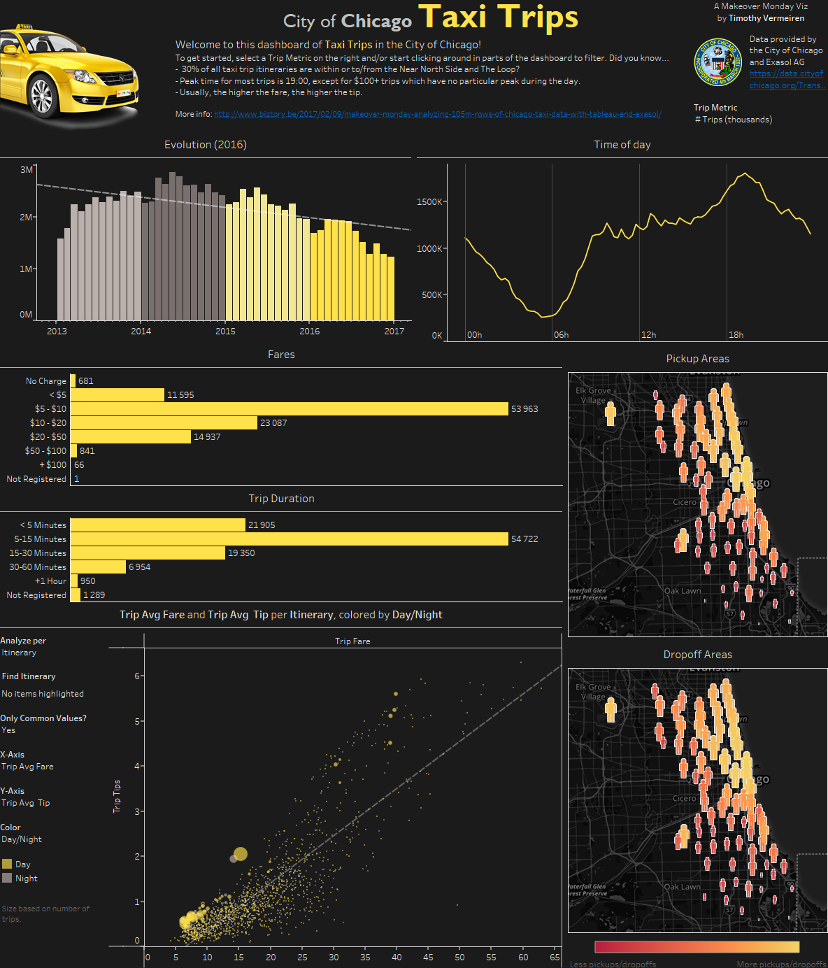
In the end I came up with a dashboard that allows you to perform a further analysis yourself. Click the image below to be taken to the interactive version on Tableau Public and see if you can validate or disprove the facts mentioned in the introductory text!